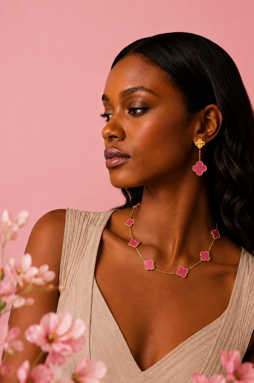
The color is new. The collector response is divided.
Since 1968, Alhambra has been the collection that defines Van Cleef & Arpels more completely than any other. It began in yellow gold with white mother-of-pearl and widened over the decades into onyx, carnelian, malachite, turquoise and guilloché gold. Through every one of those additions, natural material stayed at the center of the permanent collection.
This release moves differently.
Van Cleef & Arpels has brought translucent pink enamel into Alhambra for the first time. The house hasn’t simply added another color to an existing sequence — it has changed what the motif is made of. The reaction split almost as soon as the images circulated, and the split traces directly back to that decision.
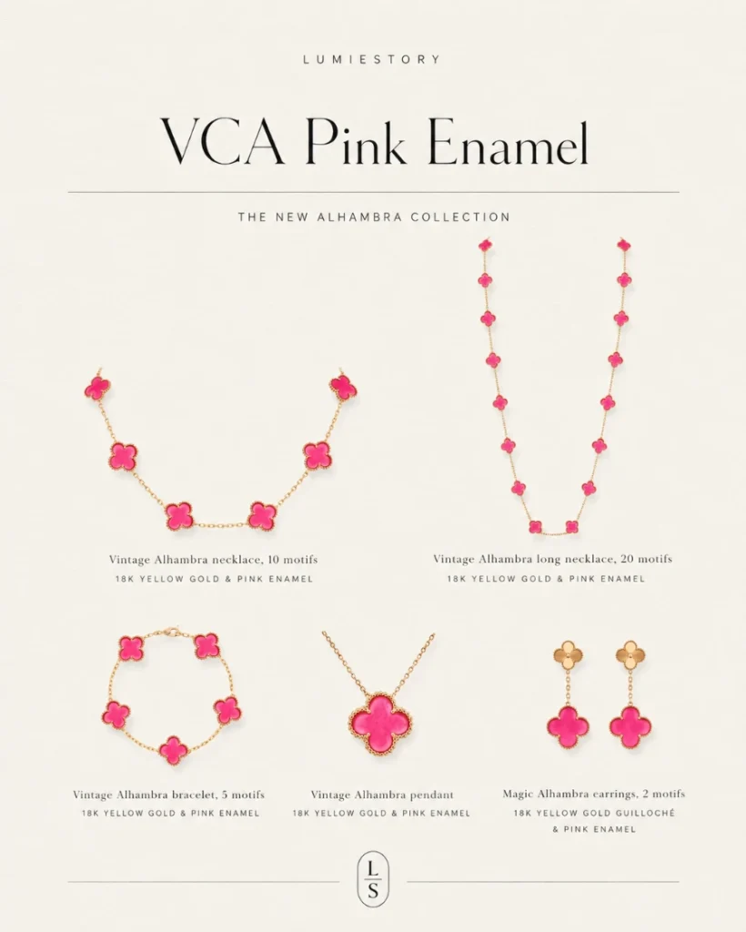
The Lineup │ A Color Family, Not a One-Off
The pink enamel arrives as a collection rather than a single piece.
- Vintage Alhambra Pendant (1 motif)
- Vintage Alhambra Bracelet (5 motifs)
- Vintage Alhambra Necklace (10 motifs)
- Vintage Alhambra Long Necklace (20 motifs)
- Magic Alhambra Earrings (2 motifs)
That covers most of the collection’s commercial core. A one-motif pendant and a five-motif bracelet are two of Alhambra’s key entry points, and putting both into the launch signals intent beyond a seasonal exercise. The structure suggests a color family rather than a single novelty drop.
Every piece pairs the pink enamel with yellow gold, and the beaded gold frame that has defined the motif since the beginning carries over unchanged, so the silhouette holds and only the center has moved.
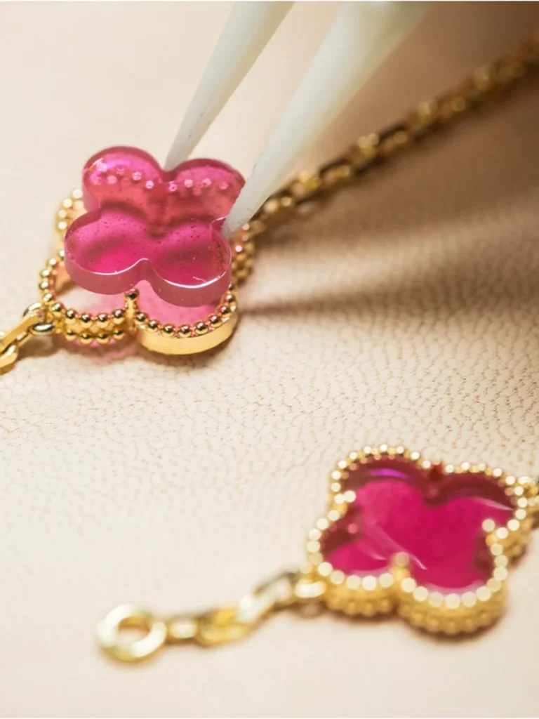
source: VCA official
The Material │ The Real Change Is the Enamel, Not the Pink
The color registers first. The material is what actually shifted.
Van Cleef & Arpels describes the work as drawing on the historic Gold Ruby glass technique — the old European glassmaking method that uses gold to strike a deep red into the glass. The house applied that logic to contemporary enamel and developed the result over several years inside its own enamel workshops.
The detail the brand pushes hardest is an unexpected one: bubbles.
In most enamel work, trapped air counts as a flaw. Here the microbubbles were deliberately retained. Light entering the enamel scatters against them repeatedly instead of passing cleanly through, which builds depth into the material and leaves no two motifs looking exactly alike.
The surface geometry supports the same effect. Rather than sitting flat, each motif carries a gentle convex curve that broadens the reflected light across the face of the clover. Taken together, the translucency, the internal scatter and the curvature are the reason the house describes each motif as a work in its own right.
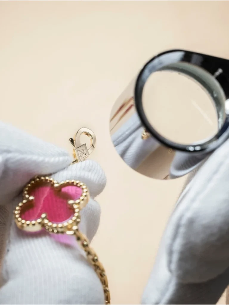
source: VCA official
The Argument │ Technique as the Selling Point
Van Cleef & Arpels has invested in enamel for a long time. The maison works with more than fifteen distinct enameling techniques and runs an in-house enamel school with a program lasting roughly three years.
That history is doing real work in the launch narrative. The house isn’t presenting a color variation — it’s presenting a technical achievement, positioning the pink as the visible outcome of a process that took years to stabilize. The launch asks buyers to value the pink as a newly developed enamel rather than as a new color.
Whether that argument lands depends entirely on how the material reads in hand.
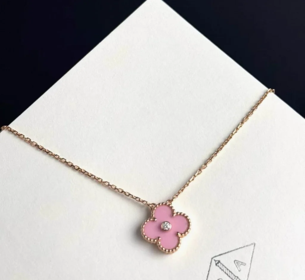
2015 holiday – Pink Porcelain
@baifern.chanel.all
Precedent │ Porcelain Came First
Calling this the first manufactured material in Alhambra would overstate the case. Van Cleef & Arpels has set Sèvres porcelain into the motif before, most visibly through the annual Holiday Pendant, and a pink porcelain version appeared as far back as 2015. Blue porcelain has surfaced in Magic Alhambra pieces as well, with examples of both still circulating on the secondary market. Letterwood has passed through the collection too.
What separates those releases from this one is scale. The porcelain pieces arrived as limited single-motif editions tied to a seasonal calendar, which kept them at the edge of the collection rather than inside its working core. Collectors treated them accordingly — as annual curiosities, priced and traded on rarity rather than on material.
The pink enamel arrives as five pieces spanning the pendant, the bracelet, both necklace lengths and the earrings. That is the same structure the house builds around onyx and carnelian, which means a manufactured material is being offered as a permanent option for the first time. The precedent exists, but the commitment behind it doesn’t compare, and that gap is where this release actually breaks from what came before.
Reception │ More Divided Than the Launch Imagery Suggests
The response across international collector forums has been more mixed than the launch imagery suggests, and the translucency draws the most comment. Plastic. Resin. Toy jewelry. Those are the words that recur, and they recur often enough that dismissing them as outlier opinion would be a mistake.
The second objection runs deeper, because it isn’t about taste. Enamel is a glass-based material. Alhambra’s permanent line has been built on hardstone and natural shell — substances that carry their own scarcity and their own irregularity. So the question being asked is whether the material can sustain fine-jewelry pricing when the center of the motif is manufactured rather than mined. The porcelain editions never had to answer that question, since their limited runs supplied a scarcity argument of their own. A permanent line has no such cover.
Others see the same saturation as the collection’s strength. Alhambra has never carried a color this vivid, and against the softness of mother-of-pearl or the muted warmth of carnelian, the pink registers as genuinely fashion-forward. For collectors who already own the classic materials and want something that reads immediately across a room, the appeal is obvious.
The collection is likely to divide along a single axis: whether a buyer prioritizes color impact or material tradition.

Wearability │ A Contrast Color, Not a Blending One
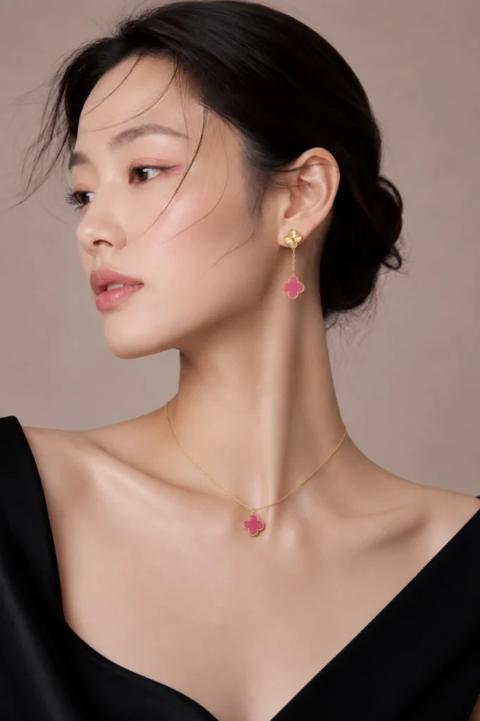
This is not the baby pink the name might suggest. From the released images, the shade sits somewhere between raspberry and fuchsia, and the translucent enamel deepens it further — under direct light the saturation climbs rather than softens. Anyone approaching it with pastel expectations should recalibrate before seeing it in person.
White mother-of-pearl works because it disappears into most skin tones. This does the opposite. It builds contrast rather than harmony, which changes how it should be styled.
On fair, cool-toned skin the pink lifts sharply and holds its position as a focal point. Paired with black or charcoal, the value contrast widens and the jewelry takes over the outfit’s center of gravity.
On skin with warm golden or olive undertones, the reading shifts. The yellow gold frame connects easily with the skin, but a fuchsia-leaning pink can catch the eye before the skin does. Ivory, cream and sand-beige neutrals soften that gap considerably and let the color sit inside the styling instead of on top of it.
Deeper skin tones aren’t excluded here — if anything the wider value contrast can make the enamel read more vividly, which works well when the jewelry is meant to anchor the look rather than accompany it. Across skin tones, the piece needs to be tested under real light and on real skin before any decision is made.
Why the Verdict Has to Wait for the Boutique
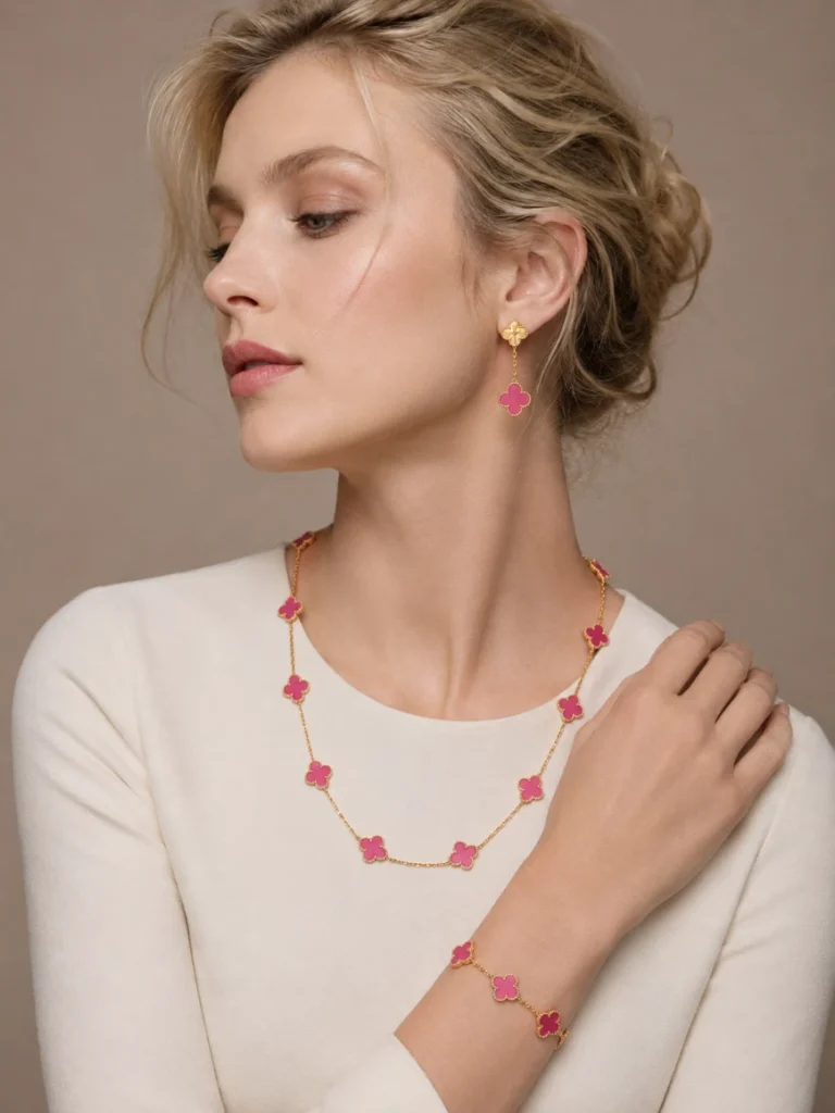
Almost everything Van Cleef & Arpels is claiming for this collection — the translucency, the internal bubbles, and the way the convex surface throws light — only exists under live light. Photography flattens all three, which is precisely the condition that produces the plastic criticism.
It cuts the other way as well. The flatness that reads as cheap on a screen may resolve into depth in the hand, and the bubbles that merely resemble inclusions in product photography may carry the character the house intended. Neither outcome can be confirmed from images.
Final Assessment
Alhambra has carried a manufactured material before, but never across a full line, and that is what makes this collection significant regardless of how the pink itself is received. The more consequential question is how far a maison can shift the material tradition of its most recognizable design in exchange for color impact.
That judgment has to wait for the boutique, since the gloss, the translucency and the texture of the bubbles all need to be seen under live light. If that depth carries in person, and if the pricing feels proportionate to the material and the technique, this could establish a genuinely separate direction within Alhambra rather than becoming another entry in its material sequence.
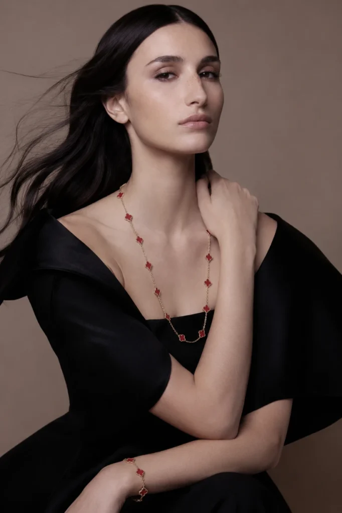
Unless otherwise noted, all editorial images in this article were generated by Lumie.
[ Related Editorials ]