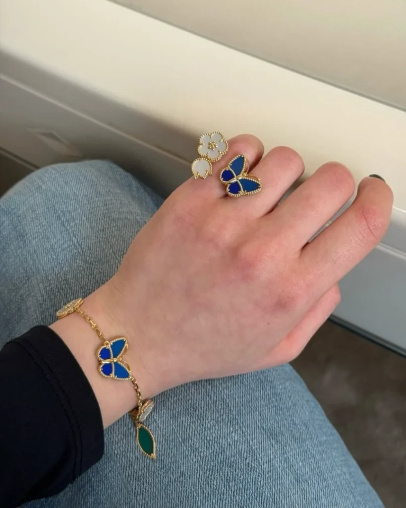
Inside Lucky Spring Butterfly
18K yellow gold, Agate, Lapis Lazuli, Mother-of-pearl
VCARPHZV00
($ 6,800/ Excluding taxes)
@tata__boutique. / Instagram
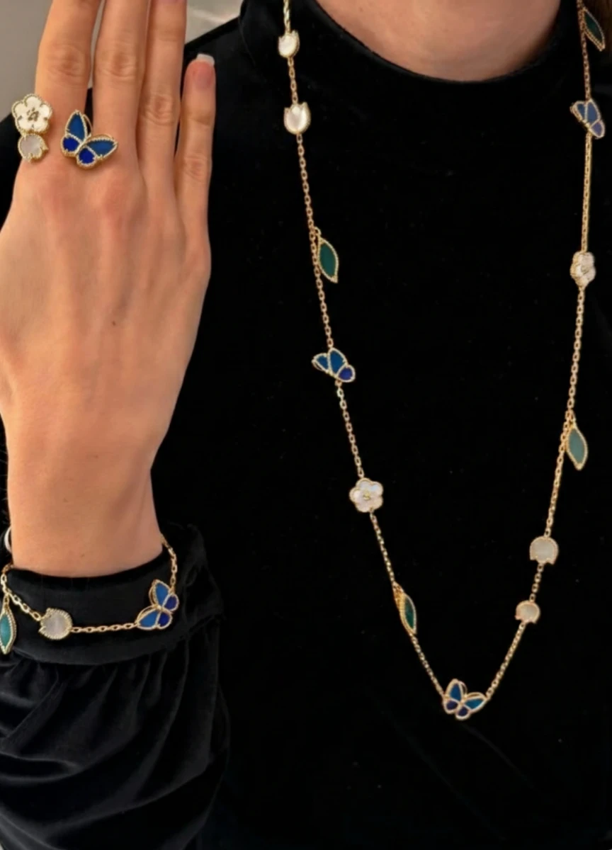
In recent weeks, quiet conversations have started to circulate around Van Cleef & Arpels and its Lucky Spring collection.
A new variation — featuring a blue butterfly — has appeared in select boutiques and private previews, despite the absence of any update on the global website.
@takashimayasc. / Instagram
No official announcement has been released. Among collectors and sales associates, an April reveal is widely anticipated.
What matters isn’t the timing. It’s the nature of the change.
This isn’t a new collection. It’s a chromatic and emotional recalibration within Lucky Spring itself.
source: VCA official
What Lucky Spring Represents Within Van Cleef & Arpels
Lucky Spring occupies a specific position within the maison’s universe.
Unlike Alhambra — grounded in geometry and proportion — Lucky Spring is seasonal, narrative, and symbolic.
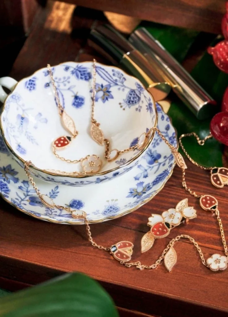
The original composition was clear:
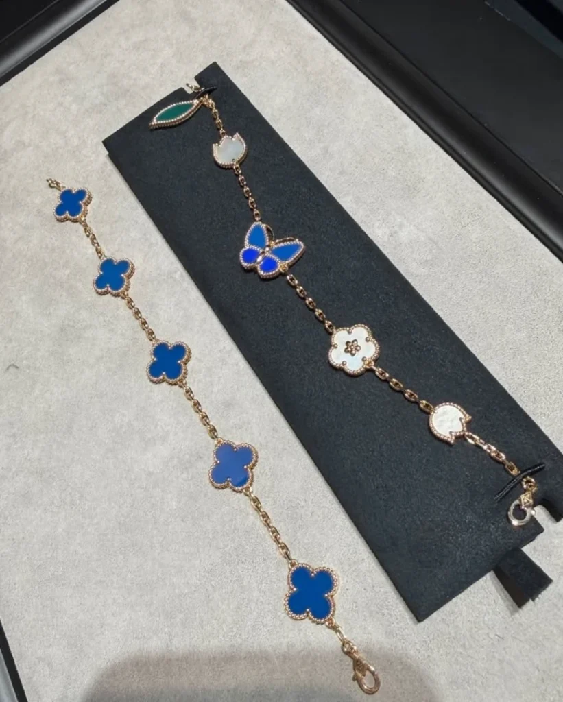
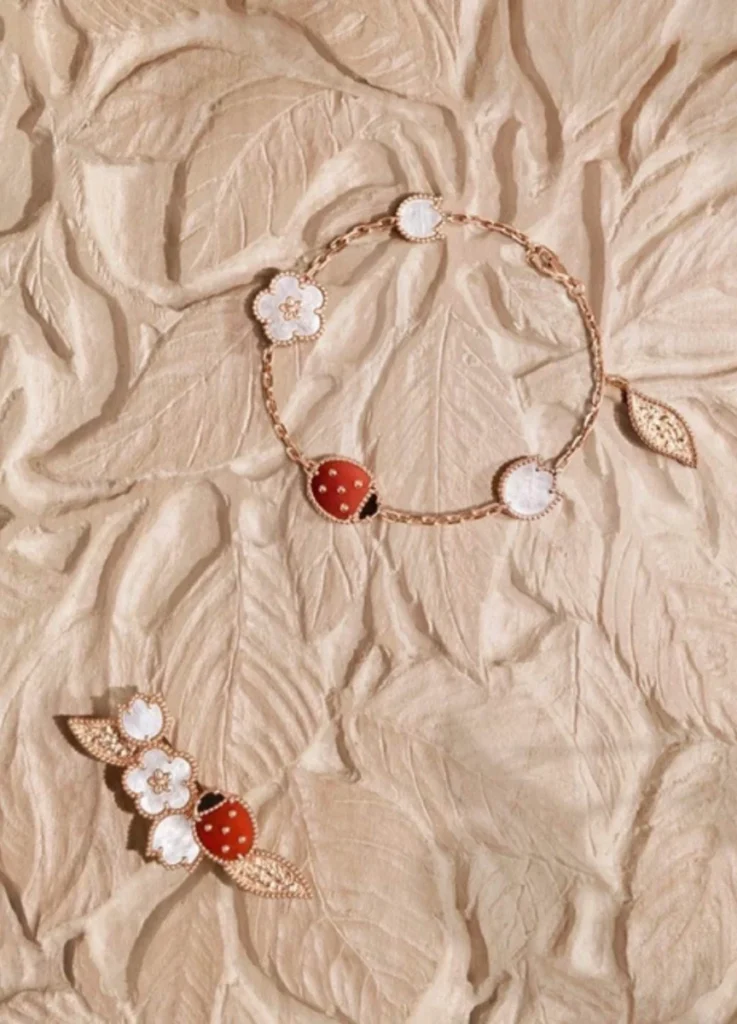
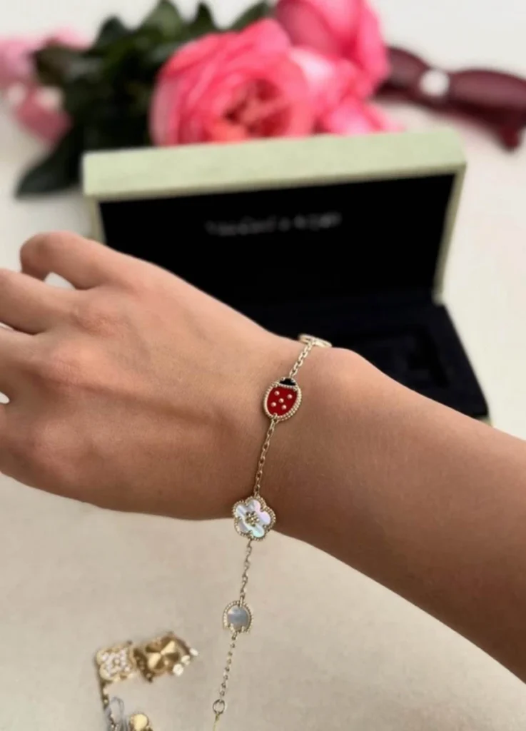
- red ladybug in carnelian
- white flower in mother-of-pearl
- green leaves
- yellow gold base
The contrasts were intentional and unmistakable. Color carried meaning. Motifs delivered a message.
This wasn’t a subtle collection. It was a declarative one — visually and symbolically centered on luck.
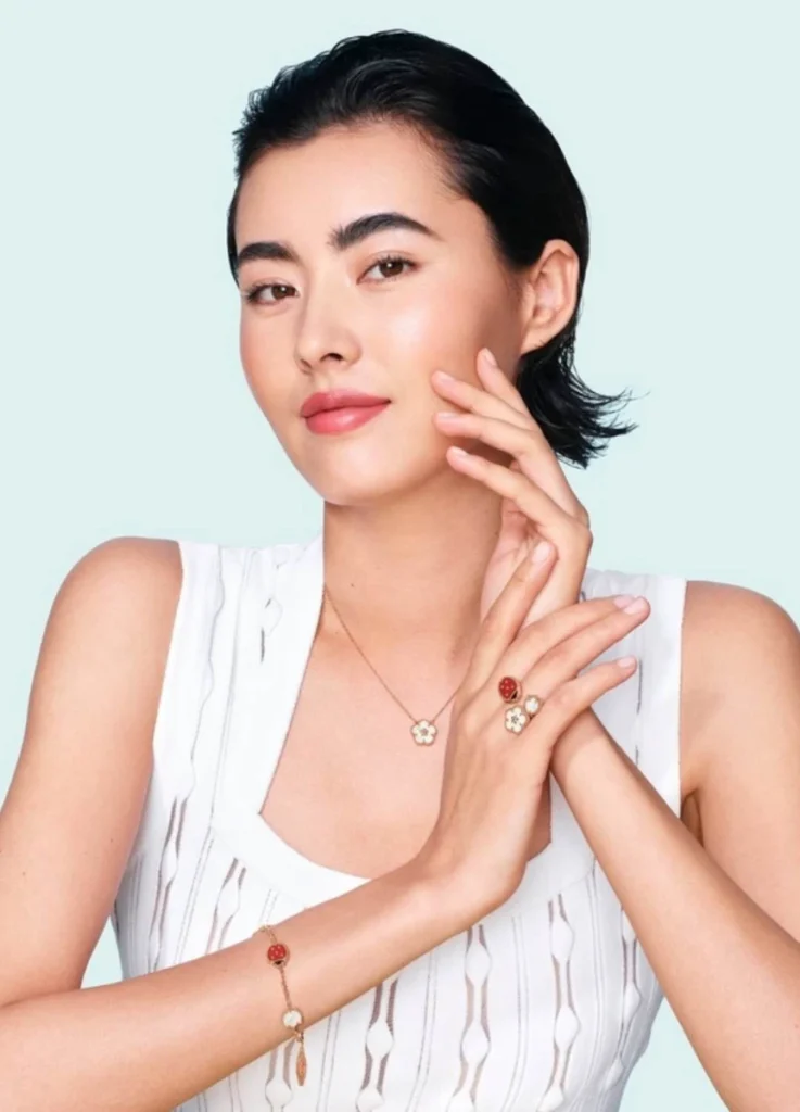
18K rose gold, Carnelian, Mother-of-pearl, Onyx
VCARP7RR00
($ 6,050/ Excluding taxes)
@zoloto_shah_kz / Instagram
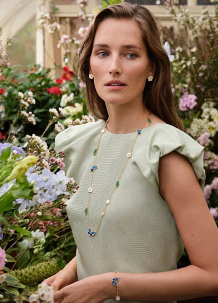
The Meaning of the Blue Butterfly Shift
The most significant change is simple, yet consequential.
The ladybug is replaced by a blue butterfly.
This isn’t merely a color update. It’s a structural and emotional shift.
| Original (Ladybug) | New (Blue Butterfly) |
|---|---|
| Dot-based, circular form | Winged, expanded silhouette |
| Horizontal visual stability | Gentle vertical lift |
| Strong red contrast | Cooler, tonal harmony |
| Symbolic, declarative | Emotional, interpretive |
The ladybug functions as a dot. The eye stops.
The butterfly functions as a surface. The eye moves.
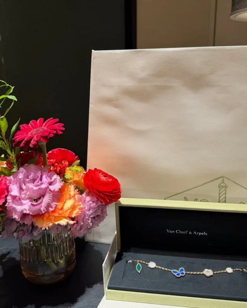
Lucky Spring Butterfly bracelet, 5 motifs($ 6,800/ Excluding taxes)
@tata__boutique. / Instagram
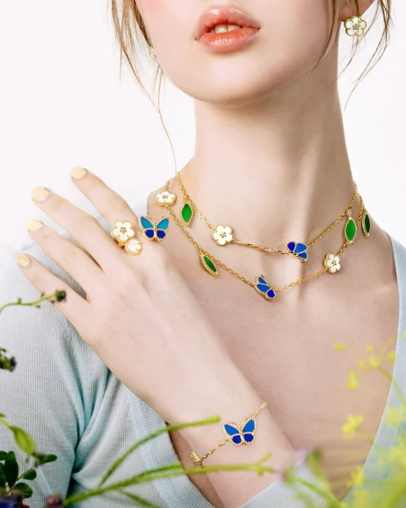
In long necklace formats especially, the butterfly subtly disrupts the repetitive rhythm of flowers and leaves, introducing lift and airflow along the chain. The composition becomes less literal, less punctuated — and more fluid.
Where red once announced luck, blue suggests transition.
The original Lucky Spring spoke through message. The new variation speaks through mood.
The first version was direct. This one is modulated. A collection once organized around symbolism is now organized around emotional register.
source: ELLE
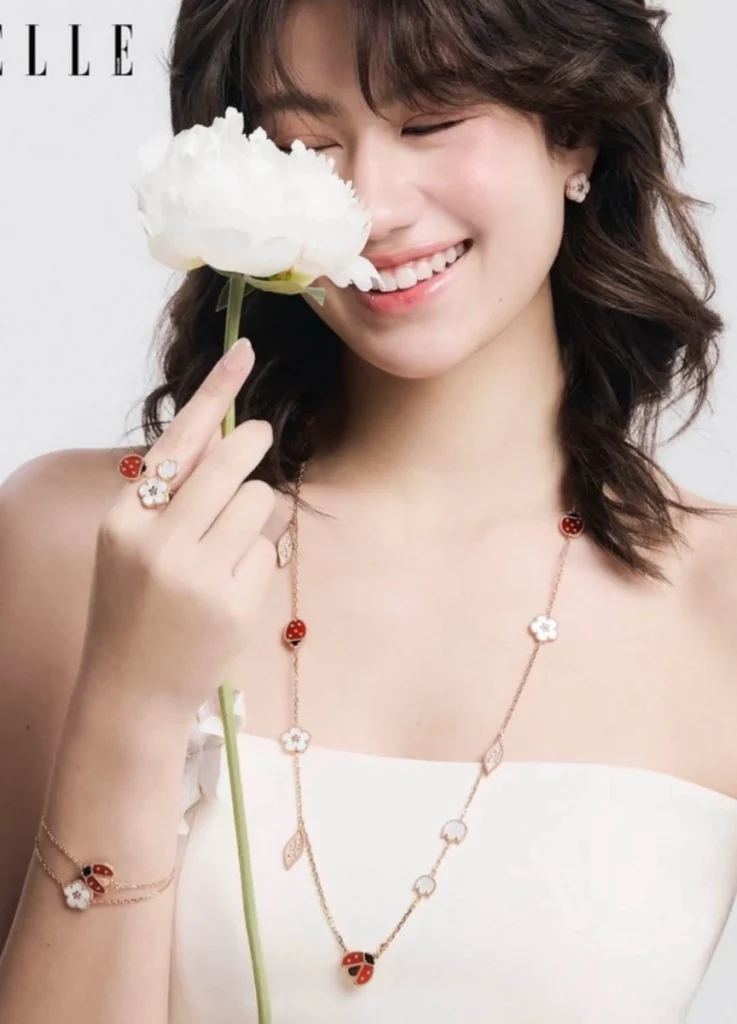
Who the Original Version Speaks To — and Why It Didn’t Work for Everyone
Lucky Spring has often been described as cute. Cuteness, however, is not neutral.
The original ladybug version tends to suit:
- faces with strong contrast (defined eyes and lips)
- slim upper bodies
- bright, direct personal imagery
- casual styles with confident color mixing
The ladybug, though small, carries visual authority. On faces with softer contrast, it can dominate rather than harmonize.
This was precisely why many — myself included — admired the collection without committing to it.
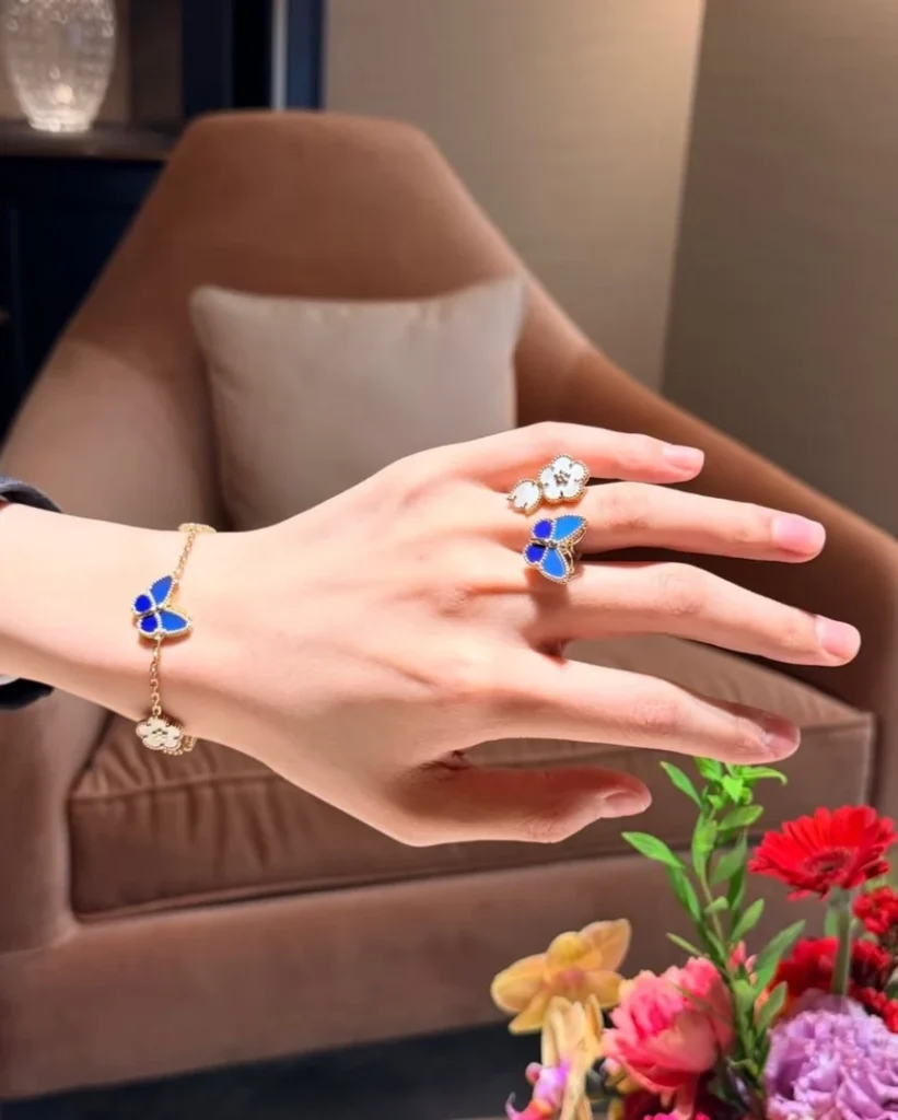
Who the Blue Butterfly Version May Suit
The blue butterfly softens that authority.
It tends to integrate more naturally with:
- cool or neutral skin tones
- faces with moderate or low contrast
- gentle, composed personal imagery
- wardrobes centered on black, navy, ivory, or grey
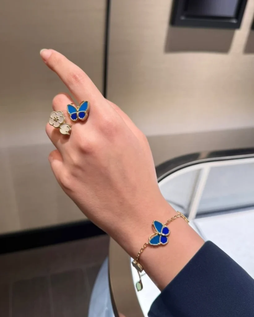
18K yellow gold, Agate, Lapis Lazuli, Mother-of-pearl
VCARPHZW00
($ 22,100/ Excluding taxes)
@tata__boutique. / Instagram
Blue is less assertive than red. It blends rather than declares.
Proportion still matters.
Long necklaces with repeated motifs can visually divide the torso. For shorter upper bodies, the segmentation becomes a real consideration — not a styling preference, but a structural fact worth weighing before acquisition.
Speaking from my own proportions, this is the case I sit within. The blue softens what the ladybug declared. But proportion does not soften with color — it remains the constant variable.
The Physical Structures That Lucky Spring Requires
Despite its lighthearted narrative, Lucky Spring is structurally demanding.
1) Slim, defined wrists
- Approximately 14–15 cm circumference
- Visible bone structure
- Enough negative space for motif rhythm
Repeated motifs require air. On thicker wrists, the bracelet reads as a pattern band rather than jewelry.
The 5-motif bracelet in particular needs visible space between motifs for the composition to read as rhythm rather than density.
source: VCA official
2) Moderate to long upper body length
Long necklaces rely on uninterrupted vertical flow. Without sufficient torso length, the rhythm fractures.
3) Medium or higher facial contrast
Lucky Spring uses color intentionally. If facial features are extremely soft, the jewelry may read visually detached from the wearer.
Lucky Spring Butterfly bracelet, 5 motifs
@tata__boutique. / Instagram
4) A wardrobe rooted in softness and narrative
This isn’t a minimalist or architectural collection. It aligns with nature, optimism, and seasonal symbolism — not austerity.
A Lucky Spring piece worn against a strict tailored wardrobe often reads as borrowed rather than belonging.
When Lucky Spring Is Likely to Feel Misaligned
Avoidance matters as much as recommendation.
Lucky Spring tends to struggle with:
- short, thick wrists
- short upper bodies with significant bust volume
- strict minimalist wardrobes
- highly charismatic, authoritative personal imagery
- existing Alhambra-heavy collections
In these cases, the motifs feel ornamental rather than integral. The piece becomes decoration on the body, rather than language of the body.
A Note on Alhambra Overlap
Lucky Spring and Alhambra share more than a maison. They share a logic — repeated motifs, mother-of-pearl as a recurring material, color as identity marker.
For collectors with significant Alhambra holdings, Lucky Spring can introduce portfolio overlap rather than diversification. The two collections speak in adjacent registers. Owning both deeply often means owning one collection twice in the practical sense — repeated against the body, repeated across occasions, repeated in styling logic.
The blue butterfly variation doesn’t resolve this overlap. It refines the entry point, but it doesn’t change the fundamental composition logic that runs through both lines.
Worth weighing before acquisition.
Lucky Spring Butterfly bracelet, 5 motifs
@tata__boutique. / Instagram
Original vs Blue Variation — Wearability at a Glance
| Aspect | Ladybug Version | Blue Butterfly Version |
|---|---|---|
| Visual contrast | High | Medium |
| Eye movement | Horizontal | Subtle vertical |
| Emotional tone | Direct, symbolic | Soft, interpretive |
| Suitability range | Narrower | Slightly broader |
| Wardrobe pairing | Casual, colorful | Neutral, darker palettes |
The blue version doesn’t dilute Lucky Spring’s identity. It widens its entry point.
Where the original required a specific personality match, the new variation makes room for a more contemplative wearer — without diluting what the collection has always meant.
@tata__boutique. / Instagram
Closing Thoughts
Lucky Spring has always been a story about luck. Luck, in jewelry, is rarely about symbols alone.
It’s about balance — how a small motif rests on the body, how color interacts with skin, how rhythm respects proportion.
Red was a clear statement. Blue is a quieter adjustment.
Once that difference becomes visible, Lucky Spring stops being a cute collection and becomes something more precise.
The question isn’t which color is more beautiful. The question is which rhythm doesn’t disrupt the proportions of the body wearing it.
Jewelry isn’t a message. It’s a small adjustment placed on proportion.
A way of choosing a season — not by message, but by fit.
Featured Image via @totelle__ / Instagram
[ Related Editorials ]
- [Van Cleef & Arpels] Alhambra Bracelet Guide | 4 Motif vs 5 Motif vs 6 Motif
- [Van Cleef & Arpels] Flowerlace in Yellow Gold
- [Van Cleef & Arpels] The New Alhambra 15-Motif Necklace
- [Van Cleef & Arpels] Zodiac Collection
- [Cartier] Love Bracelet Full Pavé Size Comparison : Small, Medium, Classic — Structure, Craftsmanship, and the Architecture of Light