Dior Winter 2026: The Pond Was Never Real
Water lilies, polka dots, and a collection that turns out to be about artifice rather than flowers.
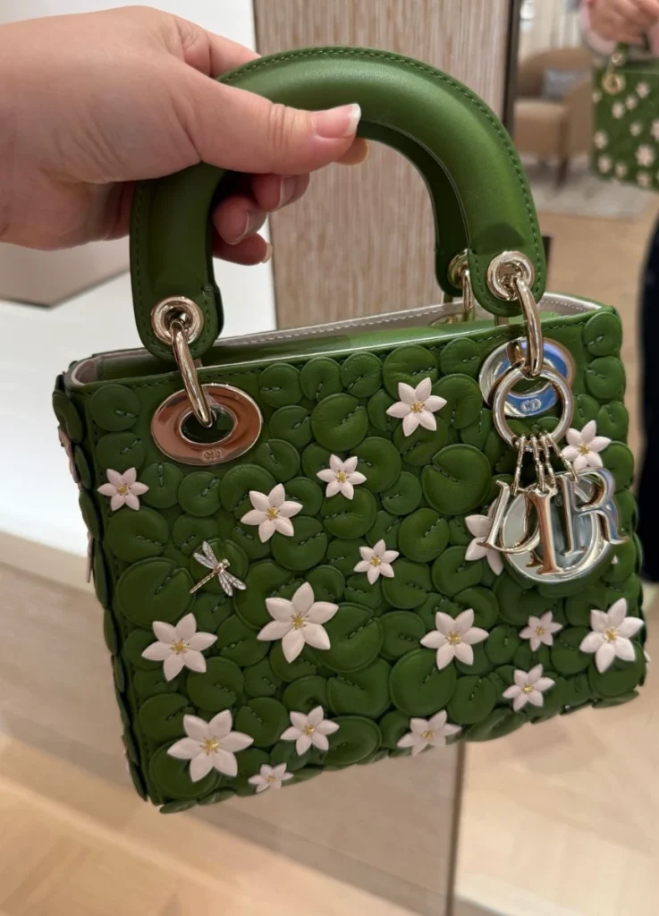
The first thing I noticed at the boutique, picking up the green Lady Dior, wasn’t the flowers. It was that the cannage had almost disappeared — the quilted lattice that has made a Lady Dior recognizable for three decades, now barely visible.
From a distance the bag looks like a floral piece: dark green calfskin with lily pads and small white blossoms layered across it. In the hand the order of attention changes completely. The pads cover the front so densely that the geometry falls behind them, and the leather pieces — each cut at a slightly different height, each catching light differently — join into something closer to a water surface than a pattern.
The structure doesn’t come first with decoration added on top. The decoration has overtaken the structure.
So the bag doesn’t come across as a Lady Dior with flowers applied. It comes across as a small pond built out of a Lady Dior.
Which raises the question that turned out to matter most this season. Why did Dior stop short of rendering flowers beautifully, and go on to rebuild the pond itself?
A fake garden inside a real one
Jonathan Anderson staged the Winter 2026 show in a glass pavilion built inside the Jardin des Tuileries. The catwalk traced the perimeter of the octagonal basin, and guests sat around the water’s edge so the models appeared to circle the pond rather than walk past it.
The Tuileries was laid out by Catherine de’ Medici in the sixteenth century and redesigned under Louis XIV, after which it served for generations as one of the most important promenade spaces in Paris. Walking in the garden was never only about looking at nature. It carried the social ritual of showing yourself to others and watching them in return.
When the garden first opened to the public in 1667, it wasn’t a space anyone could simply wander into. Visitors were expected to dress according to their social position, and a walk turned naturally into a form of public procession. The garden was a stage, and clothing was the most direct instrument for constructing yourself on it.
That history explains the choice of setting. Anderson built another garden inside a garden that already existed — a transparent pavilion, seating in the same green as the park’s own chairs, a bridge structure recalling those over the Seine, and at the center, the lily pond. Guests were inside the real Tuileries and inside an artificial set of it at the same time.
The lilies made the point unmistakable. What floated on the water weren’t plants but objects fabricated precisely enough to blur the line between the real and the made. A false pond inside a true garden, with false nature floating on it.
At the boutique, that pond converts once more. The artificial lilies become leather petals, the pads become calfskin appliqué, the water becomes embroidered canvas. A real garden, then an artificial nature staged inside it, then that artificial nature transferred again onto the surface of a product.
The artifice doesn’t happen once. It happens three times.
@shopersonall / Instagram
Why a water lily, and not simply a flower
Seen quickly, this looks like a collection inspired by Monet. The lily is certainly a central image, and the Musée de l’Orangerie — home to the large Water Lilies cycle — sits at the far end of the Tuileries. The visual chain from the show’s pond to those paintings forms on its own.
But Anderson’s reasons appear to run past the beauty of the flower. In a filmed conversation with Bella Freud shown before the show, he spoke about the way a water lily distorts the surface of the water it floats on. In the same conversation he talked about the promenade, and the long habit of dressing to be seen.
The two subjects meet. A lily sits on water and makes the water appear as something other than itself. Clothing sits on a body and constructs an exterior, and that exterior returns to you through other people’s eyes. Clothing goes past covering a body; it adjusts the surface of one, and rebuilds the impression a person makes.
What this season put in the boutique, then, is less a set of flowers than a technique for making a surface appear to be something else.
Dior’s own language points the same way. Exceptional craft creating apparitions of nature. Clothes with the appearance of flowers. Even David Sims’s campaign speaks the same language of artifice and display. Reproducing nature exactly matters less than how convincingly an image of nature can be assembled through craft. The collection’s literary references — Radclyffe Hall’s The Well of Loneliness, Baudelaire’s Les Fleurs du Mal — sit inside that same frame, where concealment and exposure, the natural and the staged, keep overlapping.
Put that way, the artificial lilies in the basin stop functioning as set dressing and start functioning as the season in miniature.
@closetstyledbyme_ / Instagram
Lady Dior — one bag paints a pond, the other becomes one
The logic surfaces most directly on the Lady Dior, where two versions of the same motif take opposite approaches.
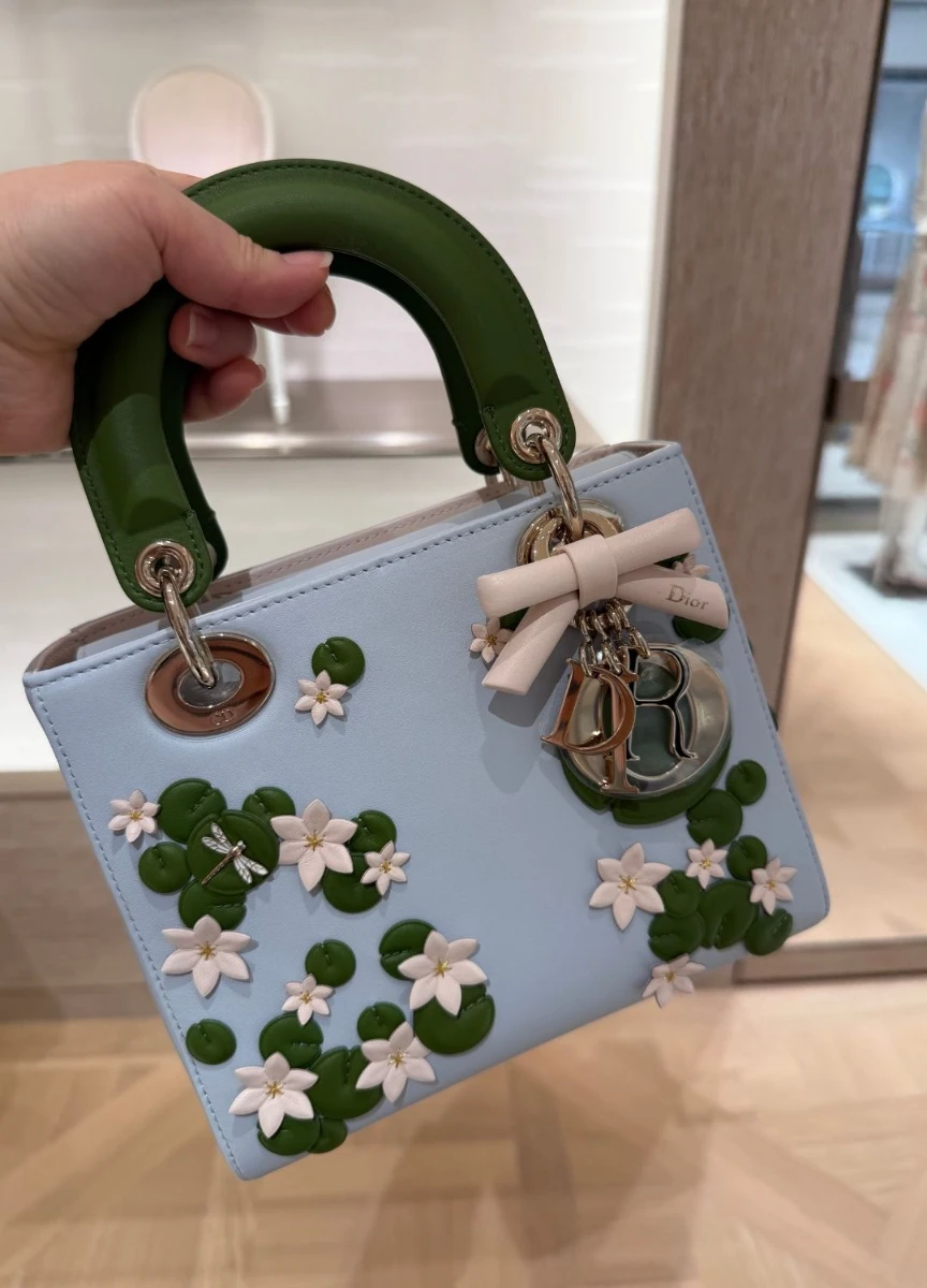
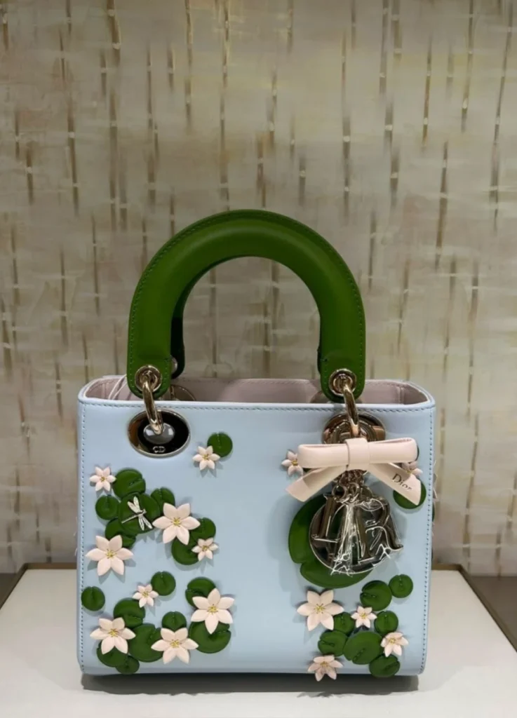
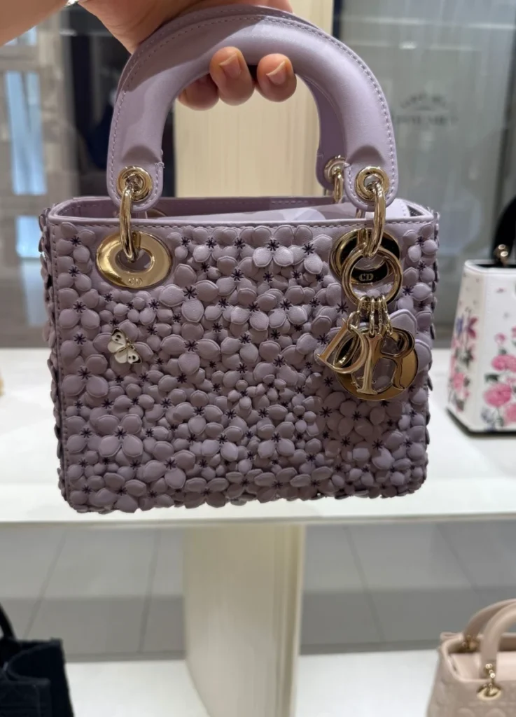
The light blue version places green pads and small white blossoms across pale blue calfskin, with a good deal of the ground left open. Because the background survives, each pad and flower registers as an individual object, and the bag’s original structure stays intact. A section of pond has been brought into the frame, and the Lady Dior remains a canvas.
The light blue bag paints a pond.
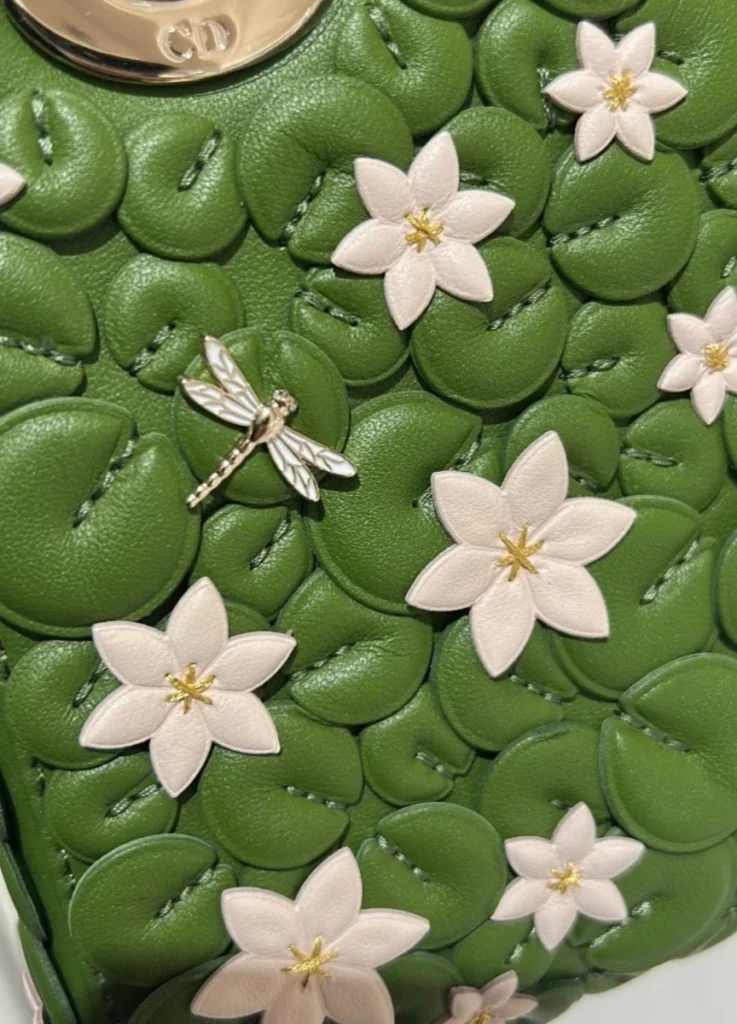
The green version pushes considerably further. Pads in closely related greens overlap across the entire front with almost no gaps, and small white flowers and a dragonfly appear at intervals between them. The leather that should function as background has effectively vanished, so the hierarchy between surface and ornament collapses. The pads no longer sit on the bag. The pads have become the bag’s surface.
This is also why the cannage barely appears on the season’s bags. The Lady Dior’s identity has rested for a long time on that lattice — a geometry strong enough that it usually registers before color or material does. Here an organic repetition of lily pads covers it over, and the bag no longer announces its structure first. That’s the reason green on green scanned as water rather than as quilting when I picked it up.
The difference suggests something beyond applying new decoration to an existing icon. It suggests an attempt to replace one of the house’s established surface languages.
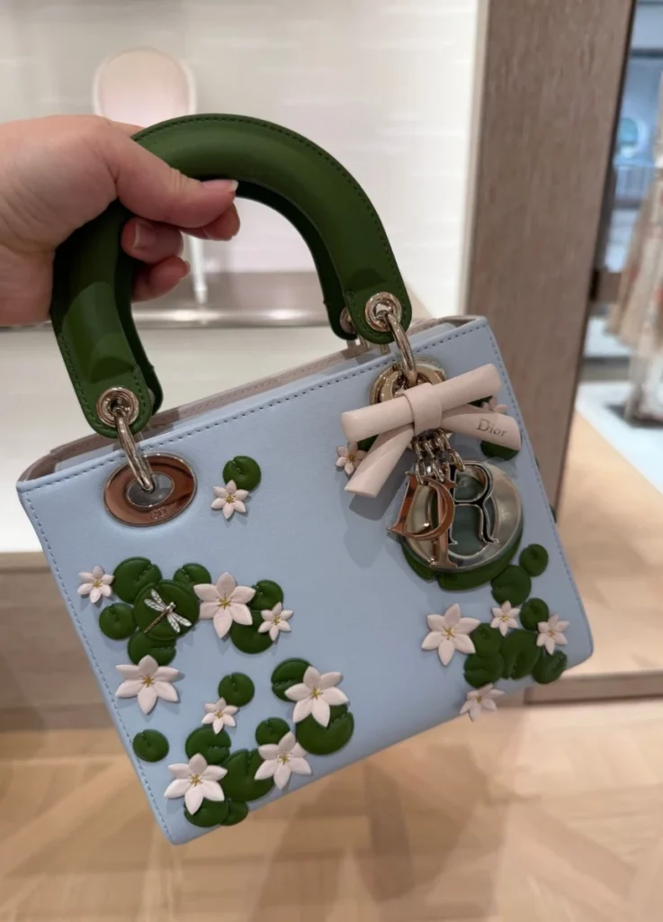
On both lily bags the dragonfly works as a small naturalistic detail and as a frankly artificial element at once — a metal insect resting on leather lilies and leather pads. Every material used to assemble a living scene is thoroughly manufactured: leather, thread, metal.
There’s a point where the precision of the imitation becomes more lavish than the thing imitated.
Book Tote — weaving the pond instead of sculpting it
Move to the Book Tote and the same landscape acquires an entirely different craft language. The Lady Dior builds pads and flowers as separate leather pieces and layers them; the Book Tote renders the same pond through the density of embroidery. Changing the material moves the method of representation from something like sculpture toward something like painting or weaving.
The light blue Book Tote makes this clearest. Pads and flowers scatter fairly loosely across pale blue canvas, with the oval Dior frame at the center, a bow embroidered around it, and dragonflies positioned so they seem to drift toward the gussets rather than anchoring the front. Space is left between the elements, so the bag comes across as a landscape painting in the same way the light blue Lady Dior does.
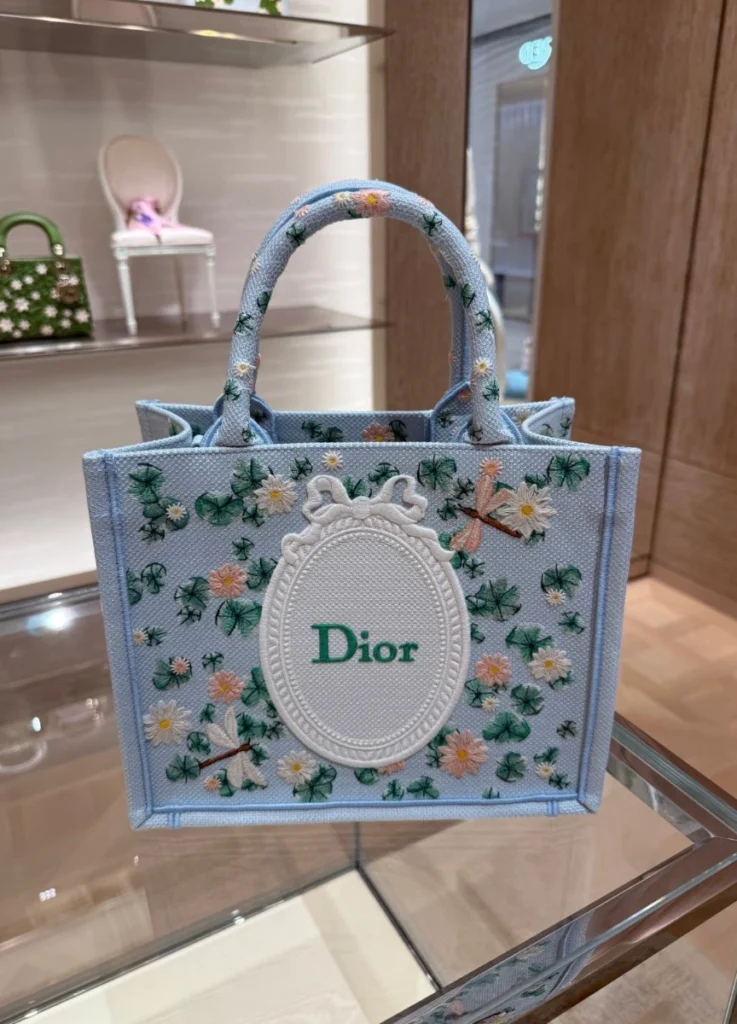
Recall that the Orangerie sits at the end of the Tuileries, and the bag starts to feel like a piece of that painting having drifted into the actual garden and been transferred into thread.
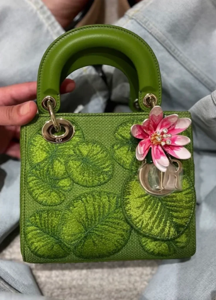
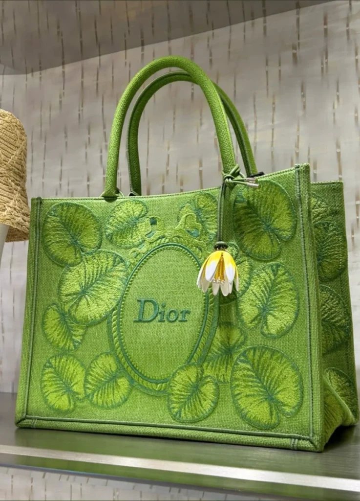
The green Book Tote covers its front almost entirely in tone-on-tone lily pad embroidery. Pads worked in different greens overlap to build the depth of a water surface, and even the central oval frame appears submerged among them rather than applied on top.
Look closely, though, and the lily flowers aren’t on the surface at all.
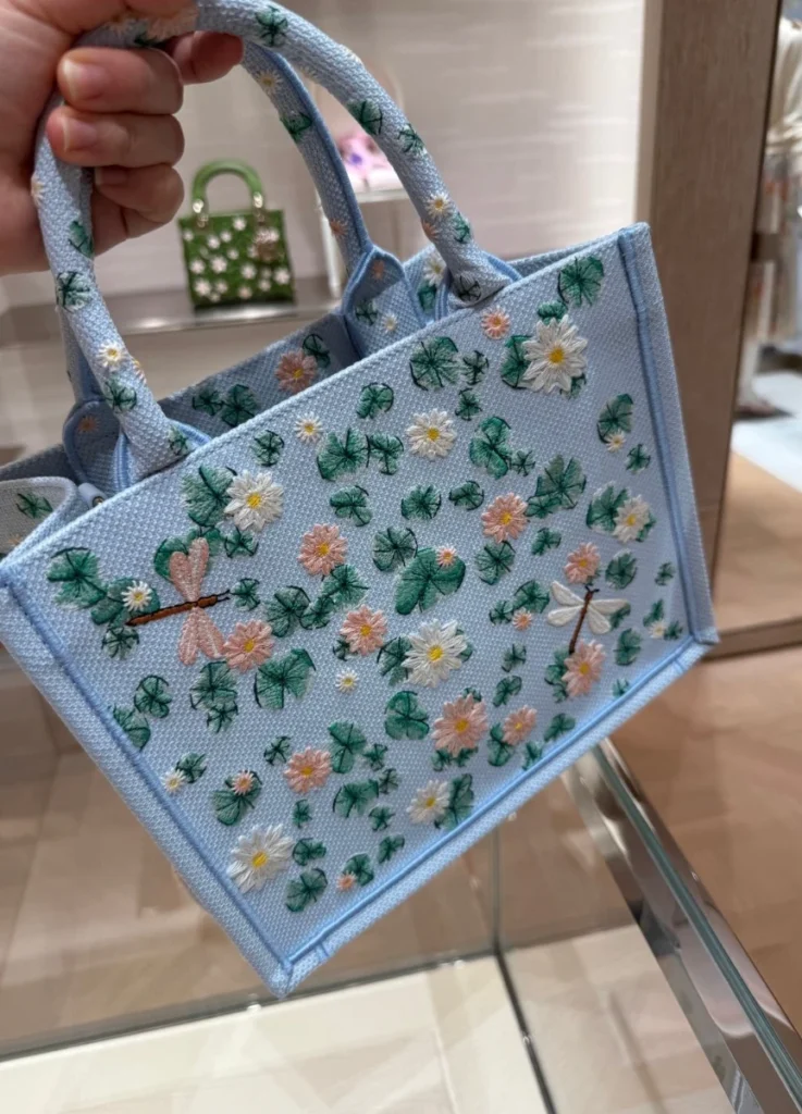
The white blossoms that sat among the pads on the Lady Dior have left the bag on this one. They hang from the handle as a dimensional charm with a yellow center and white petals.
That may be the single best illustration of the entire lily series. On the light blue Lady Dior, the flower sits on the water. On the green Lady Dior, the flower is planted into it. And on the green Book Tote, once the water occupies the whole bag, the flower separates from the surface and becomes an object.
The motif hasn’t simply been repeated across three bags. The relationship between surface and object has been varied in three stages. Once the surface of the green Book Tote converts fully into a pond, there’s no longer any need to attach a flower to it. The flower stops being a component of the picture and turns into a separate physical thing that has come out of the water.
The surface became a pond, so the flower stepped off it and became an object.
If I had to name the most conceptually complete piece in the lily series, I’d take the green Book Tote over the Lady Dior. The three-dimensional leatherwork draws a faster and more spectacular reaction, but the theme Anderson worked this season — the conversion of a surface — is pushed furthest on the tote.
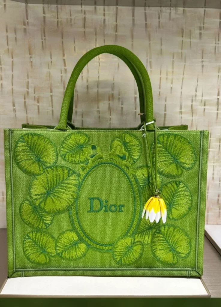
@shopersonall / Instagram
Across from the water lilies, the dots
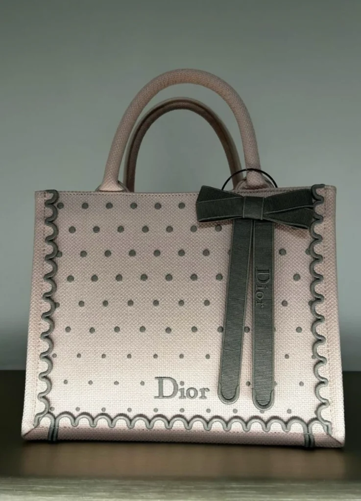
Spend enough time in the boutique and it becomes clear the season can’t be explained by lilies alone. Another language repeats across the Lady Dior, the Saddle, the Book Tote, the shoes, and the ready-to-wear: dots, scallops, ribbons.
Built mainly around pink and black, this line evokes nothing natural. It’s far more garment-like, far more archival, and decorative to the point of recalling doll clothing.
Dior describes the dots, scalloped edges, and bow details as a contemporary interpretation of dress details from the archive. The repetition of flat dots and rounded scallops carries an audible rococo femininity, though Anderson stops short of letting it look strictly historical. Familiar pink and black, regular intervals between the dots, ribbons finished a little too neatly — the result leans toward a slightly artificial prettiness instead.
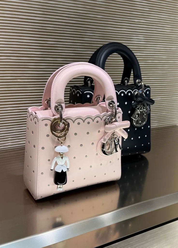
The white scallop running along the top edge of the black Lady Dior isn’t a printed graphic. The leather edge itself has been shaped. The dots gain physical presence on the surface rather than remaining flat pattern.
So the lilies and the dots share a question while starting from opposite places. If the lily line experiments with converting nature into craft, the dot line experiments with converting a flat archival vocabulary into actual material.
And their origins sit exactly opposite one another.
The lilies came from a place, the garden. The dots came from a time, Dior’s own archive. One image entered from outside the house, the other was pulled from inside it.
That contrast is what makes the collection interesting to interpret. Anderson erases nothing to build a new Dior, and leans on the archive no more than he leans away from it. The pond at the Tuileries and an old Dior dress become present-tense surfaces within the same season, by different routes.
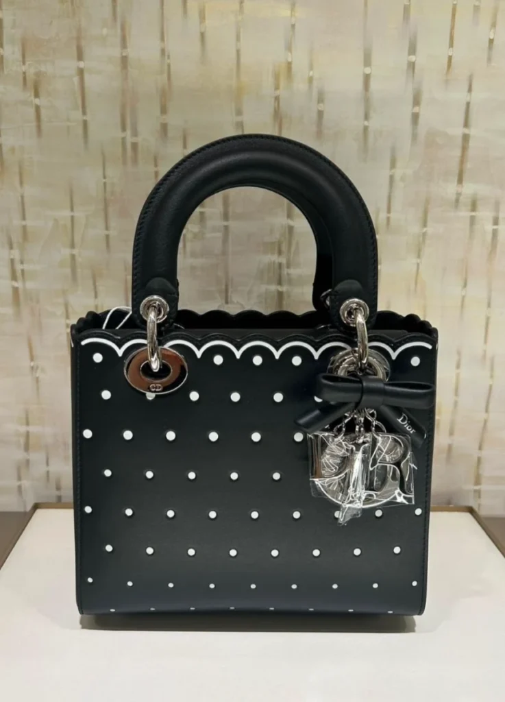
@shopersonall / Instagram
From a collector’s position, the two lines do different work
Back at the level of objects, the difference between the axes turns practical.
The lily line is where the season’s narrative lives. The 3D floral Lady Dior in particular involves genuinely complex construction, and the dimensionality built by layered leather appliqué is far stronger in person than in photographs. As a single object it carries real presence, and it’s the design most likely to come to mind years from now when Dior Winter 2026 gets recalled.
The trade-offs are real, though. Those pads and petals project off the surface, which leaves them vulnerable to friction, and thin points like petal tips need more care than ordinary calfskin. The light blue colorway is comparatively sensitive to color transfer and soiling. Enjoying the design fully means thinking about what it rubs against and how it’s stored, which places this line closer to a collector’s piece kept for a season than a Lady Dior in regular rotation.
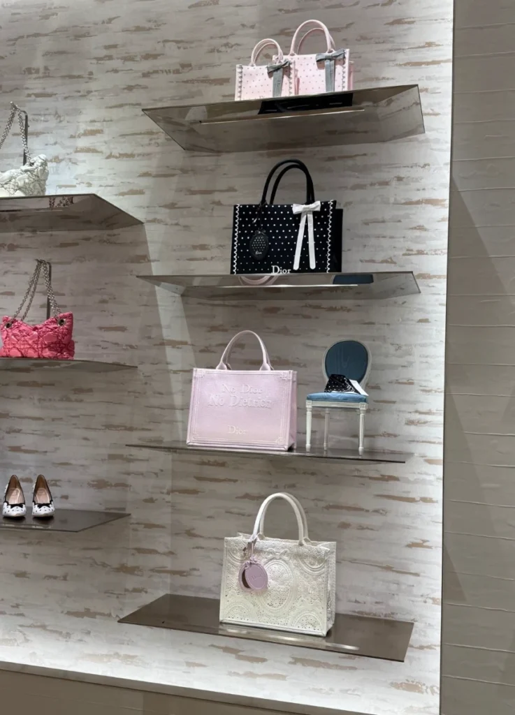
The Book Tote brings the same world into more realistic terms. Canvas and embroidery are more forgiving to maintain than three-dimensional leather appliqué, and the bag’s capacity and purpose are unambiguous. The green Book Tote in particular manages the best balance — the highest conceptual resolution in the lily line, while remaining genuinely usable.
The dot line sits somewhere else again. Black and pink both combine easily with a basic wardrobe, and without large dimensional ornament they’re considerably simpler to work into rotation. They may not carry the season’s story as forcefully, but they’re the ones most likely to see actual wear.
The lilies hold the narrative and the dots hold the wardrobe. Personally I’m drawn to the lilies, and I suspect it’s the literary depth underneath them doing the pulling.
@closetstyledbyme_ / Instagram
Where Anderson’s Dior stands now
Anderson has spoken about how easily a house like Dior can be weighed down by its own history, and about the need to release itself from that weight. This collection gave the remark a fairly concrete shape.
He neither restores Dior’s past intact nor forces an unrelated aesthetic onto it. Instead he mixes existing house codes with images brought in from outside, and redesigns the surfaces of familiar objects along entirely different lines.
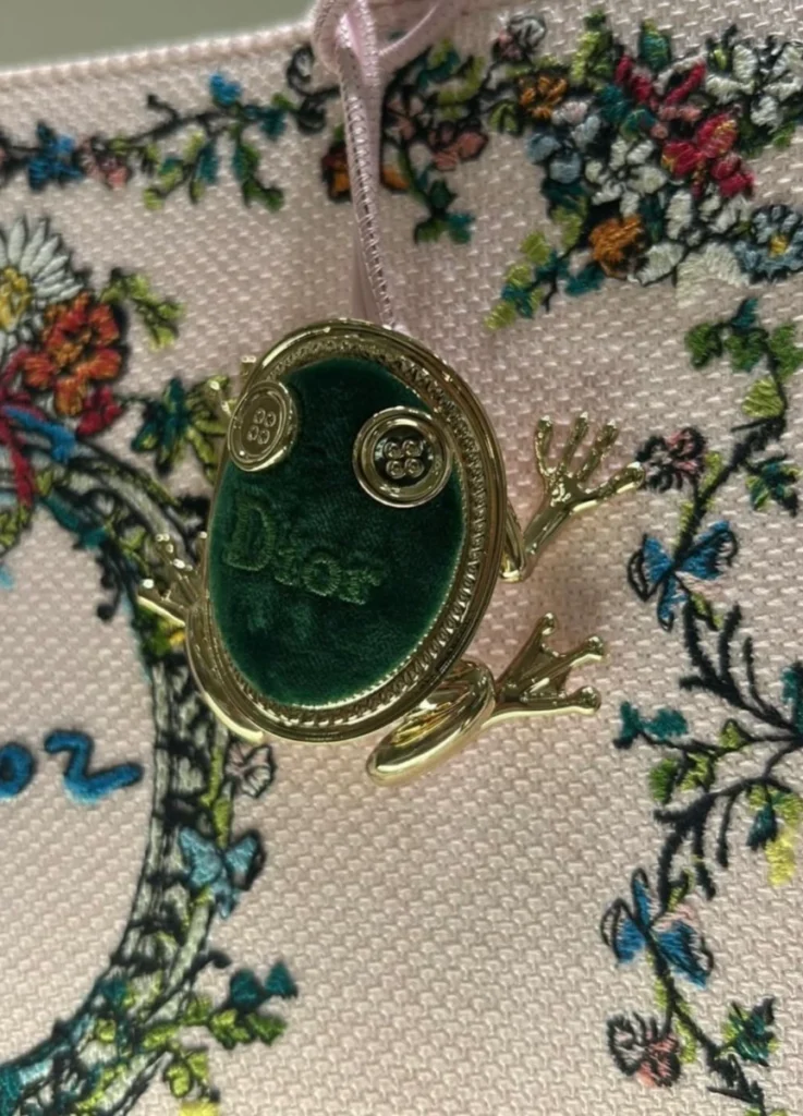
The more surreal accessories — the frog minaudière, the peanut-shaped bags — appear to strengthen this rather than undercut it. If the garden was an artificial stage from the beginning, a frog inside it isn’t a creature of nature but an ornament of the garden. Once the lilies have become leather and the dragonfly metal, a frog becoming a metal minaudière belongs on the same continuum.
That kind of humor has long been Anderson’s territory. What stays with me most, though, is that he described this collection in terms of daywear and a wardrobe.
Clothes for living in and a frog-shaped bag inside the same collection — the contradiction describes his Dior well. He gives up nothing in practicality while declining the idea that fashion owes any obligation to follow reality.
@closetstyledbyme_ / Instagram
What appears once the flowers are gone
Flowers arrive first when you look at this season. Lilies, pads, dragonflies, a garden.
Look at the products at the boutique and then return to the show space, and a different picture assembles. On the Lady Dior the cannage disappears under lily pads. On the Book Tote the canvas turns into a water surface, and the flower finally detaches and becomes a charm. On the other side, the dots start from a flat archival ornament and convert into an actual scalloped leather edge. Two completely different images, arriving at the same destination — how far can a surface become something else?
Anderson didn’t place a garden onto a bag. He rebuilt one that never existed, something more precisely real than reality, and what this season put in the boutique isn’t flowers. It’s the technique of persuading you that a surface is something else. The object of that technique was a pond that was never real to begin with.
All images unless otherwise credited: © Lumie Story
[ Related Editorials ]