
A watch is never just a timekeeping device.
On the wrist, it becomes structure. Balance. Sometimes even a boundary.
Some wrists carry weight effortlessly.
Others are defined by line, flow, and restraint.
The reason Jennie Kim is almost exclusively seen wearing the Chanel Première—and has never been publicly documented wearing the J12—begins here.
Not with styling.
But with anatomy.
Observation, Not Preference
Jennie is one of Chanel’s most visible global ambassadors.
Across runway attendance, editorials, campaigns, and candid public appearances, her watch choice is remarkably consistent.
Première appears repeatedly.
J12 does not.
This absence is not anecdotal. It is observable.
And in fashion analysis, what does not appear—when every opportunity exists—is often more revealing than what does.

Wrist Structure as the Starting Point
Jennie’s wrist is slim, elongated, and softly contoured.
Crucially, the wrist bone does not protrude sharply, and the transition from wrist to hand is fluid rather than angular.
This type of wrist responds best to linear designs—watches that behave like extensions of the body rather than objects placed upon it.
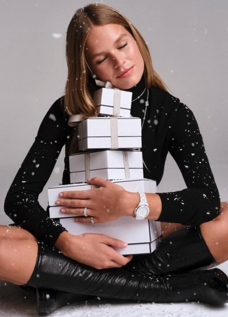
The Première, with its rectangular case and chain-integrated bracelet, follows the wrist’s natural curve.
It settles into the line instead of interrupting it.
On Jennie’s wrist, the watch does not sit.
It dissolves.

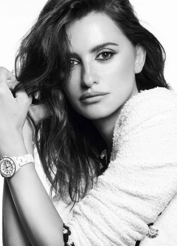
Why the J12 Requires a Different Wrist
The J12 speaks a completely different structural language.
Its round ceramic case, material density, and visual weight create presence through volume.
It is not a watch that follows the wrist—it anchors it.
For the J12 to feel balanced, the wrist must provide resistance:
- A clearly defined wrist bone
- A flatter wrist plane when viewed from above
- Enough width to absorb the case’s mass
Without that counterbalance, the watch risks appearing dominant rather than integrated.
This is why the J12 tends to work best on wrists with structural clarity rather than fluid delicacy.
The Advertising Illusion: Tweed and Ceramic
Chanel often styles the J12 with tweed jackets, pearls, and feminine silhouettes in campaigns.
Visually, this suggests continuity with classic Chanel codes.
Structurally, however, the pairing is more complex.
Tweed is irregular, textural, and soft-edged.
High-gloss ceramic is smooth, reflective, and rigid.
Unless the wearer’s wrist provides enough structural grounding, these materials can compete rather than converse.
In real-life wear—not editorial framing—the J12 reveals itself as a structural watch, not a decorative one.

Première vs J12 — Structural Compatibility
| Element | Première | J12 |
|---|---|---|
| Wrist type | Slim, fluid, softly contoured | Defined, flat, structurally firm |
| Visual language | Line-based, integrated | Volume-based, anchored |
| Wearing effect | “Melted into the wrist” | “Established as a center” |
| Best styling | Layered, nuanced, feminine | Minimal, architectural, decisive |
| Role | Ornament-as-structure | Tool-as-structure |
Size Matters: J12 by Dimension
Even within the J12 line, proportion is critical.
- 33mm
Suitable for slim wrists only if bone structure is clear and flat. Otherwise, it may feel visually detached. - 38mm
Ideal for balanced, medium-width wrists. This is where the J12’s design logic stabilizes. - 41mm
Requires a broad, confident wrist. Here, the watch becomes an intentional statement.
The issue is never gender.
It is geometry.
Conclusion: Watches Choose Their Wrists
Jennie does not avoid the J12 because of styling preference.
She avoids it—consciously or not—because her wrist speaks a different language.
Her wrist favors flow over mass.
Line over volume.
The Première listens.
The J12 demands.
A watch does not complete a look simply by belonging to the same house.
It completes a look when its structure aligns with the body wearing it.
And that alignment always begins—not with taste—but with anatomy.

※ Images’ source: @chanelofficial / Instagram
[ Related Editorials ]