
On proportion, restraint, and the watch I keep returning to

@jennierubyjane / Instagram
The Patek Philippe Golden Ellipse has returned to broader circulation following a public sighting on Jennie of Blackpink. That kind of visibility usually reframes a luxury object as a trend. The Golden Ellipse resists that reframing.
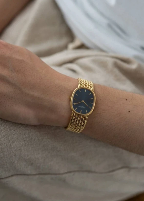
The watch she wore is one I’ve been quietly tracking for a long time — a vintage yellow gold case with a deep blue dial, the most restrained configuration the line ever produced. It doesn’t announce itself. It works through proportion, balance, and a specific quality of light that doesn’t read in photographs.
Patek calls the design a meeting of art and mathematics. I’d put it differently. It’s a watch that stays in the memory longer than it stays in the room.
Why the Vintage Configuration Matters
Introduced in 1968, the Golden Ellipse occupies a specific position in Patek’s portfolio: not round, not rectangular, neither ornamental nor overtly technical. It exists to be balanced.
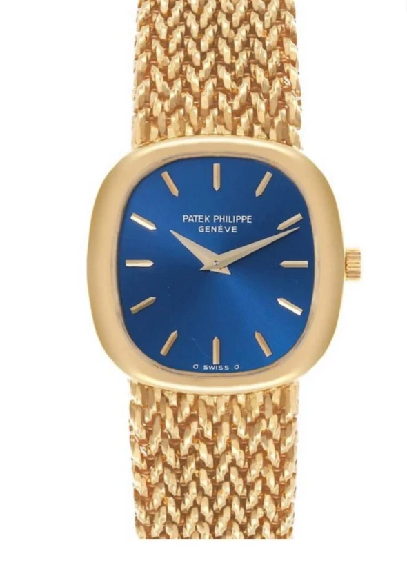
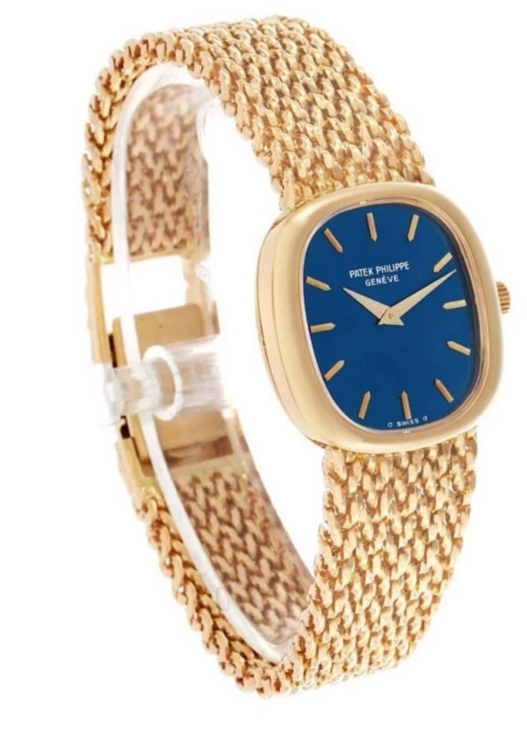
The model that resurfaced through Jennie’s wear appears to be the discontinued women’s vintage reference 4223J. It was produced in limited quantities at the time of release, which makes it relatively uncommon on the secondary market. The combination — yellow gold case, oval profile, blue sunburst dial, ultra-thin case, no visible lugs — is the line at its quietest.
I keep returning to it for a structural reason. There aren’t many Patek references that work for slim wrists. This one does, and the reasons run beneath the surface.
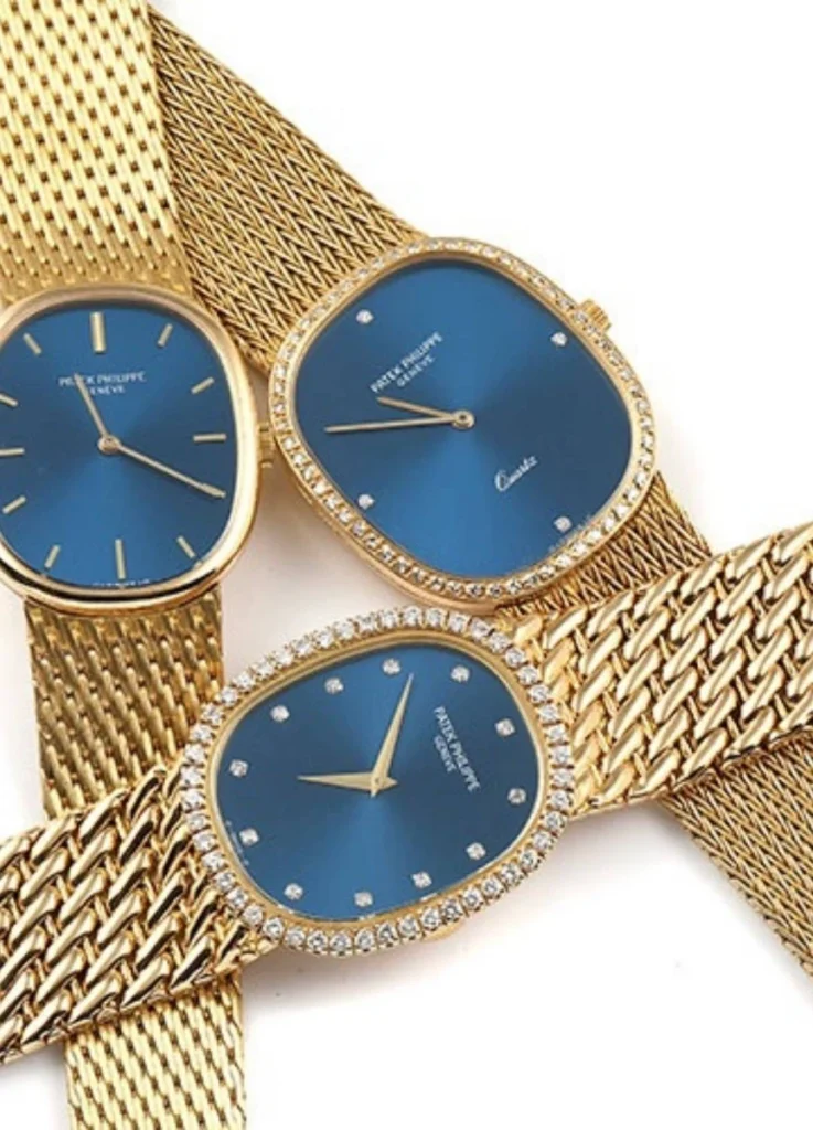
(Source: Swiiswatchexpo)
Why the Golden Ellipse Suits Slim Wrists
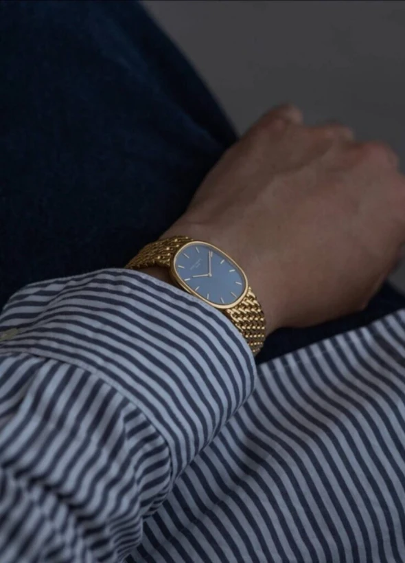
The case proportion. The elongated oval distributes visual weight horizontally rather than vertically. On a slim wrist, the round case tends to sit as a separate object on top of the bone structure. The oval doesn’t. It runs alongside the wrist’s own line and reads as continuous with it.
The lug treatment. There are no pronounced lugs. The case transitions directly into the strap, which means the watch never appears detached from the wrist or oversized at its edges — a common problem with smaller frames.
The thickness. Vintage models typically measure around 5.5 mm thick. That flat, jewelry-like profile sits close to the wrist and disappears under a cuff. It wears more like a slim bracelet than a watch.
The yellow gold itself. Patek’s yellow gold is notably subdued. It doesn’t throw sharp reflections; it leaves a soft residual glow — light that settles rather than sparkles. On a slim wrist, that restraint becomes a defining advantage. The brightness of a more aggressive yellow gold tends to overwhelm a smaller frame. This one doesn’t.
Even at the time of its release, this reference was produced in limited quantities, which makes it relatively uncommon on the secondary market today.
(Source: Swiiswatchexpo)
The model emerged during a period — roughly the 1980s through the early 1990s — when women’s watch design was shifting toward thinner, smaller proportions, with integrated bracelets gaining traction. Compared to the current Golden Ellipse production, the vintage reads as slimmer and sits more architecturally against the wrist. Closer fit, more fluid line.
Compared to the current Golden Ellipse references, it is slimmer and sits more architecturally against the wrist, offering a closer, more fluid fit.
(Source: Swiiswatchexpo)
Typical Vintage Specifications
| Component | Detail |
|---|---|
| Case size | Approx. 23 × 27 mm |
| Thickness | ~5.5 mm |
| Movement | Caliber 215, manual winding |
| Dial | Deep blue sunburst oval |
| Caseback | Solid |
| Bracelet/strap | Ultra-thin gold mesh or leather strap |
Specifications vary by production year, but the underlying philosophy stays consistent: minimum volume, maximum proportion. A full-gold watch like this benefits from leaving the opposite wrist unadorned. The watch doesn’t share visual gravity well.

and lighter skin tones particularly well.
When wearing a full gold watch of this nature, leaving the opposite wrist unadorned can create a more balanced overall impression.
@jennierubyjane / Instagram
Proportion, Negative Space, and Silence
Patek has described the Golden Ellipse as a meeting of art and mathematics — a reference to its golden ratio foundation, roughly 1:1.618. In practice, the proportion produces an effect that feels instinctively composed rather than overtly designed. The watch reads as resolved before the viewer can articulate why.
The bezel is unadorned. The dial avoids complication. Light gets absorbed and released gradually, without emphasis.
A small detail that matters more than it looks: the strap attachment points sit slightly lower than on most traditional dress watches. This lets the case follow the curvature of the wrist rather than perch on top of it. Comfort improves; visual cohesion improves more. For slimmer wrists especially, that lowered attachment is what makes the watch wrap rather than sit.
(source: Aribitro)
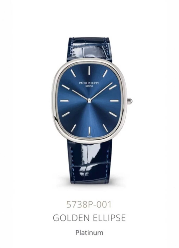
Vintage vs. Current Production
The renewed interest in vintage Golden Ellipse pieces sits in clear contrast with Patek’s current production references:
| Reference | Case Size | Material | Dial |
|---|---|---|---|
| 5738R | 34.5 × 39.5 mm | Rose Gold | Black enamel |
| 5738P | 34.5 × 39.5 mm | Platinum | Blue sunburst |
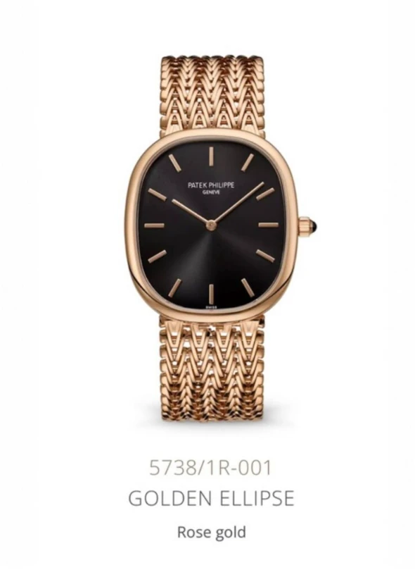
The contemporary references carry more formal presence and read better on larger wrists or under tailored attire. They are, by design, dress watches built for unmistakable scale. The movement is automatic; the proportions are larger; the architecture asserts itself rather than receding.
Access is also a separate question. Current production sits behind Patek’s purchase-history policies, which makes entry inherently selective and rarely a same-day decision.
For wearers with slim wrists, the vintage references frequently offer a more proportionate — and arguably more coherent — interpretation of the original Golden Ellipse concept. The vintage isn’t a smaller version of the current model. It’s a different reading of the same design idea, one that happens to fit a specific wrist structure better.
A Note on Aftermarket Diamond Settings
Some vintage Golden Ellipse pieces appear on the market with aftermarket diamond settings on the bezel. From a structural and archival standpoint, this is generally worth avoiding.
The watch’s aesthetic lives in negative space. Layering stones onto a bezel built around the golden ratio compromises the proportion the design depends on. Aftermarket modification also affects long-term value and can limit official Patek servicing options. For long-term ownership, the original unmodified configuration is the more stable choice.
The Blue Dial: Depth That Reveals Itself in Light
The blue dial used in many Golden Ellipse models deserves its own attention. This isn’t conventional navy or charcoal. Indoors, the dial reads almost black. Under natural light, the sunburst pattern reveals layered depth — the blue density shifts depending on the angle of the light and the angle of the wrist.
Some collectors call it a watch that needs light to come alive. That’s accurate.
When this dial meets yellow or rose gold, the temperature contrast holds: cool depth against warm structure. The effect is subtle, resolved, and durable. It also reads particularly well against fair, cool-toned skin — the dial’s blue depth and the gold’s warmth produce a balance the wrist alone can’t generate.
For wearers who respond more to dial depth than to bezel ornament, this is the kind of watch that earns long-term attachment.

A Watch Defined by Restraint
The Patek Philippe Golden Ellipse isn’t built to announce ownership. It operates through proportion rather than presence, balance rather than scale.
In a market dominated by size, complication, and visibility, the Golden Ellipse offers a different logic: a watch that holds its place quietly and rewards the wearer who understands proportion. It belongs less to the category of trend object and more to the category of enduring form — one that becomes clearer not when seen, but when worn.
I don’t own this watch yet. That may be why it stays in mind so persistently. A line that has felt familiar for a long time, attached to a name that isn’t easy to approach.
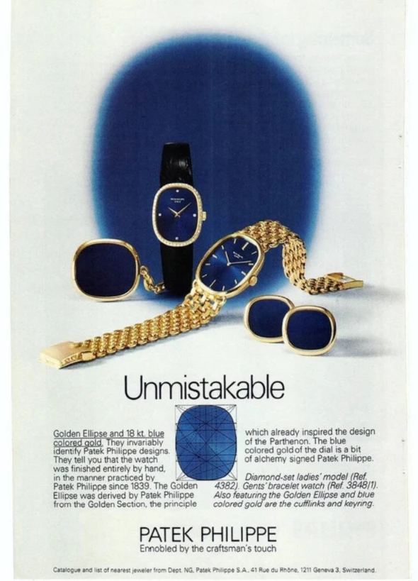
The blue dial holds something close to a spiritual register; the yellow gold above it catches light like a small ritual. When the two meet, the result isn’t loud. It also isn’t dim. It’s the kind of structure that only feels complete on a wrist that recognizes proportion — and waits, quietly, for the right season.
Featured Image via tv report
[ Related Editorials ]