
Reading Chanel’s two foundational watches through wrist anatomy, material density, and the structural reasons one watch settles where another asserts

@chanelofficial / Instagram
A watch is never just a timekeeping device. On the wrist, it becomes structure. Balance. Sometimes a boundary.
Some wrists carry weight effortlessly. Others are defined by line, flow, and restraint. The choice between Chanel’s two foundational timepieces — the Première and the J12 — sits more precisely at this anatomical level than the marketing language typically acknowledges.
The two watches share the maison’s name, the maison’s ateliers in La Chaux-de-Fonds, and the maison’s design vocabulary. They speak almost completely different languages on the wrist. Understanding why begins not with styling preference, but with structural compatibility.
@chanelofficial / Instagram
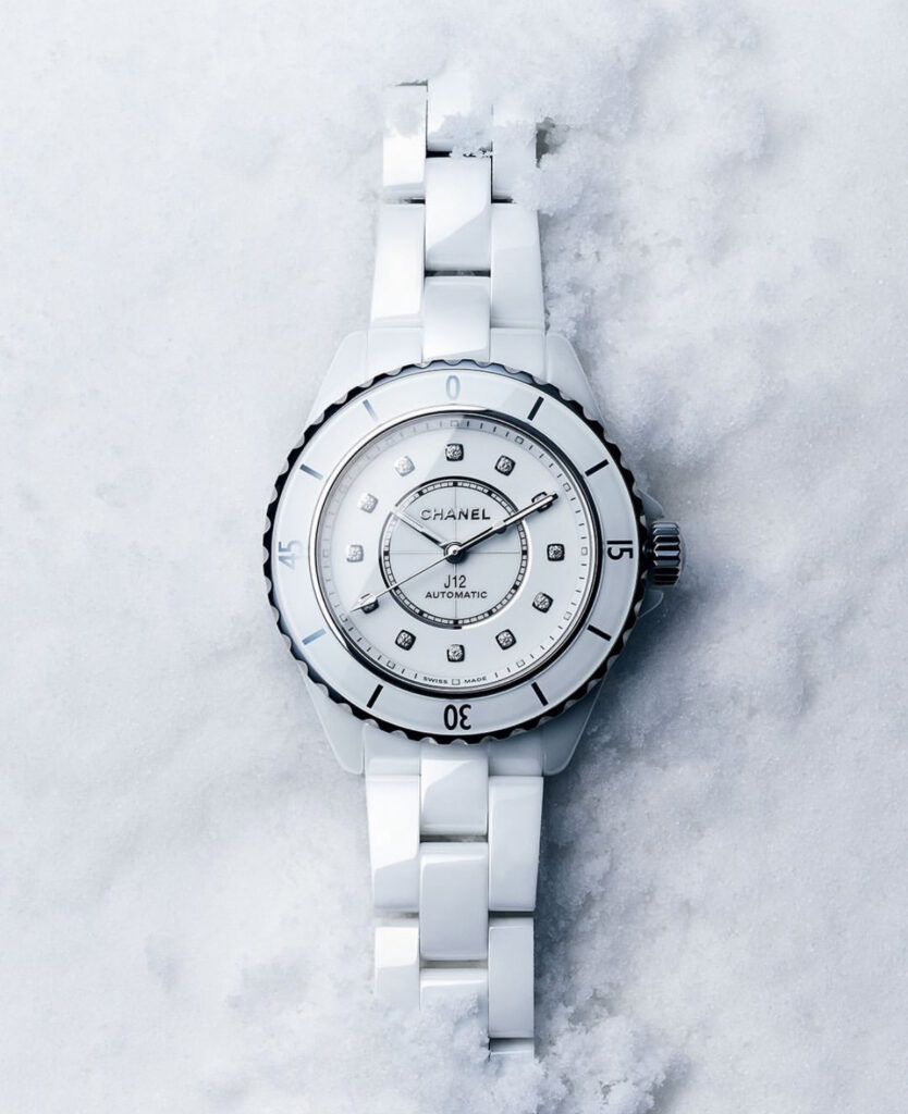
Two Foundations — Première (1987) and J12 (1999)
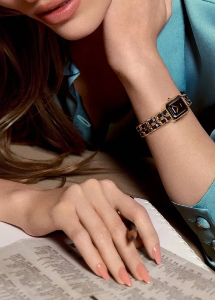
Chanel entered the horology world with the Première in 1987 — an octagonal-case cocktail watch designed by Jacques Hélleu, who had served as the maison’s artistic director for nearly three decades by that point. The case shape referenced the cap of the Chanel No. 5 perfume bottle, itself drawn from Place Vendôme’s octagonal geometry. The integrated chain bracelet — gold-toned chain woven through black leather — translated the maison’s quilted-bag hardware vocabulary into wrist-worn form. Première positioned Chanel as a fashion house with horological seriousness, and the watch became the maison’s foundational timepiece.
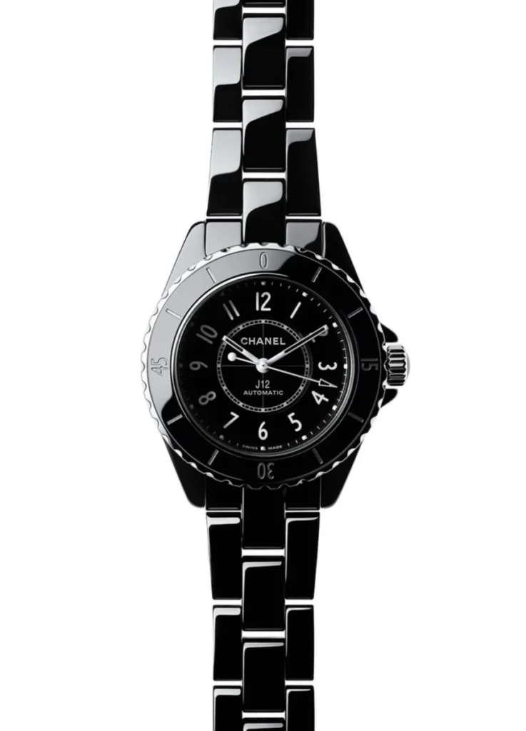
Twelve years later, also under Hélleu’s direction, Chanel released the J12 in ceramic — a watch that Arnaud Chastaingt, who became director of Chanel’s Watchmaking Creation Studio in 2013, has called the first revolution of the watch world in the 21st century. The J12 introduced high-tech ceramic to mainstream luxury watchmaking, defied conventional gender categories with its unisex sizing, and established Chanel as a serious watchmaker rather than a fashion house with watches as accessories.
The two watches share the maison but solve different problems. The Première is a fine jewelry watch with timekeeping function. The J12 is a serious mechanical watch with fashion-house provenance. The Première is shaped by silhouette and proportion; the J12 is shaped by material and geometry. Neither approach is correct in isolation. Each speaks to a specific kind of wrist.

@chanelofficial / Instagram
The Public Pattern — A Visible Preference
One of Chanel’s most globally visible ambassadors, Jennie Kim, has appeared in Première watches across runway attendance, editorial photography, brand campaigns, and candid public appearances with remarkable consistency. The J12 has been notably absent from her public watch rotation despite her continuous Chanel partnership.
The pattern is observable rather than inferred. Across years of public Chanel appearances, the Première shows up repeatedly. The J12 doesn’t. In fashion analysis, what doesn’t appear when every opportunity exists is often more revealing than what does.
The reason isn’t styling preference, marketing direction, or campaign strategy. It’s structural compatibility — the relationship between watch architecture and the specific anatomy of the wrist wearing it.

@chanelofficial / Instagram
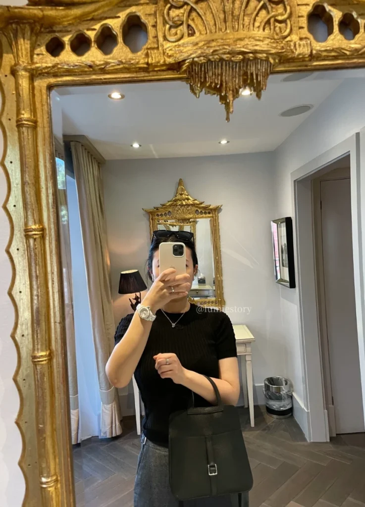
Wrist Structure as the Starting Point
The Première suits a specific kind of wrist: slim, elongated, softly contoured. The wrist bone doesn’t protrude sharply, and the transition from wrist to hand reads as fluid rather than angular.
For wrists with this profile, linear designs work best. Watches that behave like extensions of the body rather than objects placed on top of it. The Première — with its rectangular case and integrated chain bracelet — follows the wrist’s natural curve. It settles into the line instead of interrupting it.
On wrists of this type, the watch doesn’t sit. It dissolves.
The chain hardware itself contributes to this effect. The bracelet’s interlocking links shift slightly with wrist movement, creating a continuous textural surface that integrates with the skin rather than imposing upon it. The rectangular case sits low and follows the wrist’s vertical line. The total visual weight of the watch reads as ornamental punctuation rather than as a separate sculptural object.

@chanelofficial / Instagram
Why the J12 Requires a Different Wrist
The J12 speaks an entirely different structural language.
Its round ceramic case, material density, and visual weight create presence through volume. The watch doesn’t follow the wrist — it anchors it. For the J12 to feel balanced rather than dominant, the wrist must provide structural resistance.
Three anatomical conditions support the J12’s design logic:
A clearly defined wrist bone, visible from above the wrist plane.
A flatter wrist plane when viewed in profile, providing surface area for the watch case to occupy without distortion.
Enough wrist width to absorb the case’s mass without the watch reading as out of proportion.
Without those counterbalancing structural features, the watch can register as dominant rather than integrated. The ceramic catches light. The bezel projects outward. The case depth pushes upward from the wrist plane. All of these become assets when the wrist holds them and liabilities when the wrist doesn’t.
The J12 works best on wrists with structural clarity rather than fluid delicacy.

@chanelofficial / Instagram
The Advertising Illusion — Tweed and Ceramic
Chanel often styles the J12 with tweed jackets, pearls, and feminine silhouettes in its advertising. The visual continuity with classic Chanel codes is intentional — the maison wants the J12 to read as part of its broader feminine vocabulary rather than as a departure from it.
Structurally, the pairing is more complicated than the campaigns suggest.
Tweed is irregular, textural, soft-edged. High-gloss ceramic is smooth, reflective, rigid. The two materials share Chanel’s brand DNA but use opposite material grammars. Unless the wearer’s wrist provides enough structural grounding, the materials can compete rather than converse.
The pairing that works most naturally for the J12 isn’t the editorial fantasy of tweed and ceramic. It’s the structural alignment of clean tailoring with the watch’s geometric clarity.
The looks where the J12 actually settles share three structural conditions. The silhouette is clean and direction-driven — sheath dresses, tailored trouser sets, architectural minimalism. The fabric is matte or carries clear gloss-vs-matte contrast — leather, technical fabrics, dry cotton. The styling positions the watch as the visual center rather than as one accessory among many. Jewelry layering is restrained or absent.
Outside editorial framing, the J12 reveals itself as a structural watch rather than a decorative one. It rewards wearers who treat it as the architectural center of a look rather than as an accent within a feminine ensemble.
@chanelofficial / Instagram
Première vs J12 — A Structural Comparison
The two watches occupy different positions in almost every meaningful design dimension.
The Première fits slim, fluid, softly contoured wrists. The J12 fits defined, flatter, structurally firm wrists. The Première’s visual language is line-based and integrated; the J12’s is volume-based and anchored. The Première melts into the wrist; the J12 establishes itself as the wrist’s center. The Première pairs with layered, nuanced, feminine styling; the J12 pairs with minimal, architectural, decisive looks. The Première reads as ornament-functioning-as-structure; the J12 reads as tool-functioning-as-structure.
These distinctions aren’t hierarchies. They’re answers to different questions. The Première is the watch for wearers who want their timepiece to extend their existing visual language. The J12 is the watch for wearers who want their timepiece to define the visual language around it.
| Element | Première | J12 |
|---|---|---|
| Wrist type | Slim, fluid, softly contoured | Defined, flat, structurally firm |
| Visual language | Line-based, integrated | Volume-based, anchored |
| Wearing effect | “Melted into the wrist” | “Established as a center” |
| Best styling | Layered, nuanced, feminine | Minimal, architectural, decisive |
| Role | Ornament-as-structure | Tool-as-structure |

@chanelofficial / Instagram
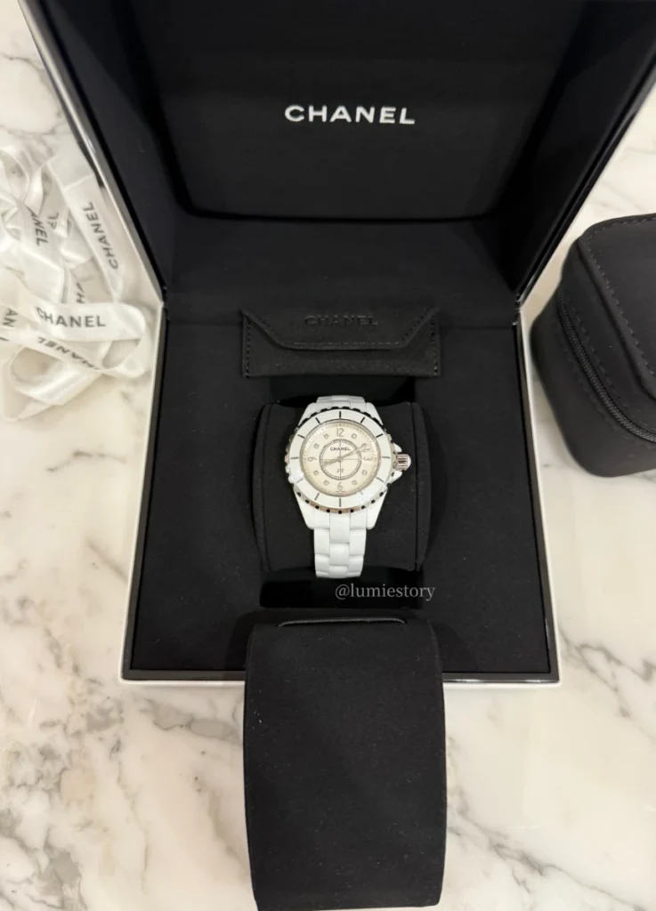
J12 by Size — Why Proportion Determines Compatibility
Even within the J12 line, proportion is critical. The collection currently offers three sizes, each calibrated to a different wrist register.
The 33mm J12, powered by the quartz Calibre 12.2, suits slim wrists only when the bone structure is clearly defined and the wrist plane stays flat from above. On wrists with rounder profiles or less prominent bone structure, the 33mm can feel visually detached from the rest of the wrist. I have child sized wrists, one PurseForum collector noted of her experience trying both sizes, and the 33mm is a perfect fit. The 38 was just too overwhelming for me. The 33mm rewards small but structurally clear wrists.
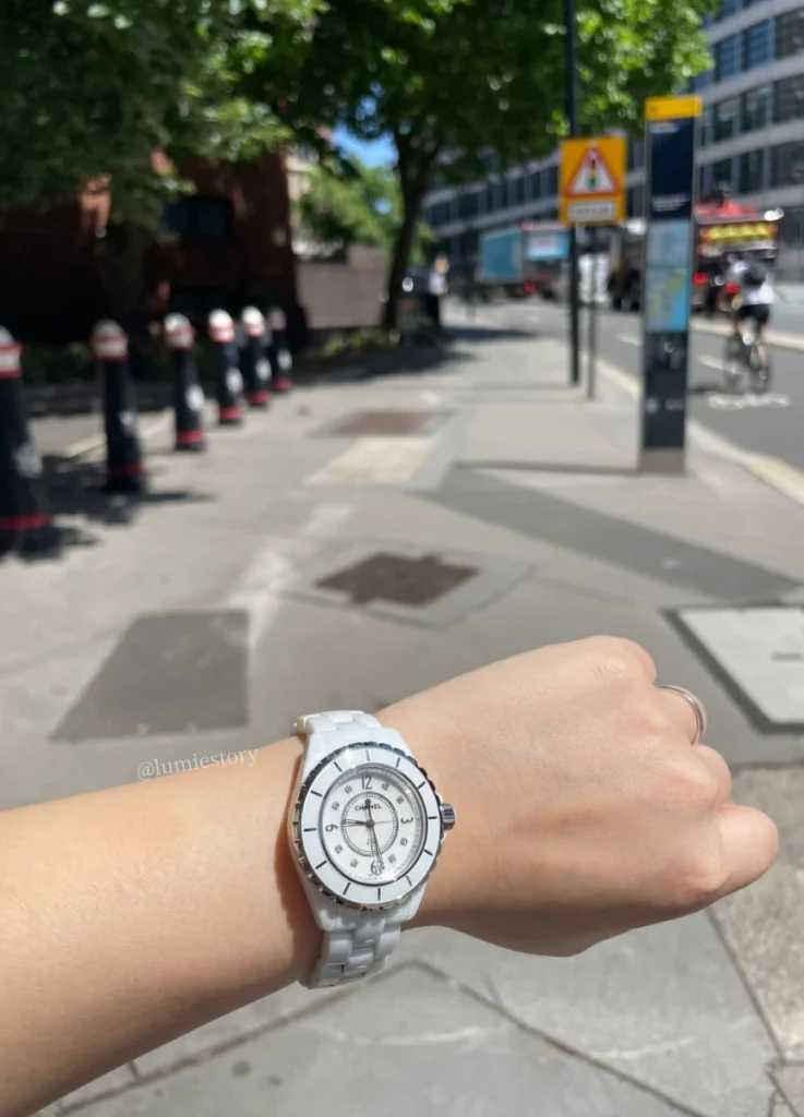
© Lumie Story
The 38mm J12, powered by the COSC-certified automatic Calibre 12.1 produced exclusively for Chanel by Kenissi, sits where the design’s logic stabilizes. Medium-width wrists with visible bone definition find the 38mm reads as a clear architectural object without overwhelming the wrist line. The 70-hour power reserve and Kenissi-built movement also position the 38mm as the J12’s most serious horological expression — the size at which the watch operates most coherently as a fine timepiece rather than as a fashion object.
The 41mm J12 requires a broad, structurally confident wrist. At this size, the watch becomes an intentional statement — closer to the masculine register of the original 1999 J12 design intent. Many female wearers will find the 41mm exceeds their wrist proportion. For wearers with broader wrists who specifically want the J12’s full architectural presence, this is where the watch operates.
The issue isn’t gender. It’s geometry. The J12 was designed by Hélleu to defy gender categories, and the structural logic of the watch follows that intent — sizing decisions track with wrist anatomy rather than with binary gender expectations.

@chanelofficial / Instagram
J12 Color and the Question of Skin Tone
The J12 launched in black ceramic, with white ceramic following shortly after. Both have remained the line’s foundational colorways, with limited editions in matte blue, pavé diamonds, sapphire crystal, and rose gold accents extending the palette.
The relationship between J12 ceramic color and skin tone is more nuanced than the marketing typically acknowledges. White ceramic settles most cleanly on fair to medium skin with cool to neutral undertones — the high-gloss surface of the ceramic carries the same dry, clarified register as the wearer’s skin. The white reads as composed clarity rather than as visual contrast.
Black ceramic operates in the opposite direction. The watch carries weight and absorbs light, which means it reads most powerfully on medium to deeper skin tones with neutral undertones. The contrast between black ceramic and skin shifts depending on undertone — warmer undertones can make the black read as too saturated against the wrist; cooler undertones allow the black to settle into the wrist’s existing visual register.
@chanelofficial / Instagram
Blue ceramic — the maison’s J12 Bleu line introduced more recently — sits between the two foundational colorways. The matte blue surface refracts light differently than the high-gloss black or white, producing a more atmospheric register that can work across a wider range of skin tones. For wearers attracted to the J12’s structural language but uncertain about black or white commitment, the blue offers a third path.
These are tendencies rather than fixed rules. The strongest determinant of compatibility remains wrist structure, not skin tone. But for collectors who have already confirmed that the J12 suits their wrist anatomy, color selection should track with skin undertone rather than with seasonal preference.
Première by Configuration — Subtle Variation Within a Single Logic
The Première’s range of configurations is broader than casual readers often realize. The Iconic Chain Watch (with the gold chain woven through leather) is the most recognizable. The Iconic Chain Triple Row extends the chain motif into a more substantial bracelet structure. The Double Row sits in between — chain-anchored but more restrained than the Triple Row. The Première Galon adds diamond accents on the gold-set bezel and bangle. The Ribbon and Necklace configurations push the watch into jewelry-piece territory.
Across these configurations, the structural logic remains consistent. The Première serves slim, fluid wrists. The variations differ in how much visual weight the watch carries within that compatibility window — from the most restrained Iconic Chain to the most elaborate Galon Diamonds.
For first-time Première collectors, Chanel’s official sizing guidance carries practical weight: if your measurement is between two sizes, choose the smaller size. The Iconic Chain Triple Row and Double Row both come in four sizes; the Iconic Chain comes in six. The smaller-side rule reflects the watch’s structural logic — the Première reads cleanest when it sits closely to the wrist rather than with significant gap.
© Lumie Story
Reading the Pattern Within the Cartier Comparison
The structural framework that separates the Première from the J12 isn’t unique to Chanel. The same logic appears in adjacent maisons. Cartier’s Tank — like the Première — serves slim, line-driven wrists with its rectangular case and integrated bracelet vocabulary. Cartier’s Santos — like the J12 — serves wrists with structural clarity through its squared case and exposed screw bezel. The maisons differ in heritage and price positioning, but the wrist-anatomy logic translates across them.
For collectors building a multi-piece watch wardrobe, the structural compatibility test should precede brand selection. A wearer whose wrist suits the Première will likely also suit the Tank, the slimmer Santos, the Cartier Panthère bracelet, and similar line-driven pieces across maisons. A wearer whose wrist suits the J12 will find the Santos, the Royal Oak, the Nautilus, and similar architectural pieces work in adjacent ways.
The wrist defines the category. The maison fills the category once the structural fit is established.
© Lumie Story
When Marketing Doesn’t Determine Fit
A practical observation for collectors approaching the J12 or the Première for the first time. The brand campaigns suggest specific aesthetic associations — the J12 with sleek, contemporary, slightly androgynous styling; the Première with romantic, layered, classically feminine looks. These associations are valuable for understanding the maison’s intent, but they’re misleading as guides for personal compatibility.
A wearer who fits the J12 campaign image may find the watch dominant or off-balance on her actual wrist. The wearer who connects with the Première’s romantic positioning may discover the watch reads as too delicate against her bone structure.
The boutique fitting matters more than the campaign image. For the J12 specifically, trying the watch in 33mm, 38mm, and 41mm sequentially reveals which size aligns with the wrist’s existing proportions. For the Première, trying the Iconic Chain alongside the Triple Row clarifies how much visual weight the wearer can carry comfortably. The watch that looks right on a campaign model isn’t necessarily the watch that settles right on the buyer’s wrist.

@chanelofficial / Instagram
Why Watches Choose Their Wrists
The pattern visible in Chanel ambassadors’ watch rotations isn’t preference. It’s compatibility. The Première suits slim, contoured, line-driven wrists. The J12 suits defined, flatter, architecturally clear wrists. When the wrist matches the watch, the timepiece dissolves into the body’s existing rhythm. When it doesn’t, the watch announces itself rather than integrates.
Her wrist favors flow over mass. Line over volume. The Première listens. The J12 demands.
A watch doesn’t complete a look simply by belonging to the same maison. It completes a look when its structure aligns with the body wearing it. That alignment begins not with taste, but with anatomy.
For collectors, the practical reading is direct. The brand identity matters less than the structural fit. Buy the watch your wrist actually carries, not the watch that occupies the cultural register you wish you operated within. The watch that settles into your wrist is the watch you’ll wear for years. The watch that announces itself against your wrist is the watch that ends up in the safe.
The Olsens at The Row build their clothing toward this same proposition. The Cartier Panthère bracelet operates by the same logic. Phoebe Philo’s Collection E translates it into ready-to-wear. What connects these references is structural compatibility over aesthetic aspiration — the discipline of choosing what fits the body rather than what fits the image.
A watch is a daily companion. It earns its place not through symbolism but through how it settles. The Première settles for some wrists. The J12 settles for others. Both are correct answers. The wrist decides which question is being asked.

@chanelofficial / Instagram
Featured Image via @chanelofficial / Instagram
[ Related Editorials ]