The name promises tropical paradise. What’s actually on the tray at the boutique is something quieter.
Van Cleef & Arpels released Fleurs de Hawaii at the start of summer 2025. Of the variations, aquamarine on white gold was the one that made the strongest impression on me — both for its visual clarity and for how naturally it pairs with cooler skin tones.
What follows is a piece-by-piece reading after wearing both the aquamarine and amethyst sets at the boutique, with notes on skin tone compatibility and what each variation left with me.
Inside Fleurs de Hawaii │ The Structural Approach
Unlike Alhambra or Frivole, which rely on symmetry and instantly recognisable motifs, Fleurs de Hawaii uses a petal-based, asymmetrical floral structure.
Each petal is shaped individually. The curves are intentionally uneven. Negative space carries weight in the overall form. The shape carries movement built in, not the flat emblem quality of more iconic motifs.
Viewed from the side, the pieces show subtle curvature and volume that aren’t immediately obvious head-on. The layered construction, combined with open spaces between petals, gives the stones room to interact with light without dominating it.
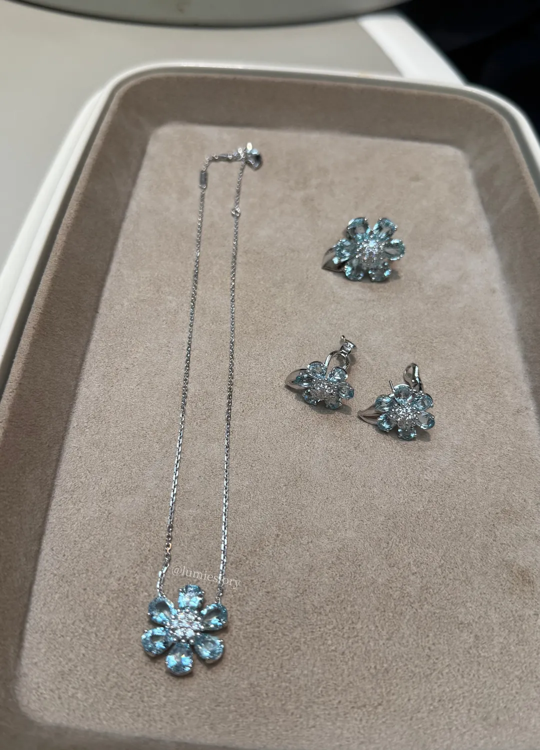
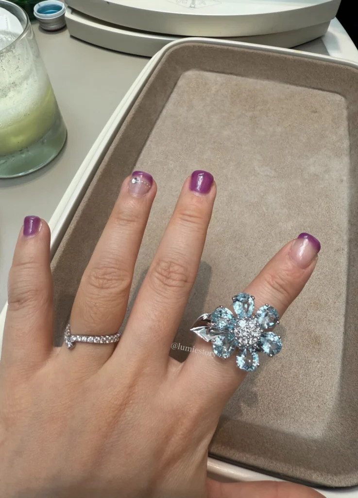
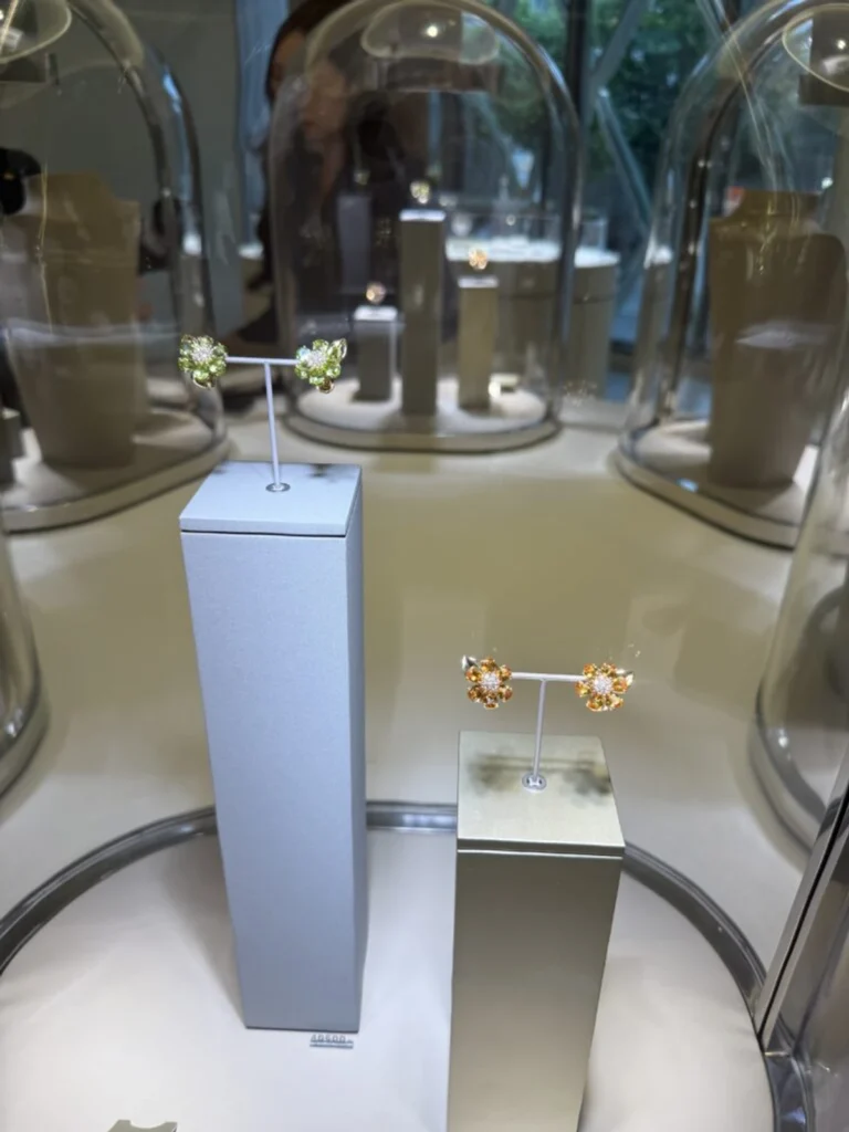
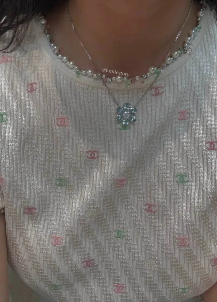
Aquamarine on White Gold │ The Defining Expression
Of the variations I tried at the boutique, aquamarine on white gold was the one that stayed with me most.
Gemologically, aquamarine carries clarity, cool saturation, and light-reflective transparency. Set in white gold, the metal lifts those qualities further.
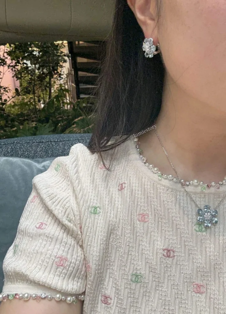
I tried on the aquamarine earrings and necklace. The effect was absorption. The colour settled into cooler skin tones, sinking in.
The scale held generous but controlled. The sparkle stayed present without sharpening, and the overall impression kept its calm even with movement.
Compared to Vintage Alhambra earrings, the Fleurs de Hawaii aquamarine pieces carry more visual presence but less symbolic weight. What you notice is the light, with Alhambra’s iconography stepping back.
Worth noting: the collection released at the start of summer, which played into aquamarine’s appeal.
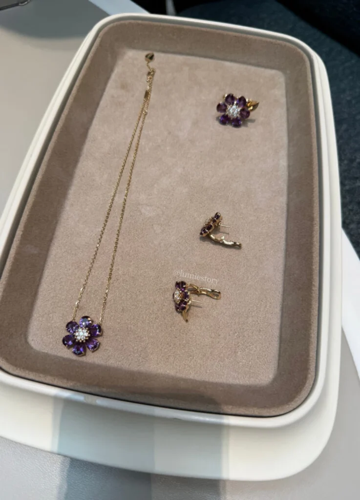
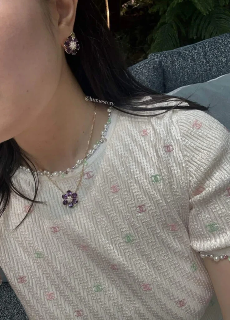
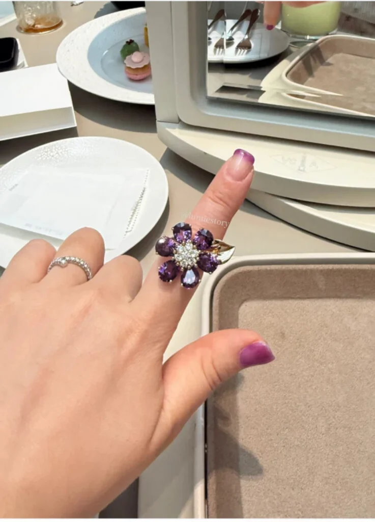
Amethyst on Yellow Gold │ An Unexpected Cool-Tone Match
In the yellow gold variation, amethyst takes the lead.
Purple gemstones often look more natural on warmer complexions. The amethyst Van Cleef chose for Fleurs de Hawaii avoids that constraint — it runs notably light-toned and transparent, without the heaviness deeper purples often carry.
I tried the necklace on, and the result was more adaptable than expected. The yellow gold chain didn’t fight my cooler skin tone because the stone’s clarity prevented colour conflict.
The amethyst variation arguably carries the collection’s most classical mood. Still, what stays with me afterward differs.
Where aquamarine settles in for longer, amethyst feels agreeable but resolves more quickly.
In personal terms, amethyst registers as “this works better than I expected”. Aquamarine reads as “this feels instinctively right”. The difference is subtle but meaningful.
Pricing also matters. Aquamarine pieces sit notably higher than their amethyst counterparts — the gap on earrings is the steepest, and necklace pricing widens too. Confirm exact figures at boutique level. This makes amethyst a practical alternative for someone wanting to strengthen a yellow gold jewelry wardrobe without leaving cooler palettes entirely.
Other Color Variations │ Expressive but Selective
The collection extends into citrine, peridot, and rhodolite, each with a different personality.
Citrine, in orange tones, brings radiant warmth that suits warmer complexions well. The visual impact is strong, but the colour saturation makes it less versatile for daily wear. Peridot’s green is fresh and a little unconventional. It can clash on cooler complexions. Rhodolite’s red is the most assertive of the variations; it suits wearers whose stylistic identity is already strong rather than those reaching for a neutral piece.
Across the variations, the most consistently wearable choices are aquamarine and amethyst — at least to my eye.
Skin Tone × Setting Match │ Quick Summary
| Skin Tone | Recommended Setting | Why |
|---|---|---|
| Cool undertones | White gold × aquamarine | Brightens the face; the transparent quality sits cleanly on cooler skin |
| Warm undertones | Yellow gold × amethyst | The purple stone’s warmth aligns naturally with yellow gold |
| Neutral undertones | Match the gold base first | Choose the metal that suits, then narrow the colour from there |
What the Collection Leaves Behind
Fleurs de Hawaii is undeniably beautiful, but beauty alone doesn’t define what the collection is doing.
The petals don’t look fully opened. That seems deliberate. The stones could look brighter, more saturated, sharper — but the collection holds back from all three.
Of the variations I tried, aquamarine stayed with me the longest. The colour reminds me of early morning light on water — cool, open, with a clarifying quality.
Calling these accessories misses something. They feel more like wearable markers of a particular summer light.
Fleurs de Hawaii vs. Flowerlace │ The Necessary Comparison
Before encountering this collection, Flowerlace held my reference position for Van Cleef earrings.
Fleurs de Hawaii proved exceptionally flattering on me. But compatibility and desire don’t always align.
Flowerlace works in a more complex emotional register — quieter, more inward-looking, less dependent on colour for its effect. Its appeal sits in stillness. Fleurs de Hawaii reaches the wearer through colour and light. Flowerlace reaches through quiet.
So Fleurs de Hawaii enters the consideration set without replacing the benchmark.
One lingering thought: the collection’s structure feels capable of supporting a vivid blue sapphire interpretation. Whether Van Cleef ever introduces that variation is an open question for now.
Closing │ Choosing Jewelry by What Stays
What stays with me from a piece is rarely just how it looked at the boutique. It’s what comes back later — when I’m not wearing it, when I think about whether to put it on.
Fleurs de Hawaii holds well in wearability and visual harmony. Emotionally, what the collection offers is brightness. Depth sits in a different territory — and the brightness here is intentional, executed with precision.
The collection comes through clearly at the beginning. It also steps back without lingering.
What I end up choosing depends on the season I’m moving into and the rhythm I want to carry that season.
I keep choosing jewelry the same way: material, form, and what I think the piece will leave with me afterward.
photograph by Lumie
[ Related Editorials ]