Unlike Alhambra or Frivole, which rely on symmetry and instantly recognizable motifs, Fleurs de Hawaii adopts a petal-based, asymmetrical floral structure.
- Each petal is individually shaped
- Curves are intentionally uneven
- Negative space plays an active role in the overall form
The flower is not presented as a flat emblem, but as something caught in motion—more breeze than bloom.
Viewed from the side, the pieces reveal subtle curvature and volume that are not immediately visible head-on. This layered construction, combined with open spaces between petals, gives the stones room to interact with light rather than dominate it.
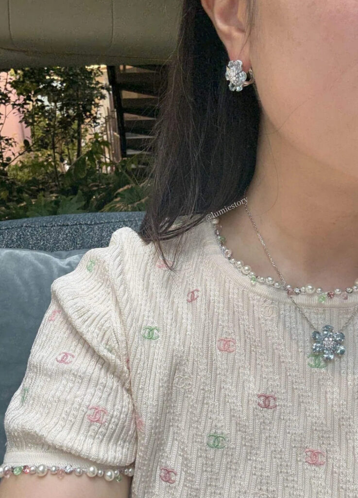
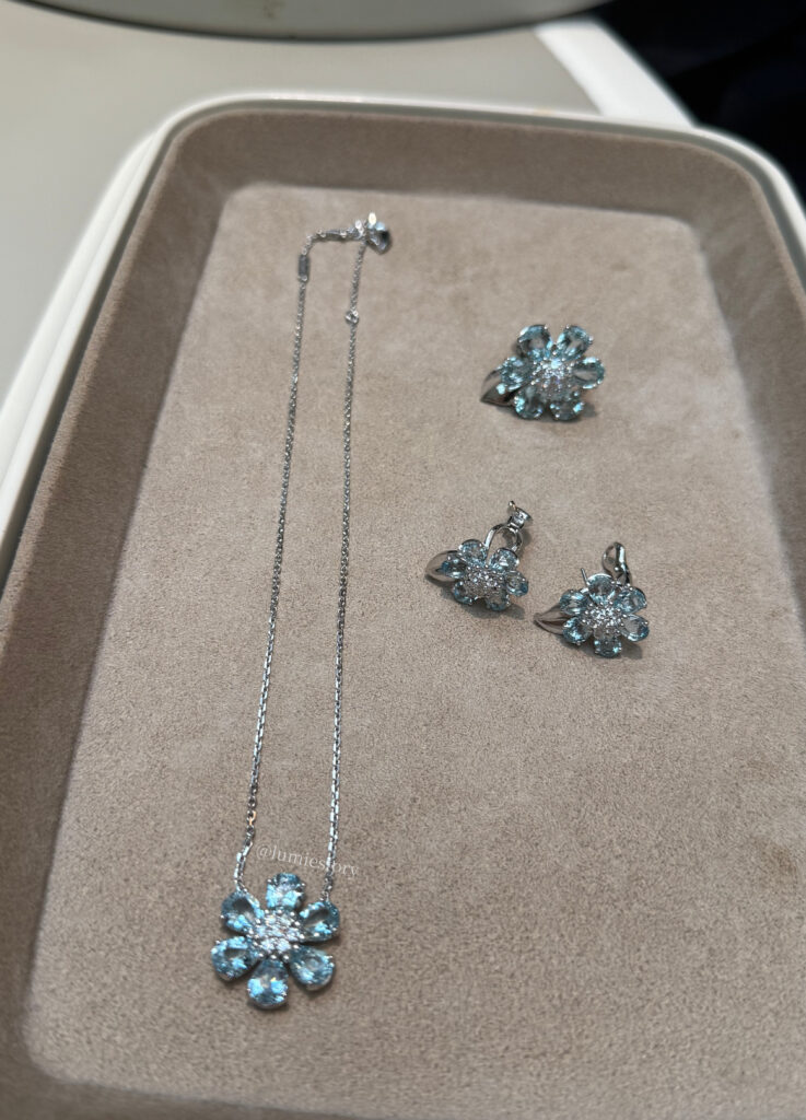
Aquamarine on White Gold: The Defining Expression
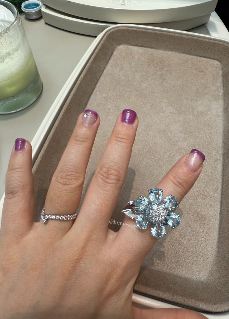
Among all variations, aquamarine set in white gold has emerged as the most sought-after.
From a gemological perspective, aquamarine’s appeal lies in its clarity, cool saturation, and light-reflective transparency. Set in white gold, these qualities are amplified rather than contrasted.
When worn as earrings and a necklace, the impression is not brilliance but absorption—the color seems to dissolve into cooler skin tones rather than sit on top of them.
- The scale is generous but controlled
- The sparkle is present, yet never sharp
- The overall effect remains calm, even in motion
Compared to Vintage Alhambra earrings, Fleurs de Hawaii aquamarine pieces are more present visually, but far less symbolic. They read as light, not iconography.
It is also worth noting that the collection’s initial release coincided with summer, which likely reinforced aquamarine’s popularity. Seasonality, in this case, worked in the stone’s favor.
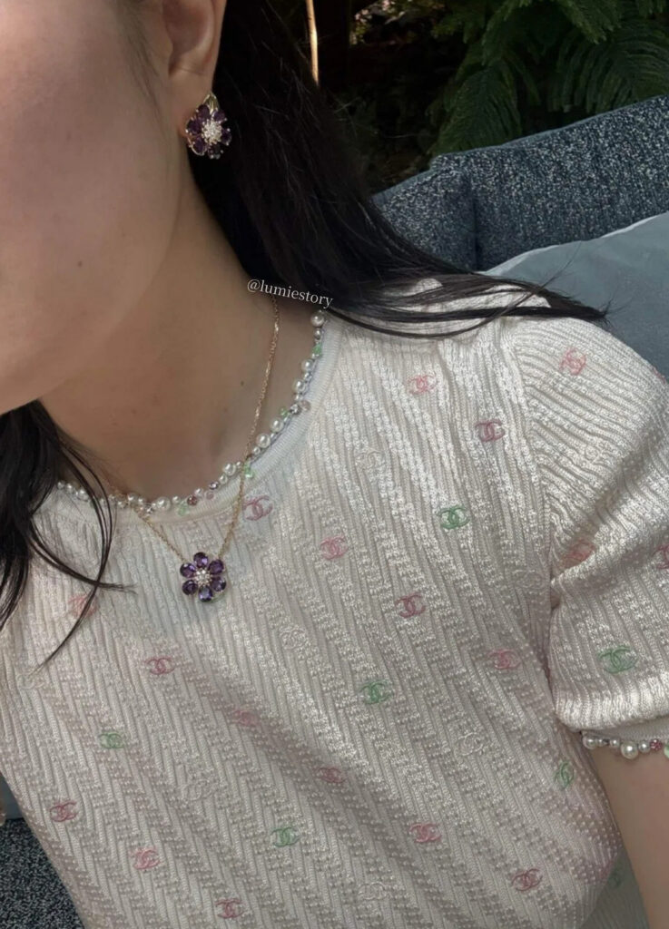
Amethyst on Yellow Gold: An Unexpected Compatibility
In the yellow gold variation, amethyst takes center stage.
Traditionally, purple gemstones pair more easily with warmer complexions. However, the amethyst selected for Fleurs de Hawaii is notably light-toned and transparent, avoiding the heaviness often associated with deeper purples.
When worn as a necklace, the result is surprisingly adaptable. Despite the yellow gold chain, the stone’s clarity prevents strong color conflict, even on cooler skin tones.
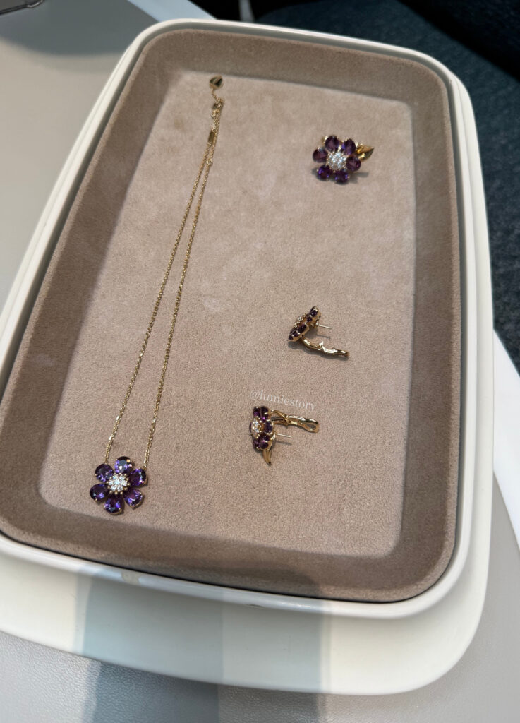
This version arguably carries the most classic mood within the collection. Still, its emotional afterimage differs.
Where aquamarine lingers quietly, amethyst registers as agreeable—but resolves more quickly.
In personal terms:
- Amethyst: “This works better than expected.”
- Aquamarine: “This feels instinctively right.”
That difference is subtle, but meaningful.
Price also plays a role. Aquamarine pieces are positioned significantly higher than their amethyst counterparts, making amethyst a practical alternative for those seeking to strengthen a yellow gold jewelry wardrobe without moving entirely away from cooler palettes.
Other Color Variations: Expressive, but Selective
The collection expands into additional stones, each with a distinct personality:
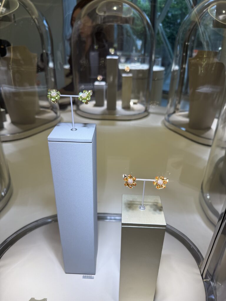
- Citrine (orange tones): Radiant and energetic, best suited to warm complexions. Visually impactful, but less versatile for daily wear.
- Peridot (green tones): Fresh and unconventional, though highly sensitive to skin tone contrast.
- Rhodolite (red tones): Powerful and expressive, recommended for wearers with a strong stylistic identity rather than those seeking neutrality.
While these variations add interest, the most stable and broadly harmonious choices remain aquamarine and amethyst.
Emotional Afterimage: What Remains After the Sparkle
Fleurs de Hawaii is undeniably beautiful—but beauty alone does not define its value.
What distinguishes the collection is its unfinished quality. The petals feel as though they have not fully opened. The colors recall light rather than saturation. There is restraint in how brilliance is allowed to appear.
Among all variations, aquamarine leaves the longest emotional trace. Its color recalls early morning light over water—cool, expansive, and quietly clarifying.
In that sense, these pieces function less as accessories and more as emotional structures—ways of holding a season, rather than displaying it.
Fleurs de Hawaii vs. Flowerlace: A Necessary Comparison
Before encountering this collection, Flowerlace remained my personal reference point for Van Cleef earrings.
While Fleurs de Hawaii proved exceptionally flattering, compatibility and desire are not the same.
Flowerlace reaches a more complex emotional register—quieter, more inward-looking, and less dependent on color. Its appeal lies in stillness rather than light.
As a result, Fleurs de Hawaii enters the consideration set, but does not replace the benchmark.
There is also one lingering thought: the collection’s structure feels capable of supporting a vivid blue sapphire interpretation. Whether that variation ever appears remains to be seen.

Closing Reflection: Jewelry as Remembered Light
Perhaps jewelry should not be evaluated by appearance alone, but by what it leaves behind.
Fleurs de Hawaii excels in wearability and visual harmony. Emotionally, it offers brightness rather than depth—but that brightness is intentional, and beautifully executed.
Like a flower remembered by light rather than form, the collection arrives clearly, then recedes.
The final choice, as always, belongs to time—to the season one is entering, and the rhythm one is willing to wear.
I continue to choose jewelry the same way:
not only by material or form, but by the memory it allows me to carry.

photograph by Lumie
[ Related Editorials ]