Prada Spring/Summer 2027: Everything Starts with the Skirt
What I kept looking at longest in this Prada show was the skirt.
From the red wrap skirt at the opening through pleats, florals, glittering embellishment and asymmetric drapes. It wasn’t only that there were so many kinds. While bras, knits, shirts and jackets kept repeating, small differences I’d normally pass over came into unusually sharp focus: how far a front panel overlaps, where the decoration gathers, why one black swallows light while another throws it back.
Scanning a whole look at once and looking at the skirt alone left different impressions. The first was simpler than I expected. The second was more complicated. This season’s point lives in that gap.
Presented in Milan on September 22, 2026, Prada’s Spring/Summer 2027 womenswear collection was titled “The Skirt.” Miuccia Prada and Raf Simons gathered 63 looks under that single subject. No grand evening gown closed the show, and no radically different silhouette appeared midway to flip the mood. Instead, they set out familiar garments and kept a line of thought going, one idea following the next.
Even after the show, I didn’t feel that any single showpiece overpowered the rest. That doesn’t mean the clothes were quiet. The bras were small, the colors were vivid, and the prints could get loud. There were plenty of glittering skirts, too. But everything asked for the same intensity of attention. Rather than having my eye captured by one look and skimming the others, I found myself watching for what would change in the next skirt.
Clothes that seem simple at first, and slow your judgment the longer you look. The quality that makes Prada interesting showed up this time in an unusually readable structure. So is this a safe season, or a precise one?
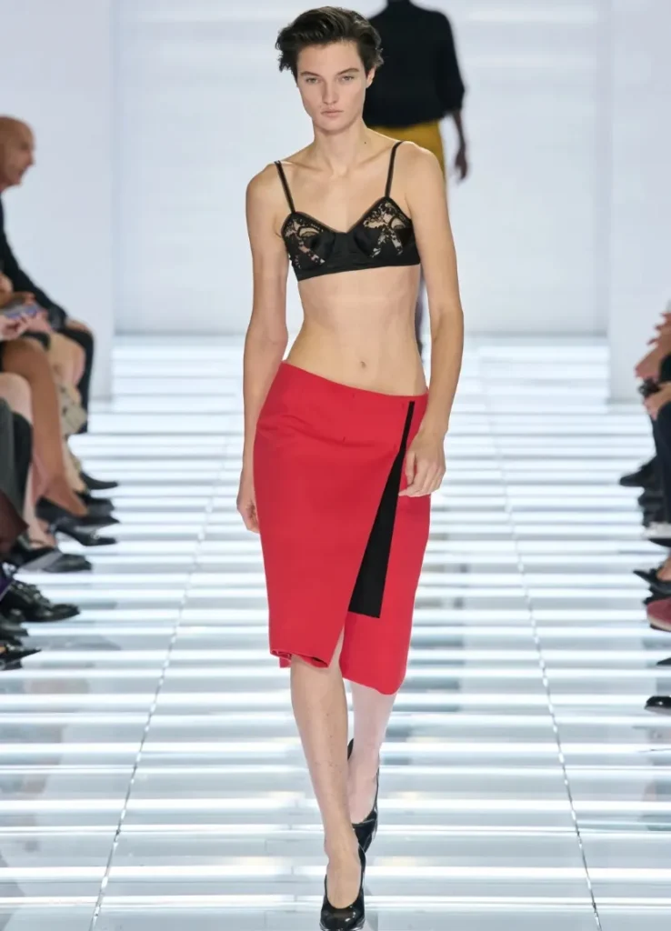
— red wrap skirt with black vertical panel
The Skirt Was Never a New Subject for Prada
Think of how Miuccia Prada herself dresses, and the answer is already half there.
A skirt and a knit. Sometimes neat, sometimes oddly ornate, the pairing carries an idea: a special garment doesn’t have to be worn in a special way. However elaborate the skirt, a familiar sweater can go on top. That alone makes the outfit feel far more personal.
A skirt isn’t a dress. A dress completes one impression fairly quickly, from shoulder to hem, while a skirt leaves open what it’ll be worn with. The same embellished skirt looks composed with a shirt and loosens its formality under a baggy knit. With a bra, the body registers before the clothes. The skirt itself doesn’t change, yet the whole attitude does.
This interest has lived inside Prada for a long time. Waist Down, the exhibition Prada conceived with AMO, opened in Tokyo in 2004 and traveled to Shanghai the following year. It took the skirt, usually seen only on a body, and set it apart as an object so its form and movement could be studied. This collection turns that gaze back toward everyday dressing. It treats the skirt with the attention of an exhibit, while placing clothes we already know right beside it.
Seen that way, Miuccia’s old remark makes sense. She once said that a skirt is to a woman what a T-shirt is to a man, a line Raf Simons brought up again this season. For some people a T-shirt is the most comfortable, familiar place to start. For her, it’s the skirt. Being a basic doesn’t mean it has to hold fewer ideas, though. Clothes worn every day can carry plenty of thought.
So the archive at work here differs a little from reviving old hits. Rather than bringing back looks from a particular year, the collection sets in motion again the pairings Prada has long favored: a proper length with a bared body, florals with industrial sheen, practical fastenings with glittering decoration. Elements that feel familiar on their own become slightly uncomfortable once they’re placed together.
Prada’s femininity has always lived close to that discomfort. Make pretty clothes, but don’t let them end too quickly at “pretty.” This time, that question was concentrated in a single skirt.
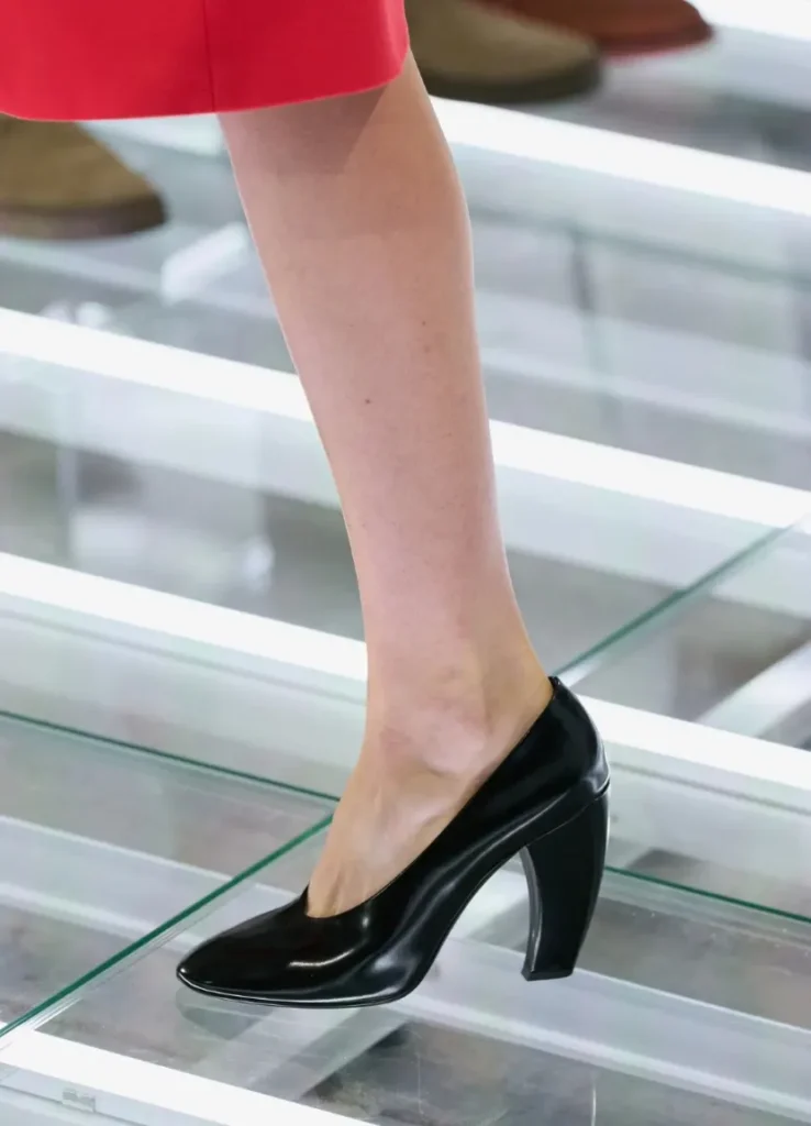
The Top Repeats, the Skirt Changes
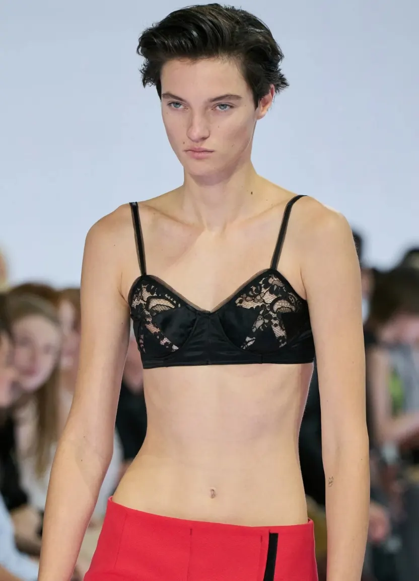
The first three looks progress clearly. Red under a black lace bra, mustard under a dark turtleneck, green under a black shirt. The tops differ in character, but in each one the color field below reads first. The red skirt of the first look, especially, is an opening that needs no explanation. A black vertical panel cuts across the wide red plane, and the overlapped front opens a little with each step.
Choosing a bra as the top left a wide blank above the skirt. It’s exposure that draws the eye, but also exposure that doesn’t hide where the skirt begins. You can see exactly where the waist sits and how the fabric falls from the hip. In this show, the bra does more than add sensuality. It reveals the shape of the skirt.
Knits and shirts do the same job in a different way. Because the audience already knows these tops, they take little time to process. The moment you see a black sweater, your eye moves down to the unfamiliar fastening beneath it. Part of that variety is real; part comes from the familiar tops repeating above the skirts.
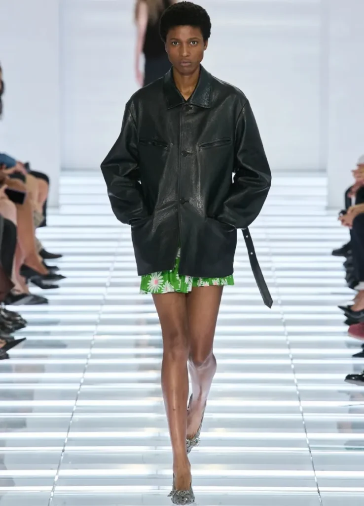
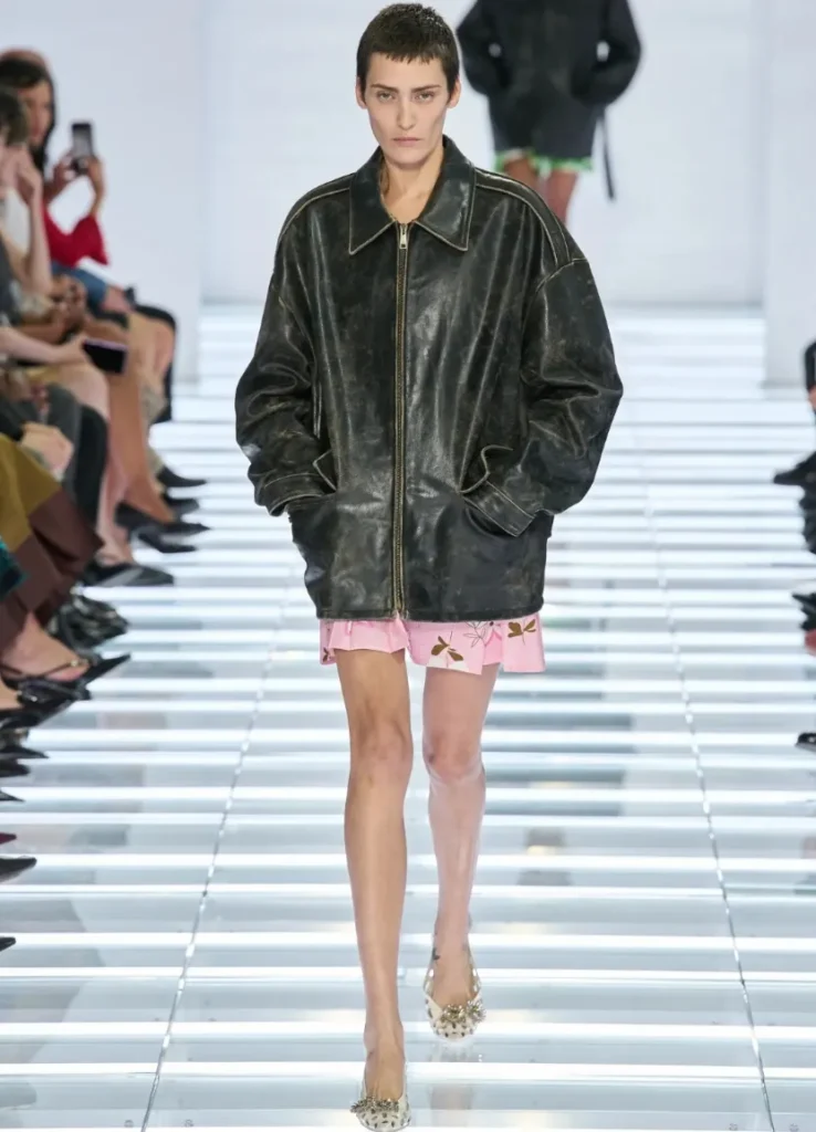
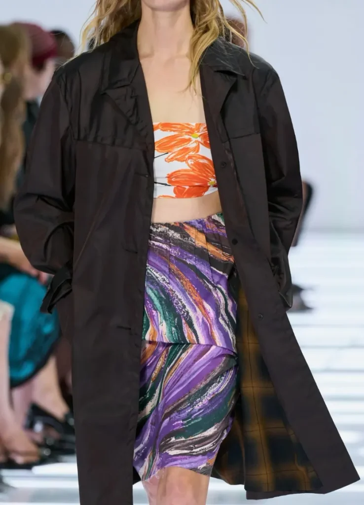
The top isn’t always quiet, though. In looks 5 and 6, generous jackets take over much of the body. A short floral skirt peeks out below, and the pleasure here lies less in the skirt’s full shape than in how much of it shows. With florals left brief under a heavy, wide jacket, the outfit doesn’t look too finished. It leaves a gap, as if thrown on in a hurry.
Later in the show, bras over shirts, floral sleeves and colored tops gain real presence. Even then, the skirt holds the center. Not because nothing is happening up top, but because the few repeated tops have already become the show’s shared language. It’s closer to using the same words while changing the end of the sentence each time.
Between them, the belted coat silhouettes of looks 12 to 14 stand out precisely because they’re quiet. With the front closed and the waist tied, top and bottom read as one mass. The white look 13 in particular gives the eye a rest amid the surrounding black and saturated color. There’s little skin and little decoration, but wrapping the body in one continuous surface, unlike the looks before it, is change enough.
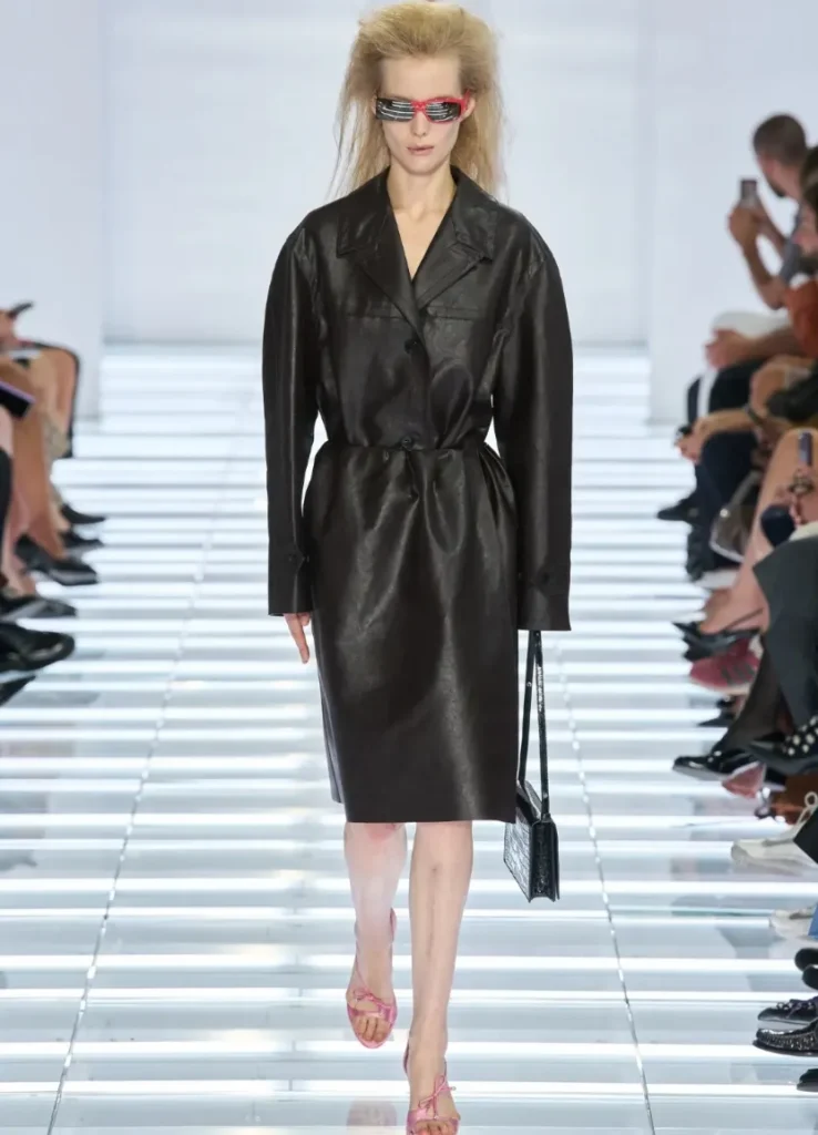
This stretch keeps the show from hardening into an overstated argument. A collection about skirts doesn’t need the skirt to be most visible at every moment. Hide it briefly and reveal it again, and the garment you do see carries more presence.
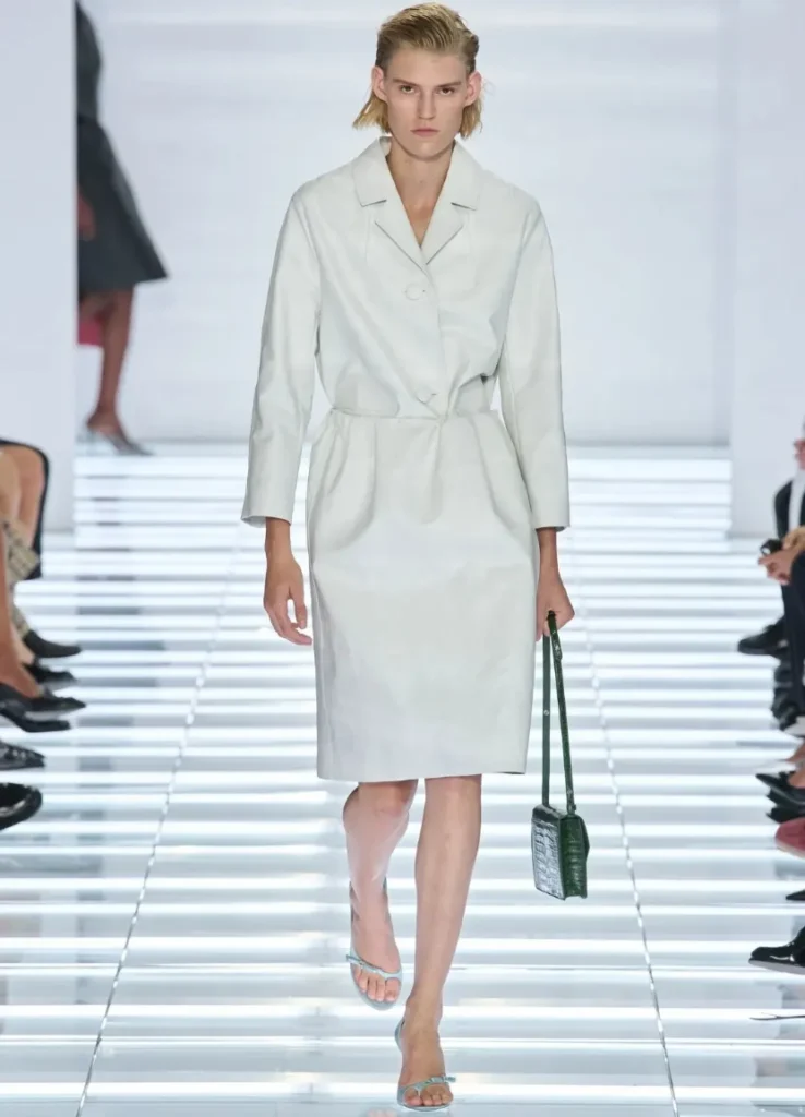
— white belted coat silhouette
Material and Color: Prada Doesn’t Leave Pretty Alone
Sorted by shape alone, this season’s skirts fall into familiar words: wrap, pencil, pleated, asymmetric. The impression from the photographs is far more varied, because the handling of surface matters as much as any novelty of form.
The solid skirts early on make you see planes and lines first. Overlaps and fastenings sit on colors you can tell apart from across a room: red, mustard, green. Because the skirts aren’t elaborately decorated, small misalignments show more. A hem that doesn’t quite line up, a different color escaping from one side, a long vertical panel. Each one unsettles the neat shape a little.
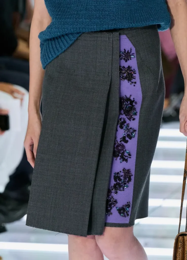
I especially like that the fastenings aren’t hidden. Instead of burying the part that holds the garment closed under decoration and finishing it smoothly, the collection keeps that function visible. Even with crystals on it, Velcro is still Velcro. The sparkle doesn’t cancel the practicality, and the practicality doesn’t deny the sparkle. It’s a contradiction Prada often handles, but this time it’s placed where it’s easy to read.
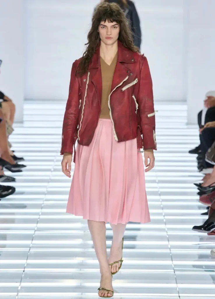
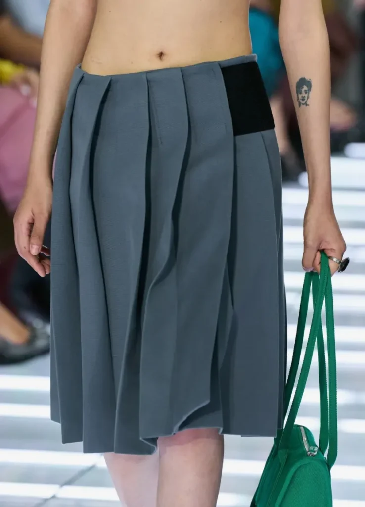
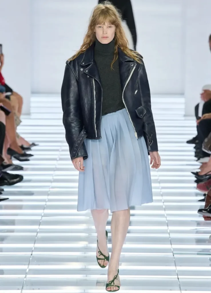
The pastel pleats of looks 17 and 18 shift the emotional register of color. Pink and pale blue are light and soft, but the rider jackets over them, with their zippers and wide collars, set a different expression. The pink skirt with a red jacket has a rough warmth. The pale blue skirt with a dark jacket, a cool contrast. The same pleats carry more or less romance depending on the color and material above them.
These two looks show clearly how Prada treats “the pretty skirt.” A demure blouse over pastel pleats would have made an outfit much easier to explain. The jacket interrupts that reading instead, as if to say that wearing a sweet skirt doesn’t oblige the wearer to play a sweet role.
In the pale skirts that follow, another surface shows beneath the surface. Color and detail seem to sit inside a thin membrane. More than plain sheerness, there’s a sense of distance, of seeing something through one layer. There isn’t much skin, yet you keep looking inside the fabric. Revealing the body and revealing a garment’s structure aren’t necessarily the same thing.
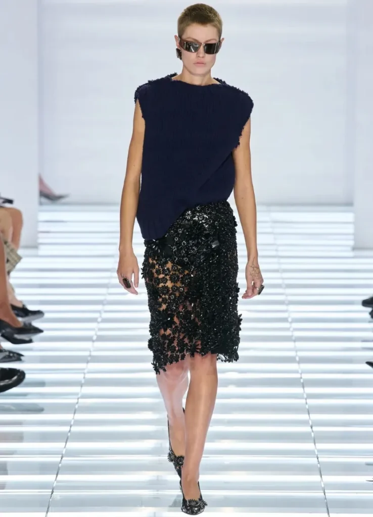
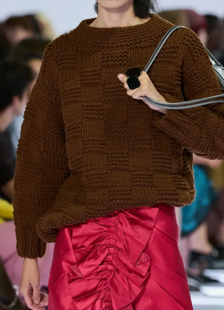
By contrast, the glossy red skirt and the glittering black embellished skirts pull the surface forward. The gap between the parts that catch light and the parts that fall into shadow is wide enough that you can feel relief and movement even in a front-facing photo. Here the plain knit on top both tones the decoration down and makes it stand out more. The glamour remains, but its purpose changes.
The prints in the middle stretch are far more assertive. The vivid lime and black of look 31, the green swirl of 32, the purple-leaning curves of 33 and the layered color flows after them fill the skirts’ narrow surfaces entirely. The silhouettes stay fairly close to the body while the eye keeps moving across them. A garment can get plenty loud without getting any wider.
Look 32 in particular is complex despite having few colors. Green and black bend and overlap until the fabric no longer feels flat. The grayish bandeau above carries a pattern too, but not the same motif as the skirt. The point is harmony without the slick tidiness of a set. That slight mismatch makes the outfit look more personal.
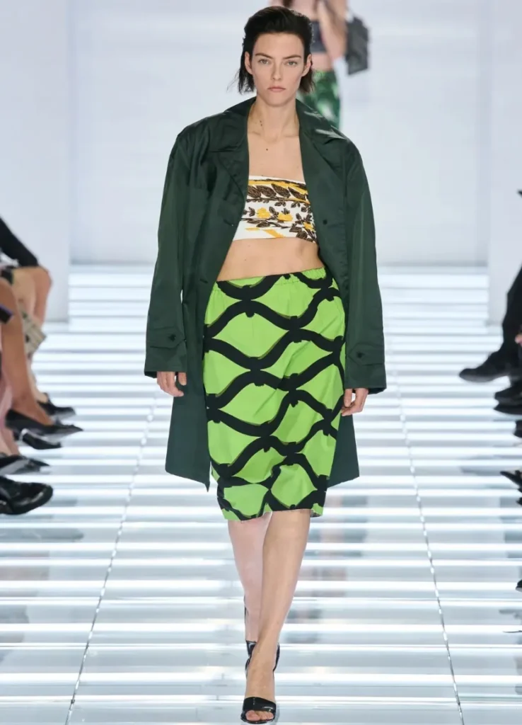
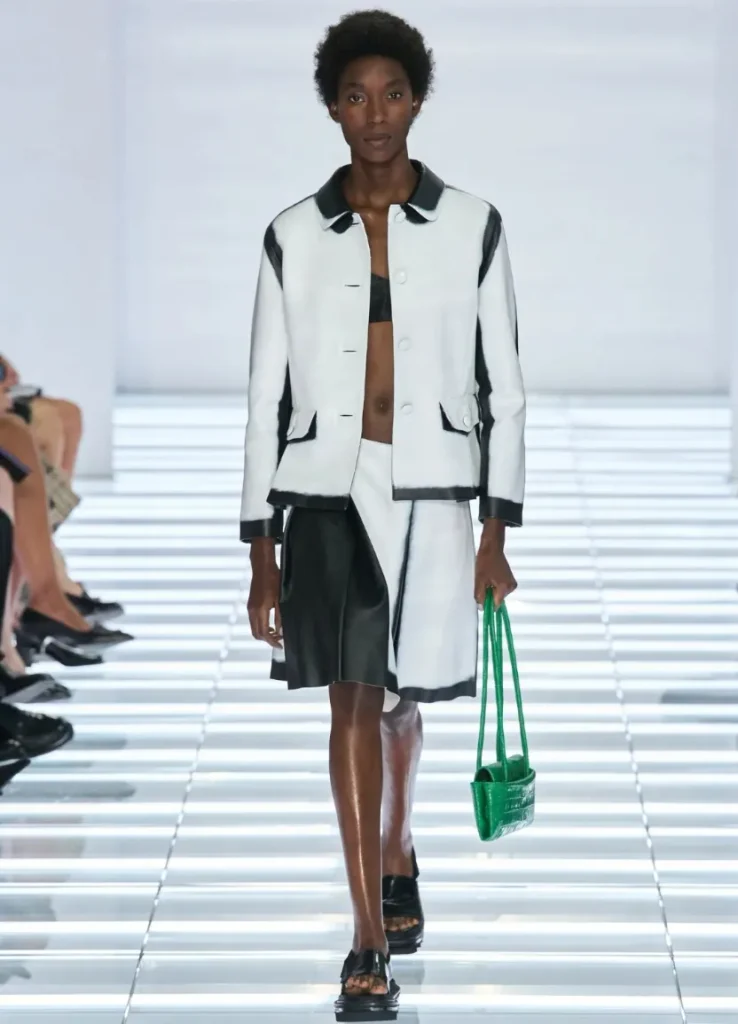
In looks 36 to 39, tops and bottoms with emphasized trims read more graphically. Black laid over white, a green edging toward yellow, purple and pink divides the colors sharply. There’s a hint of a neat suit in them, but the color, the sheen and the flaring hems place them somewhere other than conservative tailoring. It’s a stretch where top and bottom both speak up.
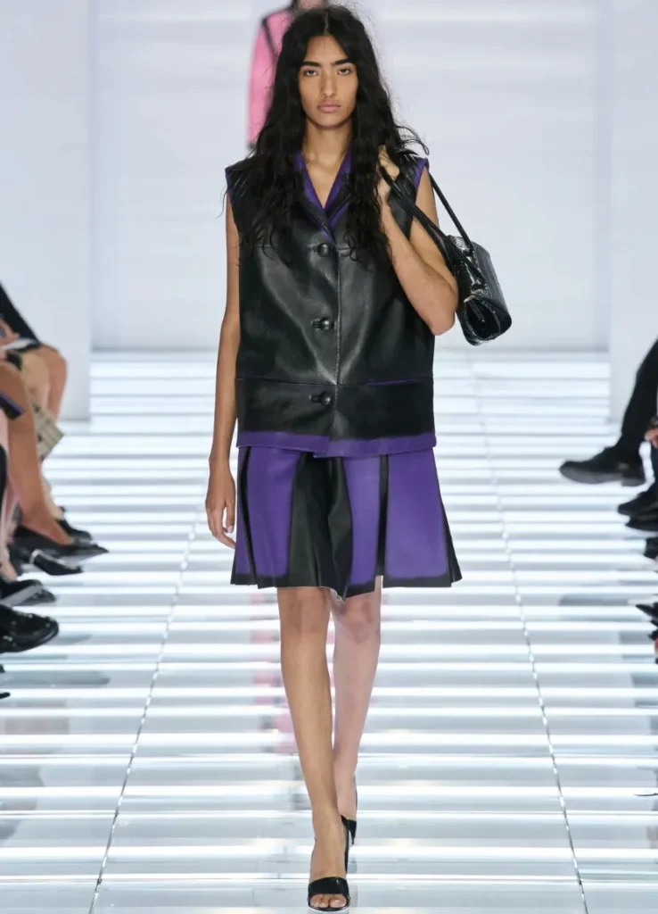
Then comes a run of black pleats, and the eye briefly leaves color to look at volume. In looks 40 to 42, the width of the pleats, the size of the top and how much midriff shows make the difference. That’s why repeated black doesn’t turn monotonous. Where color is pared back, the relationship between body and garment gets clearer.
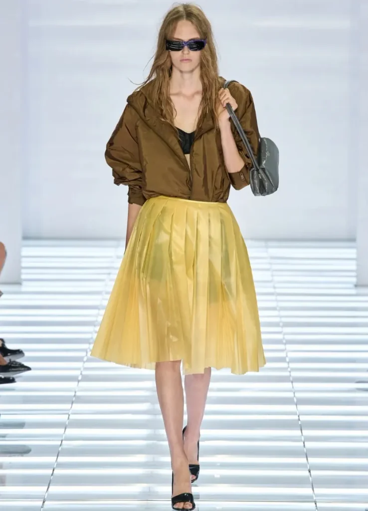
The pink and yellow pleats later on brighten again, but they aren’t sweet the way the early pastels were, because they meet practical zip-front outerwear. Two pieces you’d file separately in a wardrobe, a rainy-day jacket and a going-out skirt, sit naturally together here. The pairing feels like Prada because neither the functional piece nor the decorative one gives way to the other.
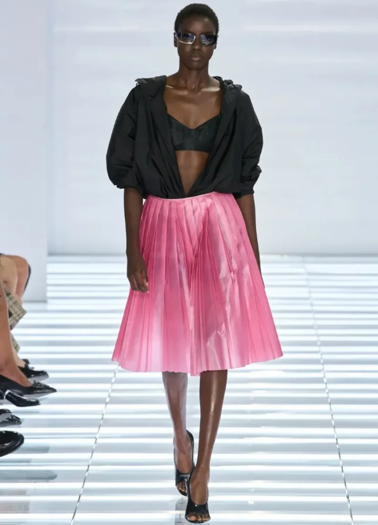
The materials add to that tension. Several of them seem to play with what they are, so that a surface can suggest one texture from a distance and promise another up close. These are clothes that, even after you’ve understood their color and proportion from photographs, make you want to touch them.
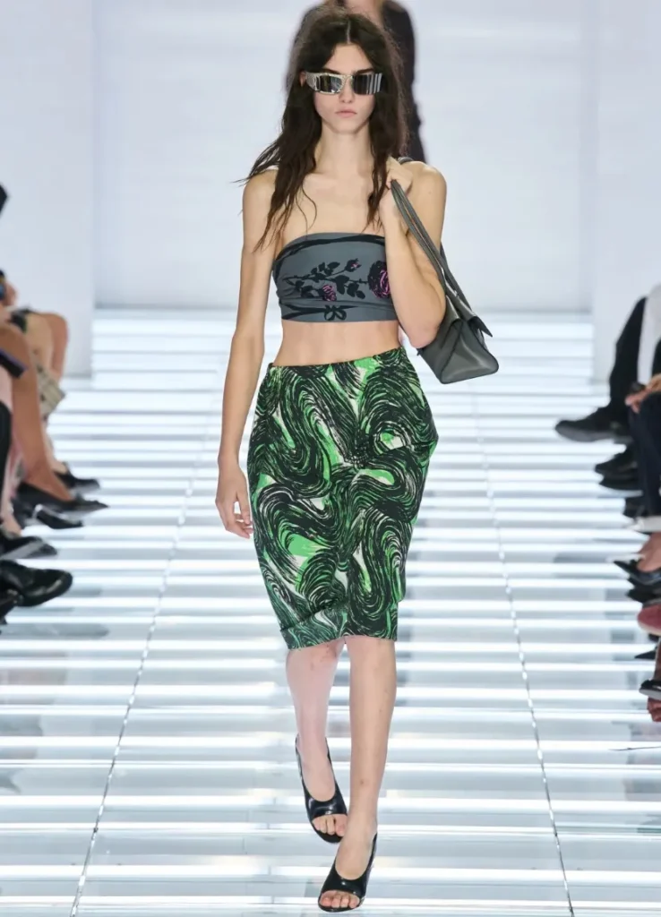
— green swirl print pencil skirt with patterned bandeau
The Bags: Longer Proportions, a Different Attitude
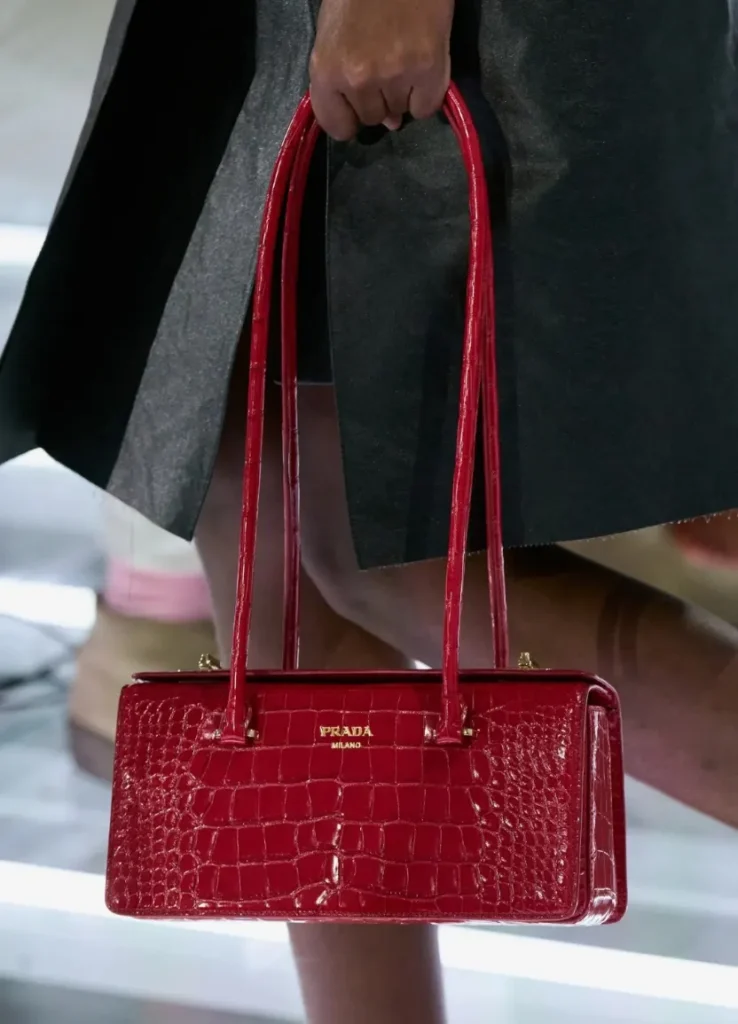
It’s a show focused on skirts, but the bags are hard to pass over. As the garment shapes repeat, the long horizontal proportion of the bags sets up a shared rhythm from look to look. The bodies are elongated and relatively shallow. The handles are thin and long. They seem designed around the line they’ll draw beside the body, rather than simply stretching a small bag sideways.
The green canvas bag is a good example. The saturated color registers first, but look a little longer and what stays is the contrast between the shallow body and the two long handles rising from it. The bag itself isn’t overly bulky, yet its outline is longer than you’d expect. That’s why it stands out at a distance without much decoration.
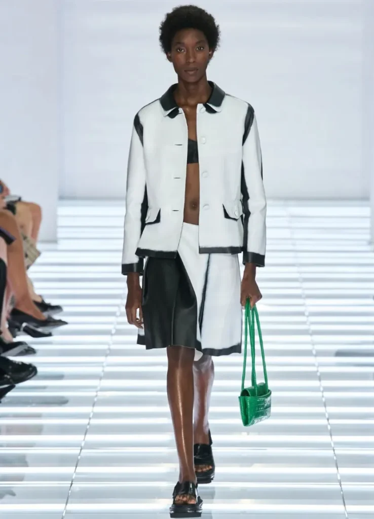
Bags like these can serve as the “ladylike” element of an outfit. Their attitude differs, though, from the classic lady’s handbag with short handles and a rigid body. The longer handles make the posture less stiff, and the horizontally stretched body tilts the balance of the formal rectangle slightly. It keeps its elegance without ending up too upright.
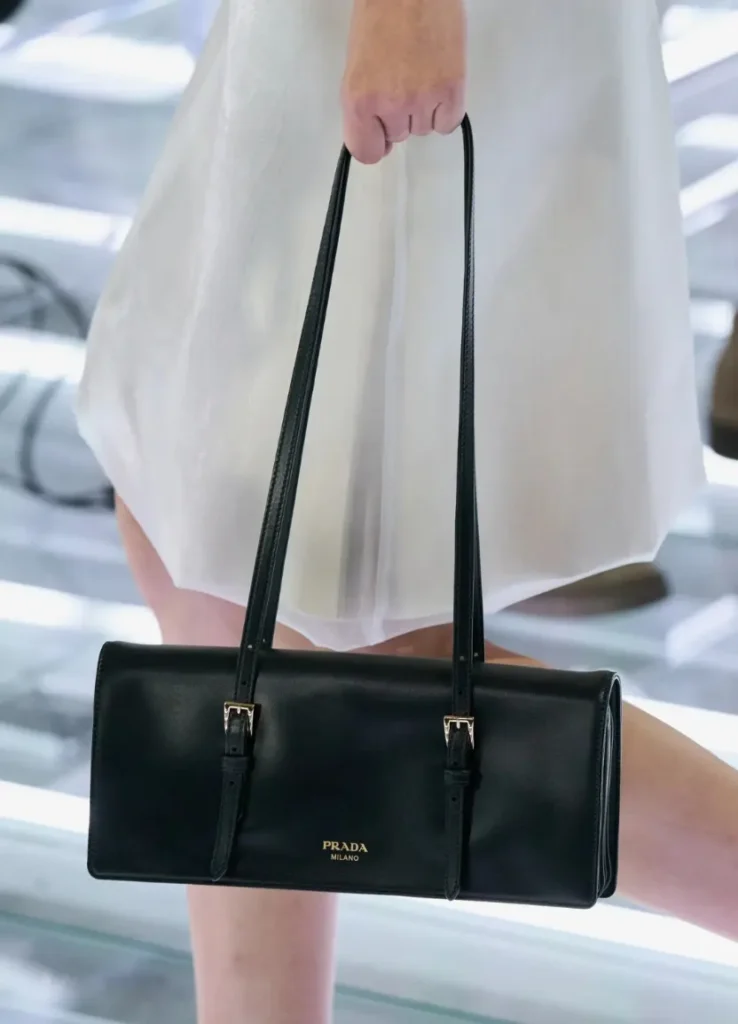
The Duel, one of the new models, is a good way into the season. Its double flap, belted buckle details and tubular handles emphasize the horizontal flow. There’s structural detail, but the body leans soft, so it looks equipped without feeling like a strict briefcase.
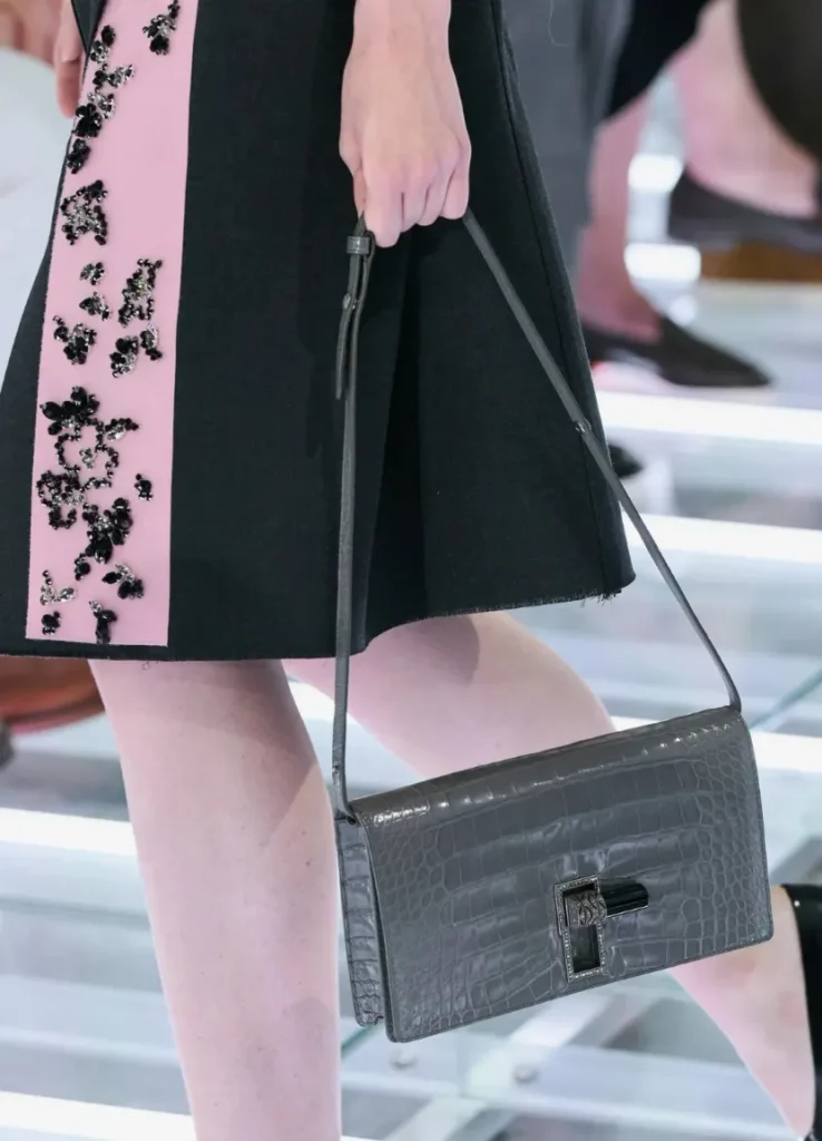
The gray flap bag shows the same appealing tension. Buckles and flap draw regular lines, but the bag folds and slouches a little against the body. Rather than depending on a perfectly crisp structure, it seems designed to accommodate the shape it takes on with use. I also like the calm role the gray plays next to a printed skirt.
The Courbe is introduced with a frame closure and folded volume, and the Geste with details drawn from Prada’s 1988 collection. The Deco centers on its flap and a decorative lock. Its closure in silver, marcasite and onyx, based on a design by Mario Prada, was reported as its defining feature. Within a single season, bags that fold softly coexist with bags that draw the eye through jewelry-like hardware.
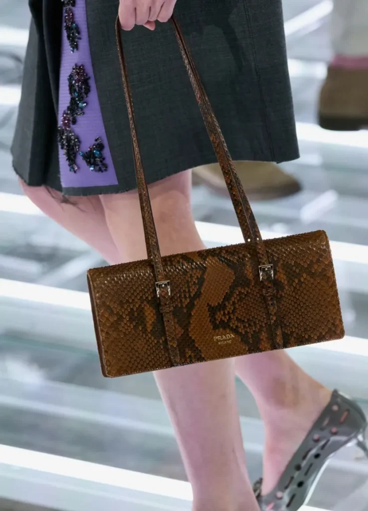
More interesting than the model names is the difference in choice. A bag with a flexible body relaxes a look a little, while a bag with a defined frame tidies its form. A decorative lock can answer the sparkle of a skirt, and a plain surface gives the eye a rest beside a busy print. They may all belong to the same long, horizontal family, but they don’t play the same role in a look.
A triangle-plaque bag with long handles and a smudged gradient along its edges can be read the same way. Rather than turning a familiar house shape into something entirely different, Prada keeps the recognizable features while shifting the effect through proportion and surface treatment. That echoes how this season’s skirts change fastening and decoration within familiar forms.
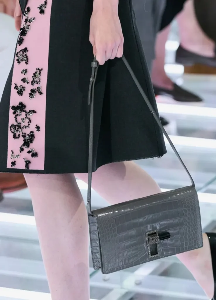
Not every bag sits at the same height, though. Carried down in the hand, it comes near the knee. Slung over the shoulder, it can land by the ribs or the waist. It looks like a small styling choice, but in overall proportion it matters quite a bit, because it decides whether another horizontal surface is added beside the skirt, or whether the bag fills the space beside a bare torso.
If you were actually choosing one of this season’s bags, you’d look at several things together: how elongated it looks beside the body, whether your arm rests comfortably when it’s on your shoulder, and at what height it meets the waistline of the skirt you want to wear. Some bags are pretty on their own, apart from any outfit, but these may show their appeal more clearly when worn.
In the end, Prada didn’t only look long and hard at the skirt. It tuned the line of the bag beside it with similar focus. The bags aren’t ornaments that simply repeat the clothes’ theme, though. Depending on where and how you carry them, they leave room to shift that balance.
Five Looks, Five Variations
If I were choosing five looks from this collection, I’d take one for each of the five ways the show changes a skirt: fastening, volume, surface, layering and drape.
Look 1: Red Skirt, Black Vertical Line
The first look works because it shows the theme at once without over-explaining. The red-and-black contrast is immediate, and the bra with a knee-length skirt makes the difference in area between top and bottom clear, so where things are placed ends up mattering more than how much is added.
It matters especially that the black vertical panel doesn’t split the skirt symmetrically down the middle. Set off to one side, the line follows the wrap structure down and gives the skirt a direction. You can see that a rectangle of fabric is wrapping the body, and you become aware of the front that could open as she walks. Within a flat plane of color sits the possibility of movement.
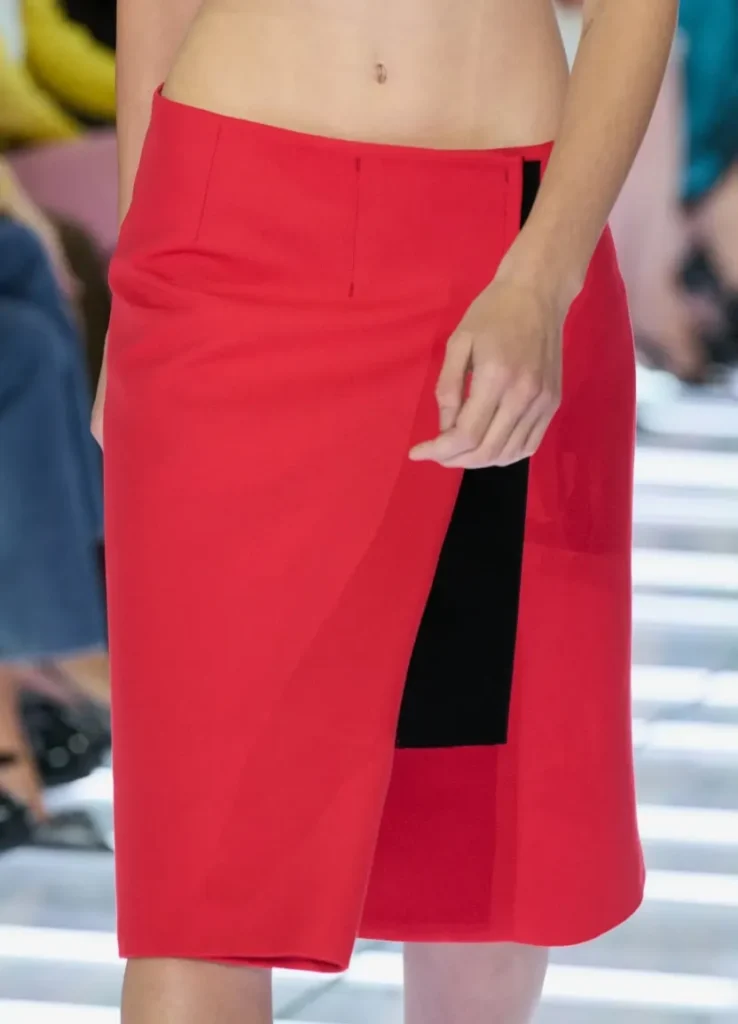
This skirt would be interesting with a different top, too. A black knit would keep the color field and vertical line more graphic, while a white shirt would give it the clarity of everyday clothes. The runway’s tension, exposing the line between waist and hip, would ease, though. Even with the same skirt, you can choose which strengths to keep and what to let go.
It’s exactly right as an opener. It doesn’t lead with the most complex decoration or the biggest volume. It presents the overlaps, color contrasts and functional details to come in their simplest form first. Come back to it after the last look, and the first skirt makes more sense.
Look 41: Black Bandeau, Full Pleats
A black bandeau and a black pleated skirt are among the simplest looks in color alone. But the area each garment covers on the body is dramatically different. Below a narrow band across the chest, the midriff is bare, and wide pleats open out beneath it. The small top makes the skirt’s volume look even bigger.
Here, the exposed midriff also separates the black above from the black below. Had a long top in the same black run down to the waist, it might have read closer to a single dress. With bare skin in the middle, it’s clearly two garments, and where the skirt begins becomes sharper.
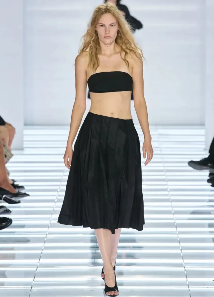
The traditional femininity of a full skirt remains, but the near-bra top keeps it from settling into something classic. In turn, the generous area below stops the exposure above from dominating the look, so revealing and covering end up carrying the same weight.
In real life, it’s the look easiest to adapt and the one that would change the most. Put a fitted knit or a cropped shirt on top and it becomes far more approachable. The dramatic contrast in area between top and bottom, the heart of the runway version, flattens out. The trade-off is worth weighing once the skirt leaves the runway for a real wardrobe.
Look 26: Navy Knit, Glittering Black
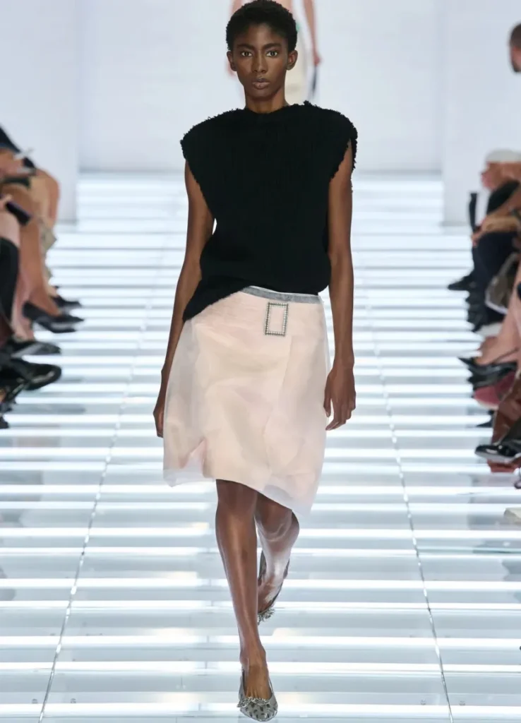
For me, this is one of the pairings that makes the most convincing case for the season’s wardrobe potential. A deep navy sleeveless knit on top, and below, a black skirt with an openwork, decorative surface. The two colors aren’t far apart, but they take light differently.
The knit holds light fairly quietly, while the skirt throws sparkle back from each small section. Skin shows through the gaps in the decoration, so the black doesn’t end as one solid plane. Up close, the detail is rich. From a distance, it reads as a spare, dark outfit.
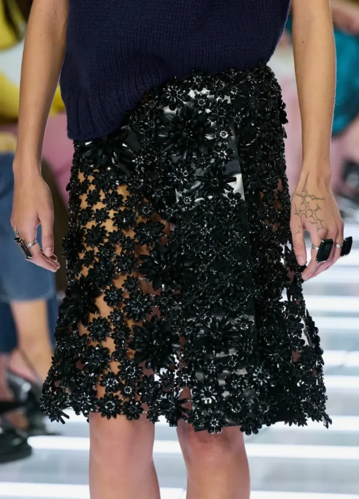
I like, too, that no necklace or showy top was added to push it toward evening. It doesn’t follow the formula that an embellished skirt demands everything else be special. Instead it puts a familiar knit on top and moves toward the idea that this much sparkle can live in daily life.
How it actually wears is another matter. The extent of the lining, the weight of the embellishment and how it feels against skin in motion all need checking in person. But the styling proposition in the photos is clear. It makes you think less about how to make a glamorous skirt more glamorous, and more about how to make it something you’d wear often.
Look 44: Black Gloss over Check
From a distance, this look is check and black. Look closer, and the relationship between top and bottom isn’t simple. The check shirt and the check below seem about to connect, then get cut off by a glossy black plane layered in front. It’s as if another garment stepped in to interrupt what might once have been a single tidy outfit.
Check creates familiar order. Repeating lines and small squares make a fabric look steady. The black plane on top, by contrast, changes with the direction of the light. Regular pattern and irregular reflection collide on one body.
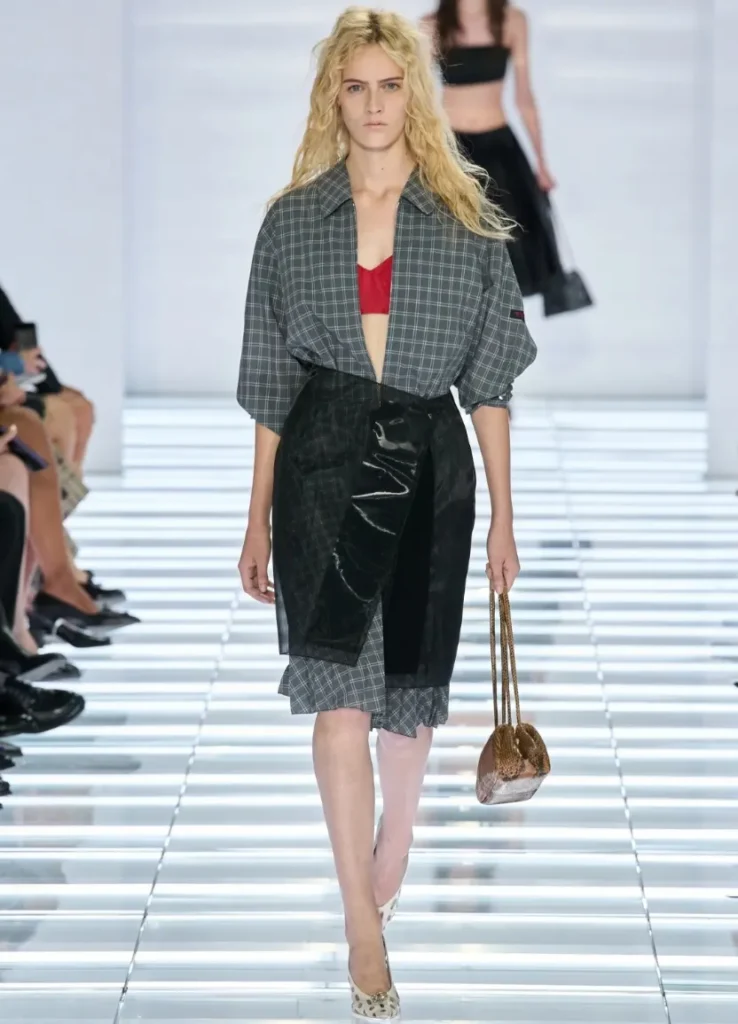
The layering is fun, too. Instead of making the outfit fuller, the layer partly hides the original garment. Because the check skirt is never shown in full, you look more at the edge of the black panel and the hem left beneath it, so the added fabric actually leaves you with less to see.
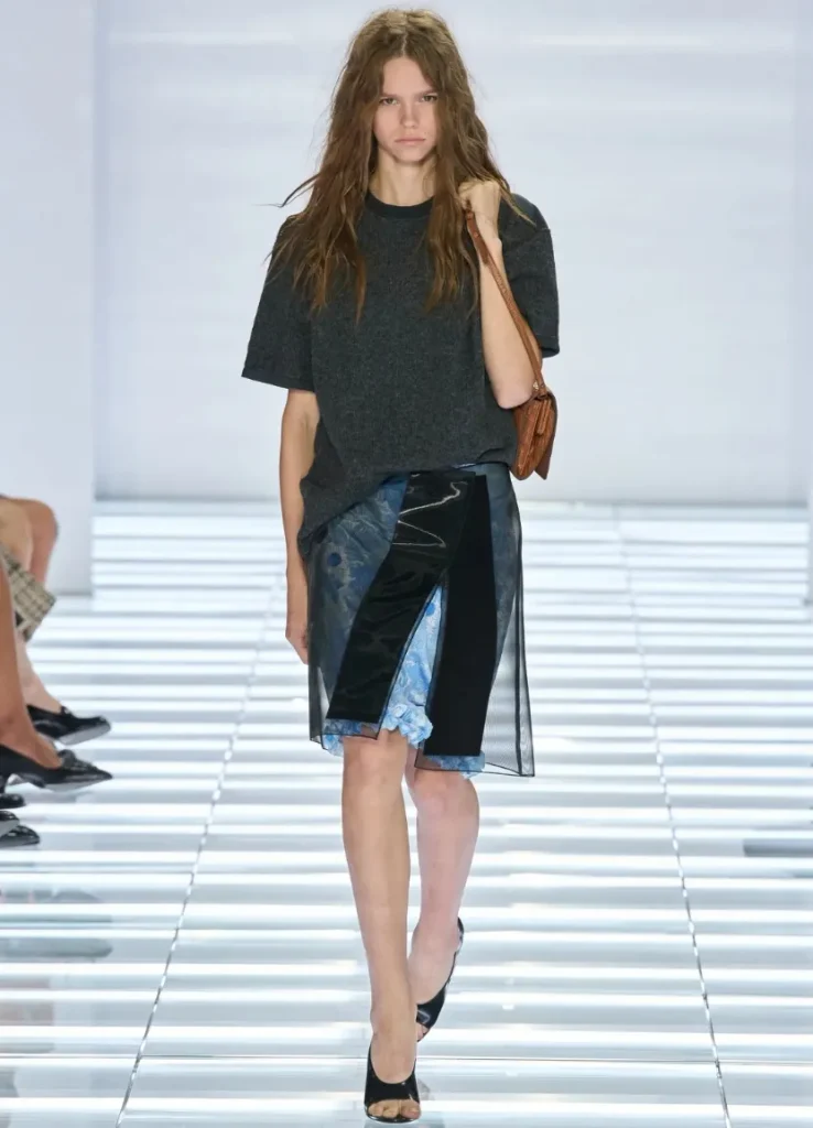
Clothes like this make sense quickly on the runway, but as a single piece they can raise questions. How the black front is attached, how it moves when you sit, how thick the overlapped hem actually gets. For someone who finds those questions tiresome, this is a difficult skirt. For someone who finds them intriguing, it may be the most Prada skirt of all.
Look 59: A Green Skirt Finished by the Hand
The green asymmetric skirt late in the show opens a presentation that began with static color fields toward the movement of the body. A pale bra is layered over a gray shirt, and below sits a green skirt with fabric gathered to one side. The layering up top is clearly visible, but what holds the eye longer is the relationship between the hand and the skirt.
As the model grips the fabric on one side, the flow of the folds changes. Instead of a hem falling evenly below the waist, one side lifts and the other hangs long. A gesture adds to an asymmetry already built into the garment, and the wearer becomes part of the shape rather than simply holding the clothes up.
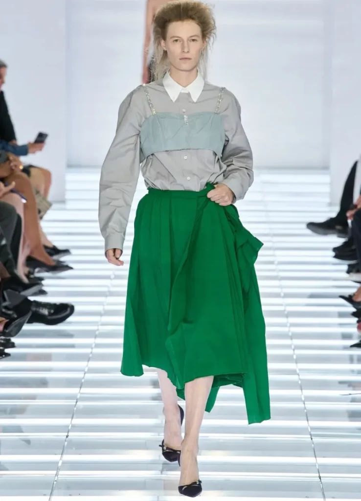
The green matters as well. It’s vivid enough under the gray above, yet it doesn’t send the eye in several directions the way the swirl print does. Because the color is simple, it’s easy to see how the fabric gathers and falls. Here, drape does the work that decoration or pattern usually would.
The beauty of this look depends partly on the model’s pose, though. I’d want to see in person whether the impression holds when the hand lets go, and how the extra fabric settles when walking or sitting. A great runway moment and a piece that works in daily life are two different things. This look makes you think about that gap, too.
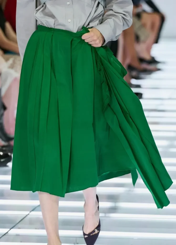
— green asymmetric skirt gathered by hand
What Changes on the Wearer’s Body
This collection is easy to read on the runway, but not in the same way on every body. The more precise its proportions, the more concretely a real wearer has to think about what to change.
For anyone who’d rather not emphasize lower-body volume, the waistline is the first variable. Some skirts appear to sit below the natural waist, closer to the hips. At that height the torso looks longer, and the horizontal line at the top of the skirt can emphasize the hips. A low waist isn’t the problem in itself. The question is whether it matches what you want your clothes to emphasize.
Where the top ends also has an effect. If a roomy jacket stops around the hips, a horizontal line can form at the point that feels widest. A very short bra or bandeau, on the other hand, lays bare the difference between waist and hip. On the runway that exposure sharpens the skirt’s shape, but on a real wearer it can mean the body’s proportions register before the clothes.
Lower-body detail is the third variable. A knot at the front of the thigh, pleats that reflect light strongly, the thickness of layered panels, a print that clings: none of these works the same way. A thin vertical panel can carry the eye downward, but if that panel is thick or flares outward, it can add dimension instead. That’s why you can’t conclude from a front-facing photo that a vertical line automatically slims.
Add the bag’s position and the difference grows. A long horizontal bag hanging beside the hip adds width, and carried low in the hand, it draws the eye further down. Even a small bag has plenty of presence in a vivid color. A long body in a shade close to the clothes, meanwhile, can read as one mass. This is a season in which accessories shift an outfit’s proportions more than you’d think.
Still, filing these skirts away as clothes for slim bodies only would be too quick. There are pleats and A-lines that fall away from the body, fairly proper lengths, and pairings with roomy knits and shirts. The design’s strengths don’t depend on wearing the runway bra exactly as shown.
Looks 49 and 50 are a good reference. A knit vest over a floral shirt with a dark skirt covers the upper body without closing it off. The pattern on the sleeves draws the eye upward, and the skirt forms a plane that sits slightly away from the body. Prada’s contrast survives without heavy exposure.
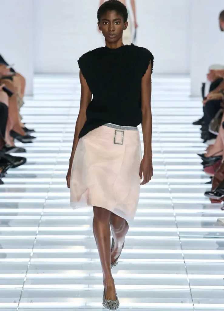
What I like about these two looks is that the florals moved from the skirt to the sleeves. Even in a show about the lower half, pattern doesn’t have to live below the waist. The choice keeps the dark skirt’s form spare and places a small commotion above it. In a real wardrobe, looks like these may be the ones I return to most often.
The belted coat silhouettes offer another direction. Because they tidy the waist and wrap top and bottom in a continuous surface, they may be more approachable than the split proportions of bra and skirt. The result depends on where the belt is tied and how big the coat’s shoulders and sleeves are, though. White look 13 looks clean in photos, but copying only its color or length won’t produce the same effect.
With some wrap skirts, you might consider adjusting the waist position within the range the wrap allows. Pulling it up regardless of where the darts and lining were designed to sit is another matter. You’d need to check whether the front gapes, whether the side seams twist, and whether the hem lifts in a direction it wasn’t meant to.
In the end, the best way to actually wear this season may lie less in copying the runway than in keeping only the tension you need. If you love the contrast of a glittering skirt and a plain knit, take that. If the low waist is hard but you like the asymmetric panel, look for a different length and wearing position where that detail still works. It takes separating the idea of the clothes from the runway body.
Easy to Like, but Not Middle-of-the-Road
Major reviews of the season were largely favorable. WWD called it one of the house’s best and easiest-to-like shows in years, and The Impression read the range drawn from a single form as a direct expression of Prada’s long-held interest in complexity.
The reaction isn’t hard to understand. The theme is visible immediately, and individual pieces are easy to remember. Above all, a thought follows naturally: what would that skirt look like with a knit I already own? The distance between admiring clothes and wearing them isn’t too great.
Still, it’s hard to see this show as just a collection of easy sellers. Having plenty of wearable basics isn’t the same as having no friction of taste. The prints are still strong, the fastenings stand out, and black gloss over check won’t feel neat to everyone. Wearing a bra over a shirt, or putting a careless knit over an embellished skirt, doesn’t resolve easily into one kind of “good taste” either.
What I like, rather, is that elements likely to divide opinion were left inside a readable format. Not everyone has to love the same look most. Someone might choose the embellished skirt of look 26, someone else the knit vest of 49, another a printed pencil skirt. Tastes split, yet the collection doesn’t look scattered.
Broad appeal and individuality aren’t necessarily opposites. To get both, though, you have to be precise about what repeats and where difference is allowed. What Prada gets right here is that distinction. Instead of laying out many unfamiliar garments, it kept changing the relationships between familiar ones.
That offers a pleasure somewhat different from smooth, composed quiet luxury. If there are clothes in which every element flows naturally within the perfection of material and cut, this collection deliberately leaves parts that don’t mesh, even inside good clothes. The rough jacket and the sweet pleats, the humble knit and the glittering surface don’t quite say the same thing. That small mismatch makes the wearer’s choices more visible.
A Precise Season
Back to the opening question: this Prada sits closer to precise than safe. Precise doesn’t mean none of the 63 looks is an exception, though. There are moments when the top grows larger, when pattern moves upward, when the skirt disappears under a coat. What matters is that even as those shifts appear, the audience keeps reading the show through the skirt.
There are plenty of glamorous clothes in the collection, but the glamour doesn’t pile onto any single look. Behind complex surfaces are simple shapes. Beside strong color are familiar tops. Rather than pulling out a new subject with each look, the show turns the same question to a different angle. What keeps that repetition from growing dull is, in the end, the fine differences between the clothes.
Look 63 brings the opening back to mind. A lime vertical panel sits on a white skirt, with a small gray-toned top above. It’s as if the red and black of the first look returned in a much lighter pairing. The way a wide color field is cut by a narrow vertical line is similar, but the impression is different.
I also like that the finale doesn’t suddenly leap into another world. It doesn’t treat the 62 looks before it as a warm-up for the last one. It closes by confirming that the idea set out in the first scene holds to the end. What stays in memory is the structure of the collection itself, rather than a single showpiece.
Whether that structure keeps its strength in the store is a separate question. Whether a skirt that was excellent on the runway is appealing enough hanging alone on a rail, whether a layering that was intriguing in photos turns uncomfortable on the body, whether the long proportion of the new bags is one you’d reach for day to day. That can only be judged in person, with the actual pieces.
Trying things on seems especially important this season. The materials may feel different from how they look, and small differences in waistline change the whole impression. These are clothes I’d rather check by walking, sitting and carrying the bag than choose from a pretty front-facing photo. Along the way, some looks will turn out better than they did on the runway, and some you’ll reach for less than you expected.
I see the fact that this later judgment remains open as one of the collection’s strengths. Rather than handing over a finished answer, the show gives the wearer a question to carry on inside her own wardrobe. Which top to wear, at what height to wear it, how much sparkle to reveal. Even after you’ve chosen a skirt, there are choices left.
Prada Spring/Summer 2027 makes the familiar skirt feel new simply by asking us to stay with it. Perhaps the season’s best moment is the simplest one: standing in front of an ordinary pairing of a knee-length skirt and a knit, and realizing you’ve been looking at it longer than you expected.
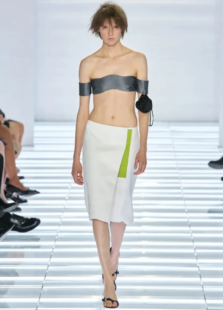
— white skirt with lime vertical panel
All images unless otherwise credited: Vogue Runway
[ Related Editorials ]