A study of marquise cuts, body proportion, and the difference between a beautiful jewel and a flattering one
The eye first registers the butterfly itself in Graff’s Butterfly collection — two wings, a central axis, the symmetry that scales out from the body. Graff isn’t working with the biological form. What the collection actually addresses is the directional behavior of diamond cuts arranged across the body.
The butterfly is a worn motif in high jewelry. Flight, transformation, lightness, femininity, the imagery of spring — the butterfly slips too easily into metaphor, which is why it’s a difficult shape to handle.
Sentiment turns it decorative. Cuteness drains the tension out of high jewelry. Graff Butterfly is interesting at exactly this fault line. The collection doesn’t soften the butterfly. It uses the form as a vehicle for showing how diamonds extend, where they converge, and what density they create between the face and neckline.
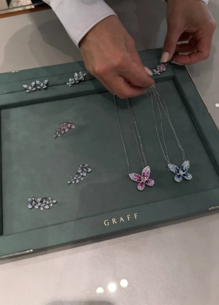
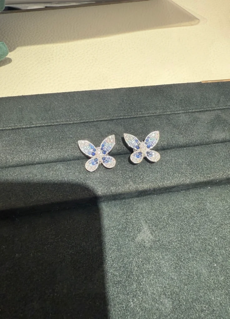
The 2026 color stone version exposes that structure more openly than previous editions. Where the all-diamond Butterfly worked through transparent directional light, the color stone version adds chromatic weight to that direction.
Blue sapphire and pink sapphire placement clarifies the hierarchy between wing center and edge, between smaller butterflies and the larger anchor. With diamonds alone, light scatters and softens the form. Once color enters, the eye stays longer in specific places. The collection shifts from a sparkling butterfly into a colored structure.
— sapphire necklace and earrings
@tuffstuffru / Instagram
The Marquise Cut as Wing Language
The cut defines the collection. Marquise is one of the most directional diamond shapes — round cuts release light evenly from the center, pear cuts carry weight toward one side, but marquise pushes tension outward toward both points. Graff uses marquise as the language of the wing.
Each wing isn’t built from rounded, soft surfaces. It’s built from repeated marquise cuts arranged along an axis. The result reads less like fragile flight and more like a precisely engineered structure. The butterfly doesn’t flutter. It sits, calibrated, on the body.
The collection’s treatment of movement is worth examining directly. Most maisons working with butterfly motifs express movement through curves — wings curling at the tips, asymmetric placement, chain articulation that produces actual physical motion.
Graff doesn’t go that route. Movement here is created through cut direction rather than physical flex. Each wing extends outward and gathers back toward the center. When multiple butterflies cluster, the eye travels vertically. The earrings and rings especially read less like a butterfly mid-flight and more like layered wings stacked into dimensional surface.
This is where Graff Butterfly diverges from Van Cleef & Arpels’ naturalistic vocabulary or Chaumet’s garden references. VCA assigns narrative and symbolism to its motifs. Graff puts the stones themselves at the front. The butterfly carries the name, but the protagonist is the diamond — its scale, its cut, the density of its setting, the direction of its light. That’s a Graff signature, and the Butterfly collection makes it especially visible.
This isn’t a sentimental butterfly. It’s a butterfly where the diamond runs the form.
@tuffstuffru / Instagram
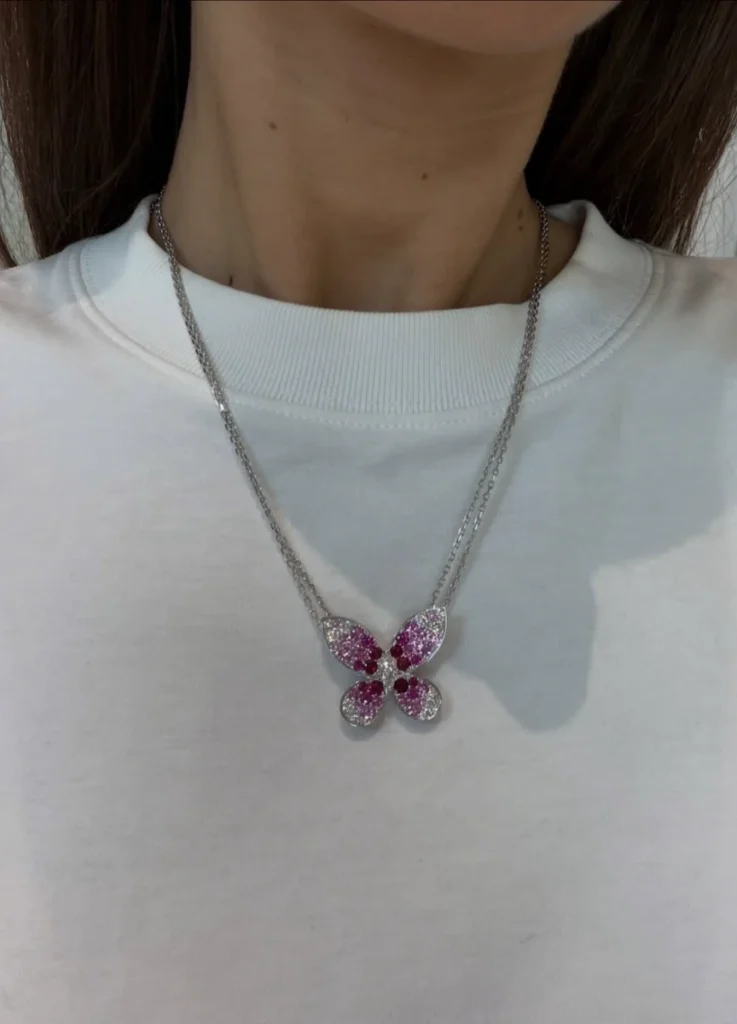
The Necklace — Wider Than It Looks
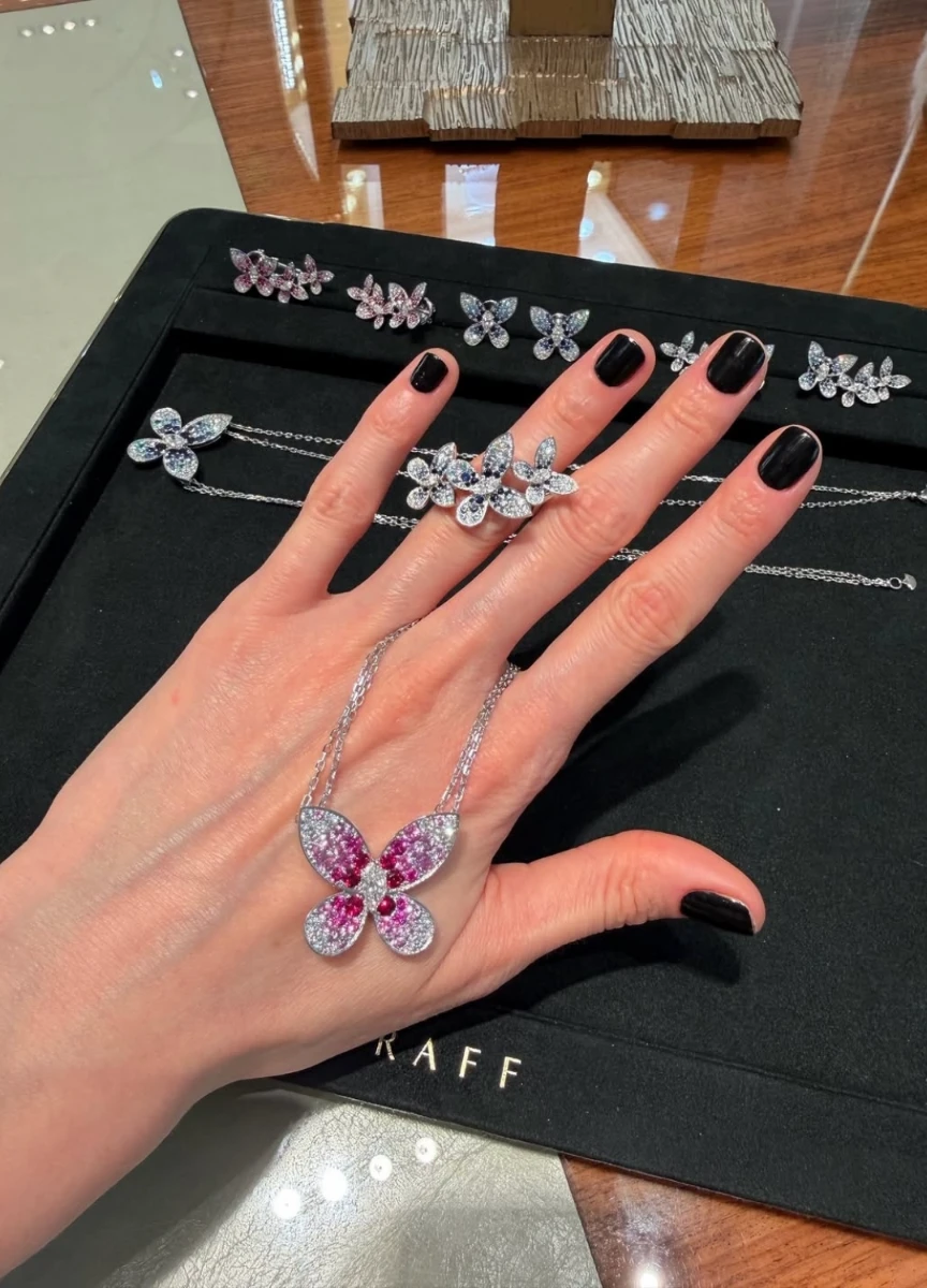
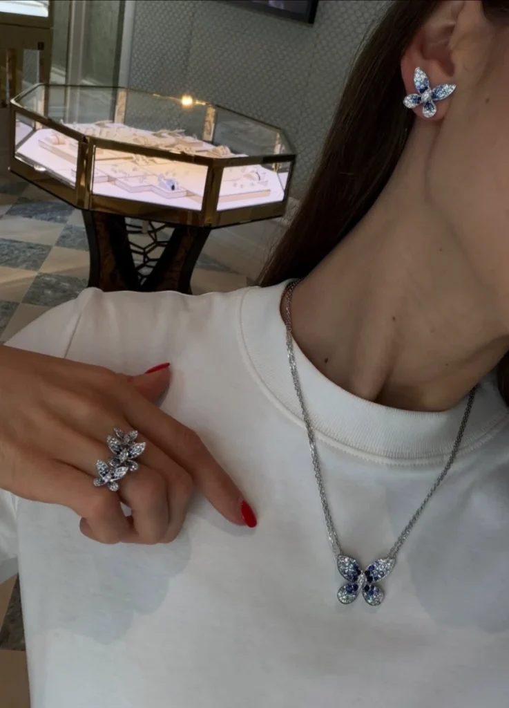
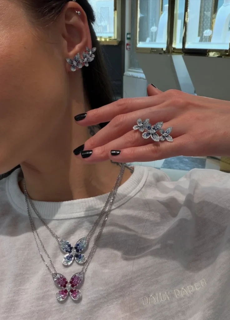
The most worn pieces in the 2026 collection are the necklace, the earrings, and the ring.
The necklace appears to be a simple pendant. On the body, it works differently. The pendant itself is on the larger side, and the central butterfly settles below the collarbone, anchoring more visually than a conventional pendant.
Most pendants concentrate the eye to a single point and leave the area below open. The Butterfly doesn’t. The wings extend laterally, so the focal point doesn’t lock to one place. The eye gathers at center, drifts to the wing tips, returns through the color stone accents. The wear footprint is wider than the pendant size suggests.
— collarbone and neckline detail
@pastila.club / Instagram
This necklace works for a long neck and pronounced collarbone. The lateral expansion of the wings fills the empty space between the collarbone and the throat in a way that feels deliberate. On a shorter neck, or upper body that already carries volume, that same lateral expansion can read heavy.
The pendant doesn’t drop downward into open space — it spreads sideways, and the upper torso reads wider as a result. Pair it with a round-neck T-shirt or a high-cut knit and the butterfly stops floating. It sits flat against the fabric, more decoration than form. The piece is unmistakably beautiful, but the negative space around it is what allows the form to breathe. Without that space, the butterfly looks attached to the cloth rather than suspended in front of it.
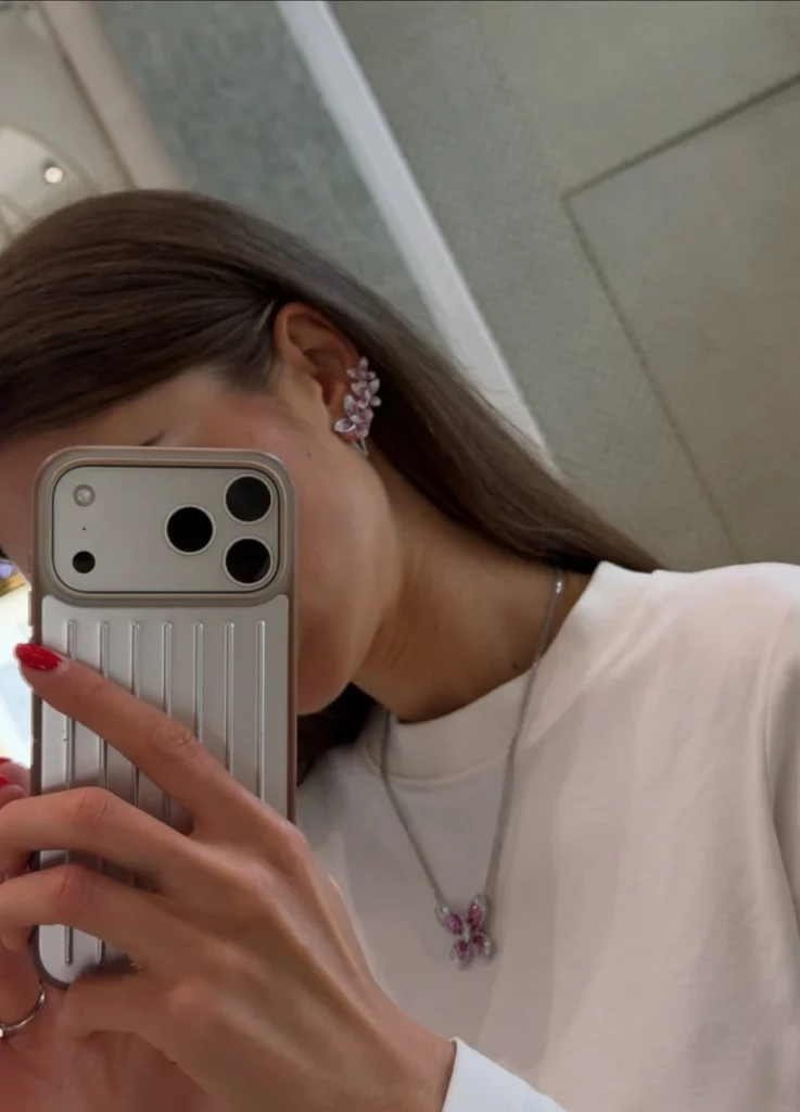
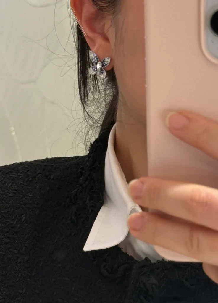
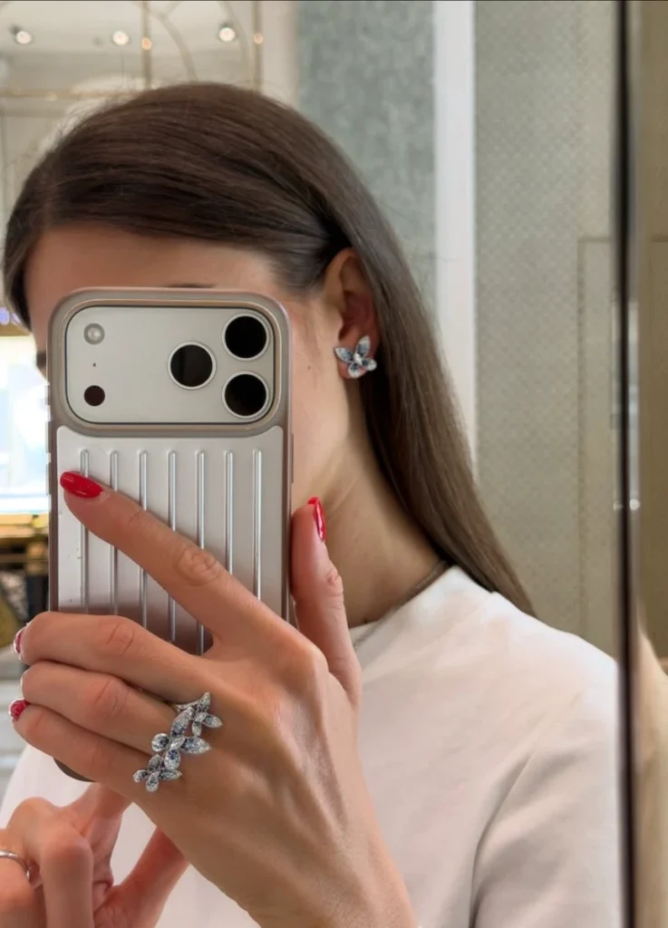
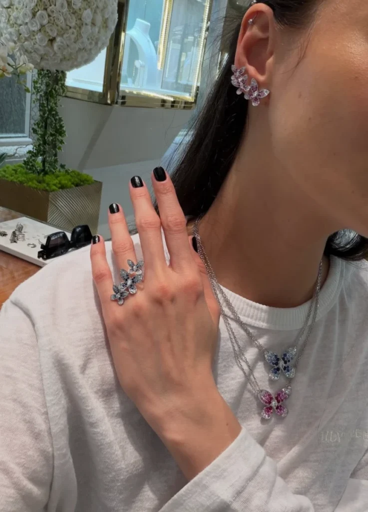
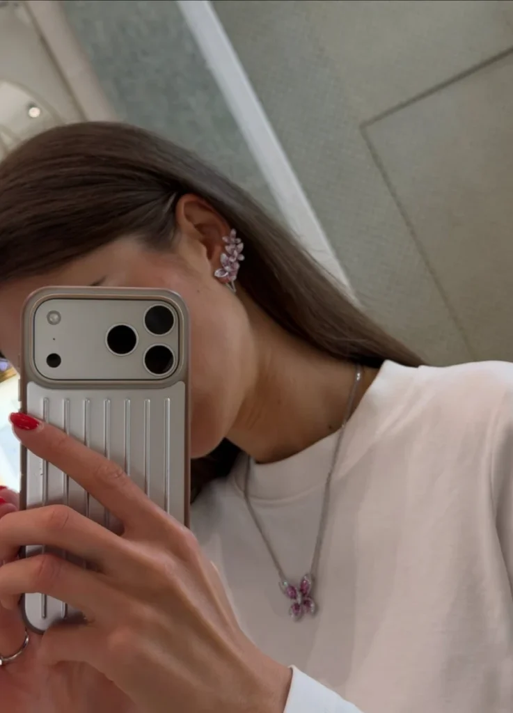
The Earrings — Two Different Categories
The earrings split into two categories that need to be evaluated separately.
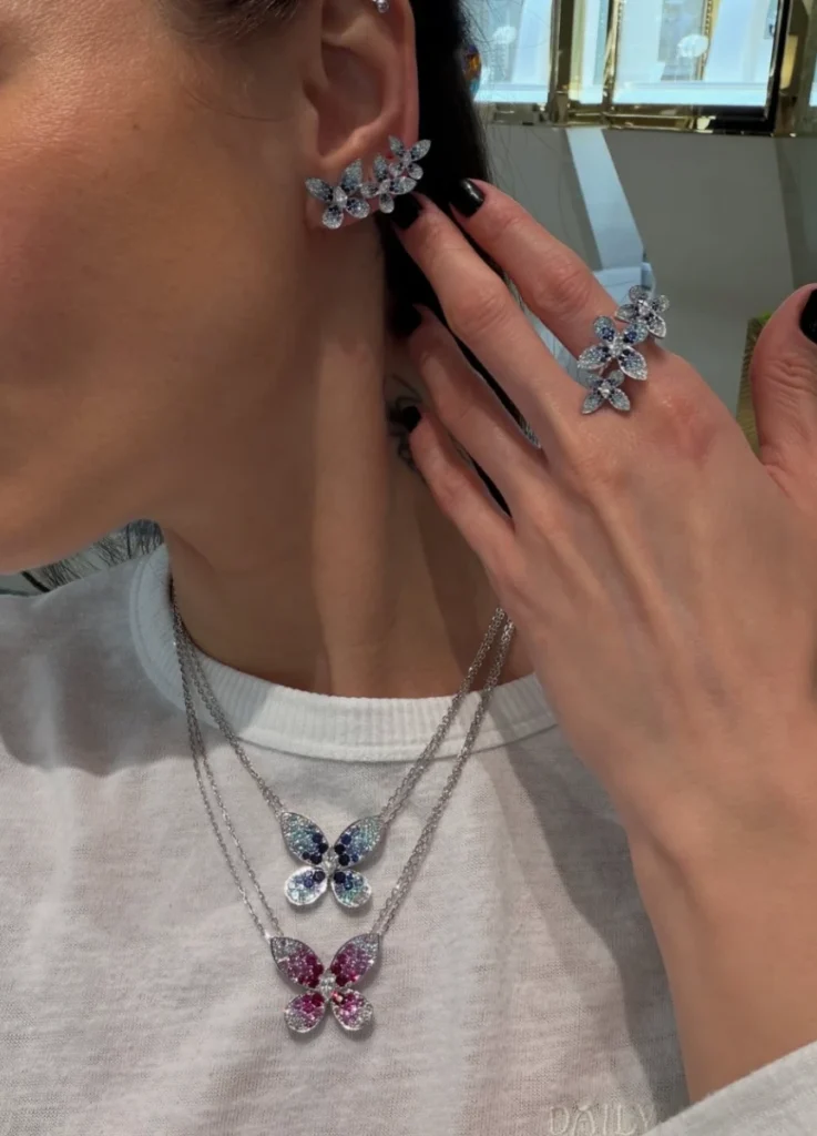
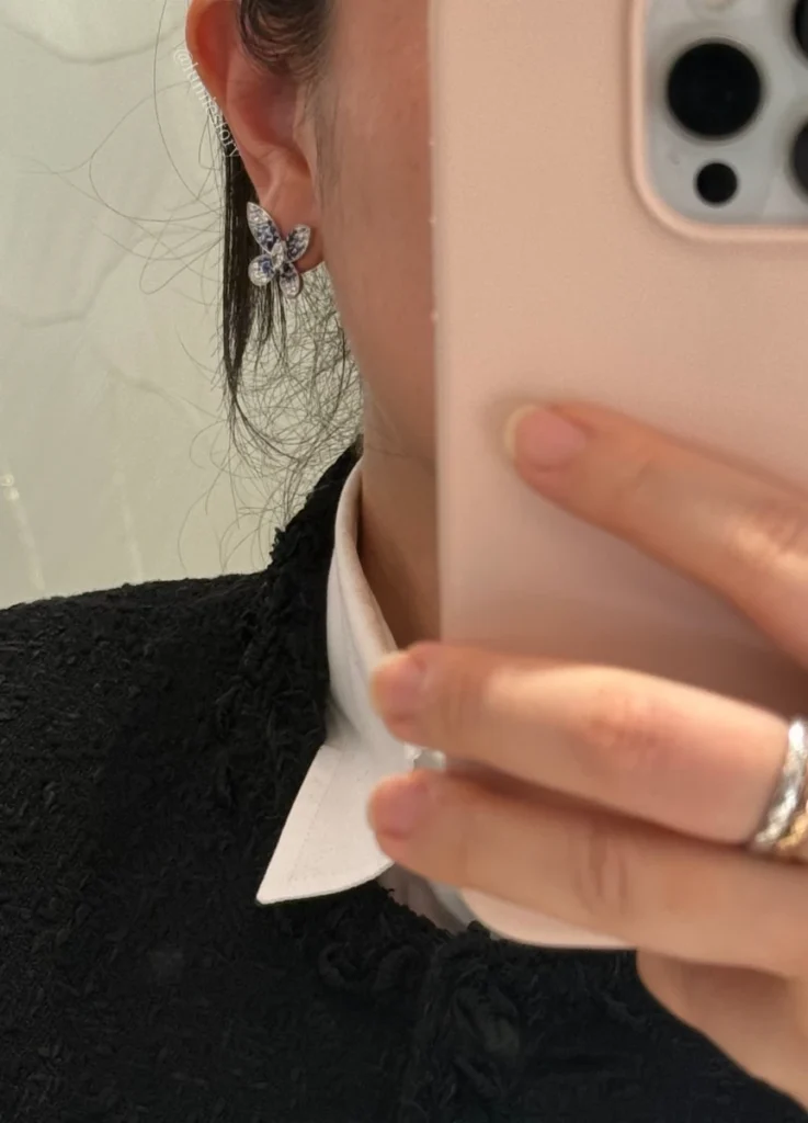
The single-butterfly earring sits closer to a standard wear curve. It anchors just under the lobe, adds light beside the face, and reads as a daily-wearable high jewelry accent.
The cluster ear-climber is something else entirely. It traces the curve of the ear and extends upward, building a line of stones along the side of the head rather than functioning as an earring in the conventional sense. When worn, the ear shape, the lobe position, the side profile of the face, and the hair styling all participate in the final image.
This works particularly well on small ears with a clean facial line. The graduated structure becomes a frame — it organizes the area beside the face. On a face with stronger features or natural volume, the eye lands on the architecture beside the ear rather than on the face itself. The piece doesn’t flatter the wearer in that case; it competes with her. That’s a real distinction worth holding before purchase.
@tuffstuffru / Instagram
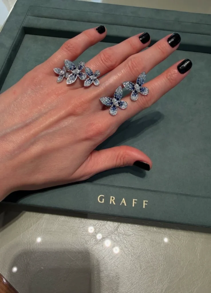
The Ring — A Construction on the Hand
The ring is where the structural character of Butterfly shows up most openly. The piece in question doesn’t sit a single butterfly on top of the finger. Multiple wings spread across the back of the hand in a graduated cluster.
On long fingers with slim knuckles, the effect can be exceptional — the hand becomes the canvas, and the layered structure flows naturally across it. On smaller hands or shorter fingers, the proportions tip quickly.
The ring stops elongating the hand and starts covering it. Graff Butterfly isn’t a ring designed to slim the finger. It’s designed assuming the finger already has length and the hand has visual room. Without those conditions, the ring reads as decoration sitting on top of the hand rather than something the hand carries.
@tuffstuffru / Instagram
On Trying the Sapphire Version
I tried the sapphire Butterfly in person, and the impression was less commanding than the photographs suggested. The reason has nothing to do with the sapphire itself. It has to do with what the graduated cluster structure asks of the wearer.
Graff Butterfly isn’t a piece that lifts the eye toward the face. It functions as its own self-contained scene, which means the jewel and the wearer’s face are competing for attention rather than collaborating.
The sapphire version increases that effect, because the color contrast is strong. Blue sapphire is a cold, exact color. It doesn’t melt softly into the skin. It builds a chilled luminous plane alongside the diamonds. When the facial structure or skin tone doesn’t match that cold contrast precisely — or when the face is already defined enough to compete — the overall image doesn’t lift the way it should.
@tuffstuffru / Instagram
What worked subtly against the piece, in my case, was the graduated structure itself. Graff Butterfly isn’t a piece that brightens a face through a single dominant point. It’s a piece built from many small directional accents that combine into a single scene. That graduated logic flatters very specific bodies — long faces, long necks, slim shoulders, upper bodies with abundant negative space.
The jewelry fills the empty area around the face and produces a refined density. For a wearer who already reads the body and the jewelry structurally — who already brings a defined presence to the face and torso — that same graduated logic can dilute the impression. The line of the jewelry doesn’t support the face. It builds a parallel scene next to it.
The contrast becomes clearer against linear jewelry. Graff Butterfly belongs to the category of pieces that place an independent sculpture on the body. The wearer has to carry the piece. The piece doesn’t accommodate the wearer; the wearer has to provide the negative space and the proportion the piece requires.
@tuffstuffru / Instagram
Pink vs. Blue Sapphire — The Real Difficulty
The pink sapphire reads softer than the blue, but lower difficulty isn’t the right reading.
Pink color stones are particularly sensitive to skin temperature. On skin that’s clear, low in red tones, with a luminous overall image, pink sapphire brings warmth to the face. On skin with yellow or red undertones, or when the outfit shifts even slightly warm, the pink can read playful. Graff’s pink Butterfly isn’t a romantic pink — it’s a sharp pink set against the cold luminance of diamonds. The result is graphic rather than romantic. Without that distinction in mind, the piece can read more girlish or over-accented in person than expected.
The blue sapphire version is colder and more polished. The diamond and blue sapphire pairing is one of the most established contrasts in high jewelry — clean, sharpened, unmistakably luxe. But that exact contrast also reveals the wearer’s skin and facial line with no diplomacy. Blue sapphire Butterfly doesn’t soften into the skin. It places a precise cold mark beside the face.
The version works most strongly with cool fair skin, a long slim neck, a smaller face, and linear hair. When the skin is warmer, the face softer in line, or the upper body carries a warmer atmosphere, the jewelry can float coldly above the wearer rather than integrating with her.
@pastila.club / Instagram
The white diamond version looks easiest, and is in some ways the strictest. Without color, it doesn’t clash with skin or outfit, but the structure itself becomes more exposed. Cut and setting carry the piece entirely. A single large butterfly at the ear or throat is undeniably beautiful, but the way it lifts the face stays narrow. Without color reinforcement, the diamond version asks for a refined overall register — clean skin finish, low-set hair, simple necklines. Heavy makeup or strong garments compete rather than support.
What the Collection Actually Asks For
Graff Butterfly works for a specific physical and stylistic register.
Negative space. A small face, a long neck, an open collarbone area. The collection’s density needs room to breathe.
Slim line. The jewelry already runs at high internal density. A heavier line in the wearer’s silhouette or a strong upper-body presence makes the combination too weighted.
Skin and styling that can absorb the cold luminance. The color stone versions especially generate strong contrast between diamond white and stone color. A consistently warm or soft register on the wearer means the jewelry sits separately rather than integrating.
Hair discipline. This piece loses force when it disappears into hair, and dominates when too much is pulled away from it. A low chignon, smooth straight hair, or styling that frames the ear and neckline cleanly produces the most convincing results.
The mismatches are equally specific. A short neck, a compact upper body with volume, a soft round facial impression, an outfit that already carries strong texture or volume — these conditions raise the difficulty considerably.
Pair the Butterfly necklace with a coat or a heavy knit and the precision of the cuts gets buried under the overall decorative impression. The lapel and material weight of a coat already construct upper-body architecture. The Butterfly necklace then reads less like a focal point on the wearer and more like high jewelry resting on top of the coat. The combination isn’t unflattering. It’s just a combination that shows the jewelry rather than lifting the wearer.
@tuffstuffru / Instagram
Beautiful and Flattering Are Not the Same
Graff Butterfly 2026 Color Stone Collection is undeniably beautiful, but it isn’t a generous collection. In photographs the impression is immediate — the motif is intuitive, the diamond and color stone combination is rich, and Graff’s signature stone authority is fully present. In actual wear, the calculation gets considerably more complex.
This isn’t a collection that automatically beautifies the wearer. It’s a collection that lays diamond density on top of someone who already has the proportion and the negative space to receive it. For the right wearer it’s commanding. For an ambiguous fit, the impact is unexpectedly soft.
The sense I had with the sapphire version — beautiful, but not making me look more beautiful — is precisely the point. With high jewelry, beauty and flattery have to be evaluated separately. A beautiful jewel doesn’t automatically make the wearer beautiful. The more refined the high jewelry, the more specific its conditions on the wearer’s body and face become.
Graff Butterfly is a collection with relatively demanding conditions. The pieces look light, almost weightless, but the marquise cuts, the color stone weight, and the cluster construction generate considerable density on the body.
If the collection is being seriously considered, the butterfly is beautiful isn’t sufficient justification. What needs to be examined is whether the neckline supports the lateral expansion of the necklace, whether a graduated diamond structure beside the face actually lifts the impression, and whether the cold contrast of the color stones harmonizes with the skin.
The neckline geometry in particular is decisive for the necklace. A V-neck, a shallow square neck, or a dress with abundant skin negative space let the piece breathe properly. A round-neck T-shirt, a dense knit, or a wide-lapel coat tends to flatten the work into surface rather than form.
Earrings divide the same way — single butterfly is approachable and adds light beside the face, but the cluster ear climber treats the entire side of the head as canvas. That’s not buying an earring. That’s choosing a frame for the side of the face. The ring follows the same logic. It’s not a ring sitting on the finger; it’s a small construction extending across the back of the hand. On long fingers and a slim hand, the result can be exceptional. On smaller hands, the jewelry reads before the hand itself.
The real appeal of Graff Butterfly isn’t accessible prettiness. It’s the overwhelming sculptural presence that emerges when the conditions align. The collection sits closer to cold, precise ornamentation than to romantic softness. The name says butterfly, but what Graff has actually built is the trace of flight reconstructed in stone. The wings don’t flutter. The cuts don’t shift. The diamonds push light outward in their assigned directions, and the color stones hold the center of that light. The result isn’t a delicate motif. It’s a sculptural body of work that occupies the wearer.
@pastila.club / Instagram
Closing Notes
The 2026 Graff Butterfly color stone collection is beautiful, but the beauty isn’t easy. The collection doesn’t soften around the wearer. It builds its own structure on the negative space the wearer provides. Anyone considering a purchase should look past the immediate luster of the piece and evaluate whether wearing it makes the face register more strongly, not less.
The butterfly is usually read as a symbol of lightness. Graff’s butterfly isn’t light. It’s the quiet luxury that emerges only when the marquise cut, the color stone weight, and the wearer’s negative space all align.
Less a jewel that flies. More a jewel that needs to land in exactly the right place to look beautiful at all. Graff Butterfly 2026 is, in that sense, very much a Graff piece. The most beautiful moment isn’t the distant brilliant moment. It’s when the wearer’s line and the jewel’s direction stop competing, and find the same rhythm.
Featured Image via @pastila.club / Instagram
All images unless otherwise credited: © Lumie Story
[ Related Editorials ]
- Graff Tilda’s Bow Expansion | A Refined Study of Structure, Diamond Cuts, and the Modern Language of the Bow
- [Van Cleef & Arpels] Lucky Spring | The Blue Butterfly Variation
- [Van Cleef & Arpels] Alhambra Bracelet Guide | 4 Motif vs 5 Motif vs 6 Motif
- [Cartier] Love Unlimited | When an Icon Learns to Flow