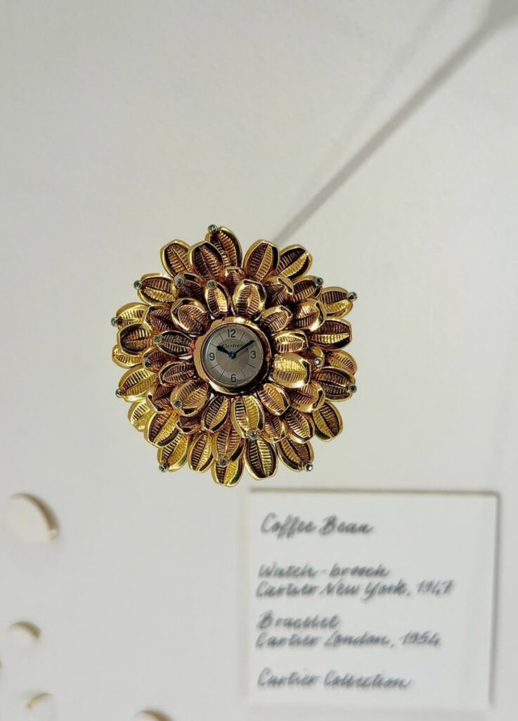
A Coffee Bean Motif, Reimagined as a Watch
At Watches & Wonders 2026, Cartier made a quiet but deliberate choice: translating one of its oldest jewelry languages into watchmaking. The Grain de Café watch is the result.
Grain de Café — French for “coffee bean” — is a jewelry collection drawn from the form of the coffee bean itself. Cartier describes the motif as an expression of the maison’s long engagement with natural forms. The line extends across necklaces, bracelets, brooches, and rings, and has been receiving renewed attention within the high jewelry context since 2023.
The origin of the motif reaches back to 1938, when Jeanne Toussaint — Cartier’s legendary creative director — first introduced the Grain de Café design. The motif gained wider recognition through the 1950s and 60s, particularly through its association with Grace Kelly.
That connection is worth pausing on. Kelly’s relationship with jewelry was unusually precise. For her, a piece was never simply placed on the body. It completed a posture. It finished a gesture. Grain de Café suited her for exactly this reason. The motif borrows from nature — it spreads like petals, flows like leaves — but it carries none of nature’s softness. The forms are organic in origin but architectural in execution. And Kelly, tall, large-framed but impeccably composed, gave those forms a body that matched their structural ambition.
The 2026 Watches & Wonders edition of the Grain de Café watch inherits that lineage directly.
@luxforte / Instagram
Structure Before Time — How the Watch Reads
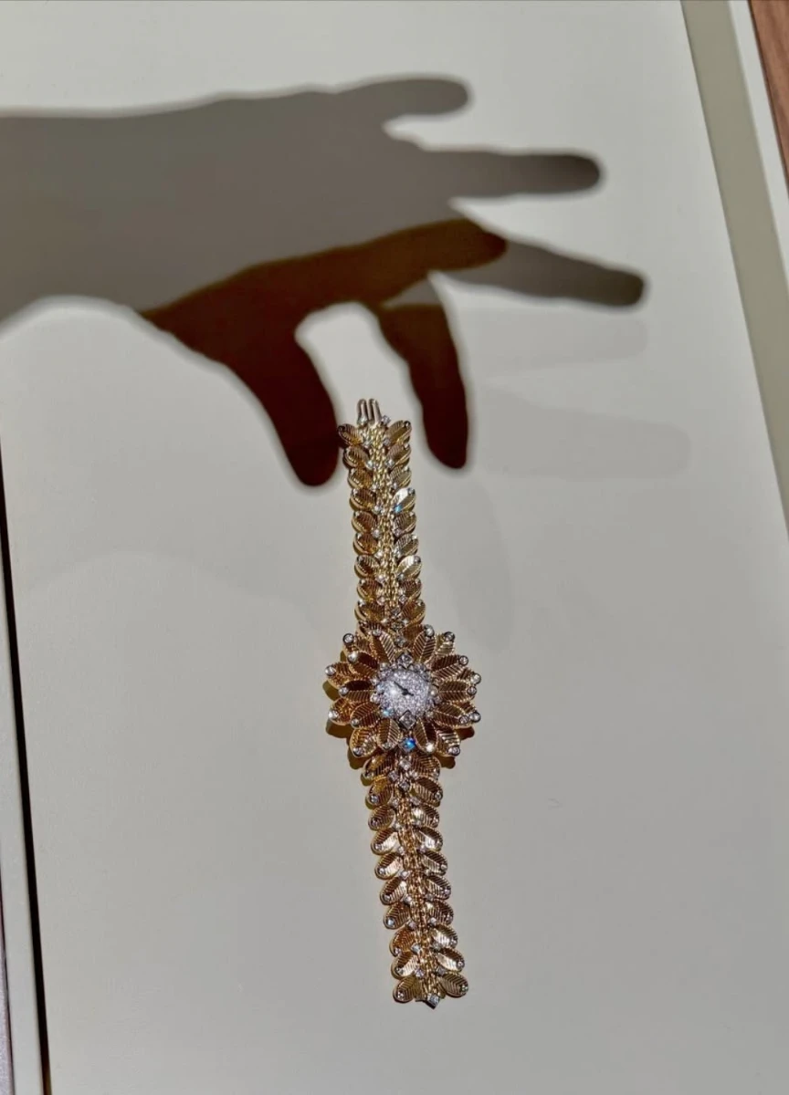
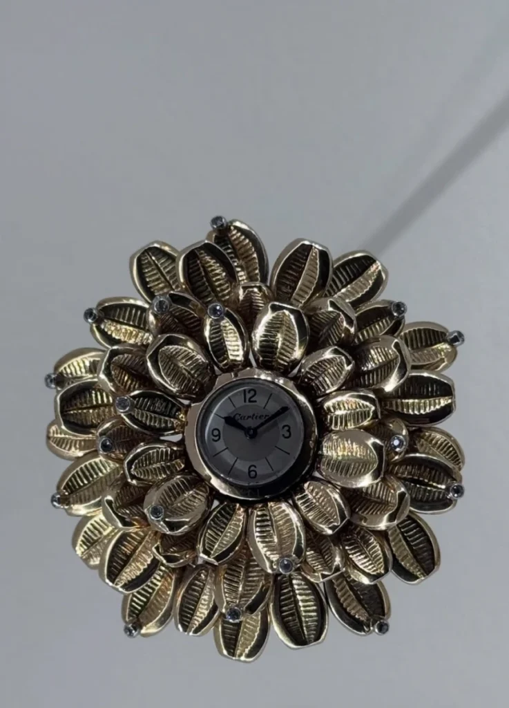
The first thing the eye registers is not a watch. It is a surface.
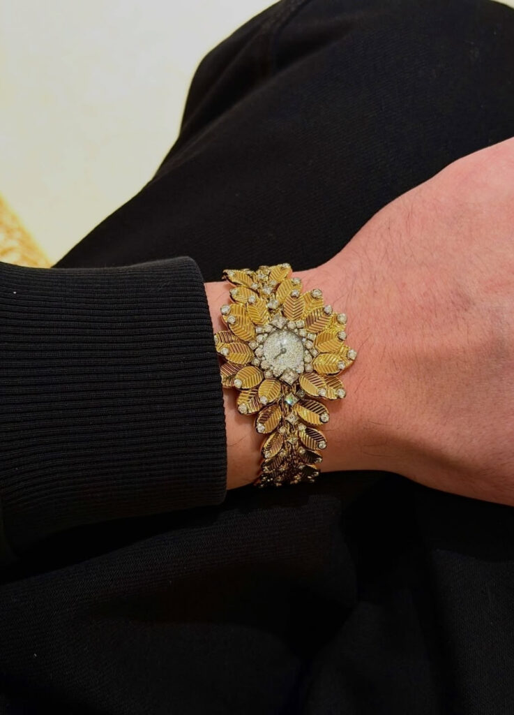
A small circular dial sits at the center, but it is nearly absorbed by the surrounding architecture. Coffee bean modules wrap around the dial and extend outward across the bracelet, each carrying subtle volume, fine rib detailing, and diamond accents at their tips and junctions.
The visual center of this watch is not the dial. It is the expanding rhythm of the motifs around it.
This inverts the conventional logic of watch design. In most timepieces, the dial is the protagonist and the bracelet supports it. The Grain de Café reverses that hierarchy. The dial remains — legible, functional — but it has stepped back. The surrounding structure has moved forward. Time can be read, but the watch does not insist on being read for time.
Function is not hidden. It is placed one step behind form. The wearer encounters shape before information.
@sandrinemerle / Instagram
What Makes a Jewelry Watch — And Why This One Qualifies
A watch covered in diamonds is not automatically a jewelry watch. A true jewelry watch is one where time has been absorbed into the ornament — where the decorative structure leads, and the timekeeping function exists within it rather than above it.
The Grain de Café watch meets that condition almost textbook-perfectly. The dial is central but small, bright, and visually recessive. When looking at the watch, the eye moves first to the rhythm of the surrounding motifs, the directional flow of gold surfaces, the way light breaks and reconnects across each module. The experience is closer to reading a form that happens to contain time than reading a clock surrounded by decoration.
Gold That Lives — Material and Craft
Recent iterations of the Grain de Café line combine yellow gold and white gold, occasionally platinum, with diamond setting. The coffee bean modules are not smooth, featureless metal. Each carries sculpted surface texture — fine ridges, gentle convexity — that separates this watch from a conventional floral diamond piece.
That distinction defines the piece. Diamonds sparkle. But what feels alive is the gold.
Micro-texture across the gold surface means light does not release in a single burst. It distributes differently across each module, shifting as the wrist moves. Some jewelry watches deliver all their information in one glance. This one gives more the longer you look and the more it moves. The difference between a piece that is consumed at first sight and one that continues to reveal — the Grain de Café sits firmly in the second category.
@posh.a.bee / Instagram
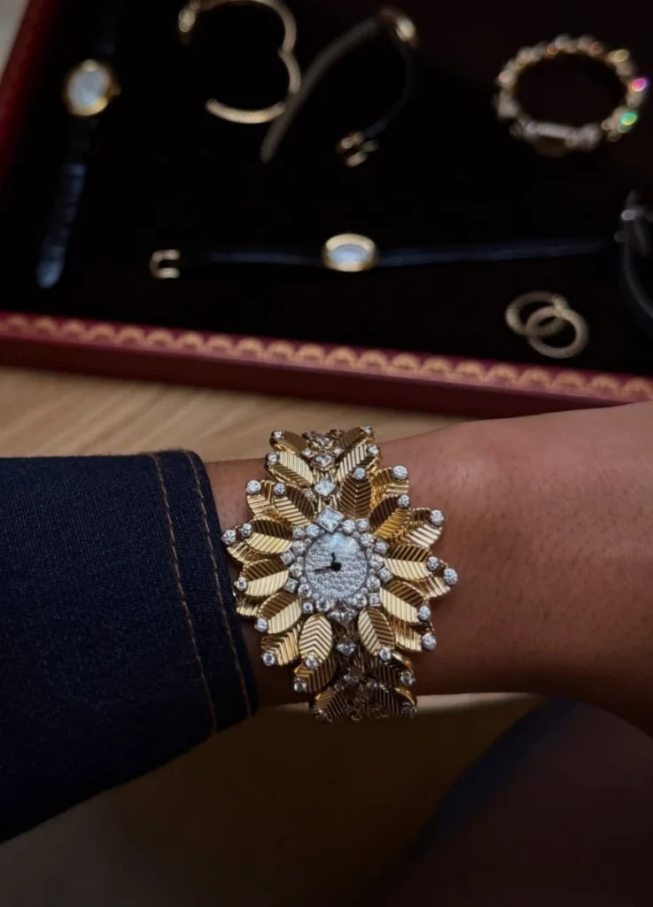
On the Wrist — Surface, Not Line
A conventional bracelet watch reads as a line on the wrist. A case sits at center, and the bracelet extends in both directions. The structure is linear.
The Grain de Café watch operates differently. On the wrist, it reads as a surface. The central cluster — closer to a floral head than a traditional watch case — covers the top of the wrist, and the bean modules spread outward in both directions, creating width rather than simply length. The watch does not sit on the wrist as a centered object. It unfolds across the wrist as an expanding plane.
This redefines who the watch serves.
Body Structure — Where It Works and Where It Does Not
The watch performs best on a wrist with some flatness and visible bone structure. The Grain de Café is designed to spread along the upper curvature of the wrist and follow the gentle slope toward each side. When the wrist provides that topography — a slight ridge at center, a gradual descent at the edges — the modules flow as a continuous organic structure rather than a stacked ornament.
On a wrist where the central bone is slightly prominent, the dial and surrounding modules connect into a single cohesive mass. The watch reads as architecture, not decoration.
On a short or thick wrist, the outcome shifts. The wide head of the watch occupies only the top surface and loses room to spread laterally. Modules that should flow along a curve instead compress into a single decorative block. The essential quality of the design — its sense of expansion — disappears, and what remains is a placed ornament rather than an unfolding structure.
Wrist circumference alone is not the deciding factor. What matters more is the flatness of the wrist, the position of the bone, and how smoothly the forearm connects to the hand.
Forearm proportion also plays a role. This watch does not stop at the wrist — it engages the arm visually. If the forearm is very short, the watch head arrives before the body does. The piece leads instead of accompanying. On a forearm with sufficient length and a clean transition, the watch sits like a node at the start of a longer line. The balance holds.
Height matters less than arm geometry. What determines fit is how clearly the wrist and forearm present themselves as a continuous, readable surface.
@tattedjam / Instagram
Styling — Less Is the Only Option
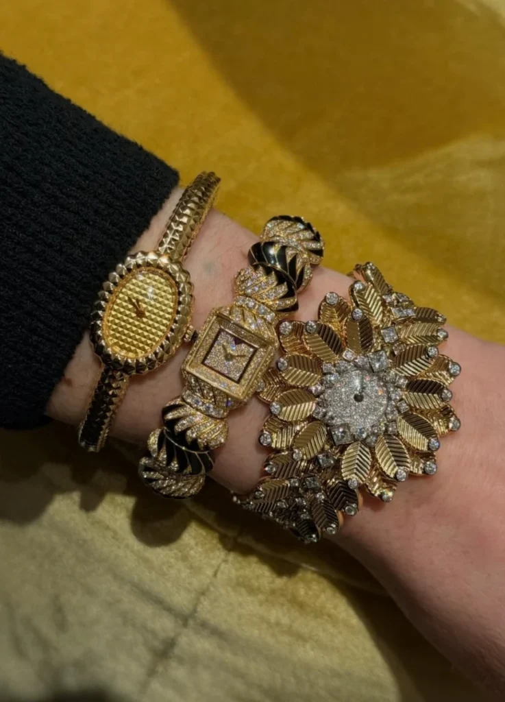
This watch does not coexist easily with other strong jewelry on the same wrist.
Visual density alone does not explain it. A tennis bracelet or a bangle operates as a line — it can share a wrist with other linear pieces. The Grain de Café watch operates as a surface. Adding another bracelet to the same wrist either crowds the structure or breaks its coherence.
Solo wear is the strongest configuration. If balance is needed, the opposite hand can carry a restrained ring or a very thin bangle. The watch itself is already a complete statement. One wrist, one structure. That is the composition.
⸻
@sandrinemerle / Instagram
Who This Watch Is For
1) Someone who wants time contained within jewelry, rather than jewelry added to a watch.
2) Someone drawn to structures that expand across the body rather than anchoring at a single point.
3) A wearer who values decorative density but expects that density to maintain architectural clarity — ornament that holds its structure rather than dissolving into sparkle.
The Grain de Café watch can look like a floral motif at first glance. It is not romantic in practice. It is deeply calculated. Each bean module repeats, but the whole settles into a territory that is neither botanical nor geometric. It sits in between — exactly where Cartier has always operated best. Borrowing from nature without committing to naturalism. Using decoration without depending on decorativeness.
@sandrinemerle / Instagram
Why It Matters at Watches & Wonders 2026
Watches & Wonders is an event that gravitates naturally toward technical complication, mechanical ambition, and traditionally masculine horological language. Cartier’s decision to place a jewelry watch at the center of its showing carries a message.
Watchmaking’s center does not have to sit with mechanical complexity alone. The relationship between form and body, the hierarchy of decoration and function, the contemporary translation of a jewelry heritage — these are equally valid subjects within horology. The industry noticed. The Grain de Café watch drew attention precisely because it proposed a different axis for the conversation.
Cartier has never made watches as watches alone. At Watches & Wonders 2026, that tradition continued with precision.
⸻
Final Reflection
The Grain de Café watch does not place time on the wrist. More precisely, it is a surface architecture carrying time.
Like all such objects, it is not for every wrist.
On the right one, however, it comes alive with more conviction than most watches can claim.
The question this object reframes is not “how do you read time” but “how do you place a curve.” Whether to lay a line on the wrist, unfold a surface across it, or let light disassemble structure entirely. The answer determines not just how the watch looks, but how it exists.
And that difference — between wearing a watch and inhabiting one — is where the Grain de Café begins.
@tattedjam / Instagram
Featured Image via @worldtempus / Instagram
[ Related Editorials ]