The flower has always been one of the most fundamental languages of Van Cleef & Arpels.
If Alhambra functions as a symbol—almost a graphic sign—Flowerlace belongs to a different register altogether. It does not signify. It forms.
The newly introduced Flowerlace Yellow Gold collection marks a quiet but meaningful shift. Rather than extending the maison’s traditional high-jewelry narrative, this release recalibrates it—bringing sculptural clarity into a scale and structure designed for daily wear.
What emerges is not a “softer” flower, but a more deliberate one.
1. Craft as Structure
How Volume Replaces Ornament
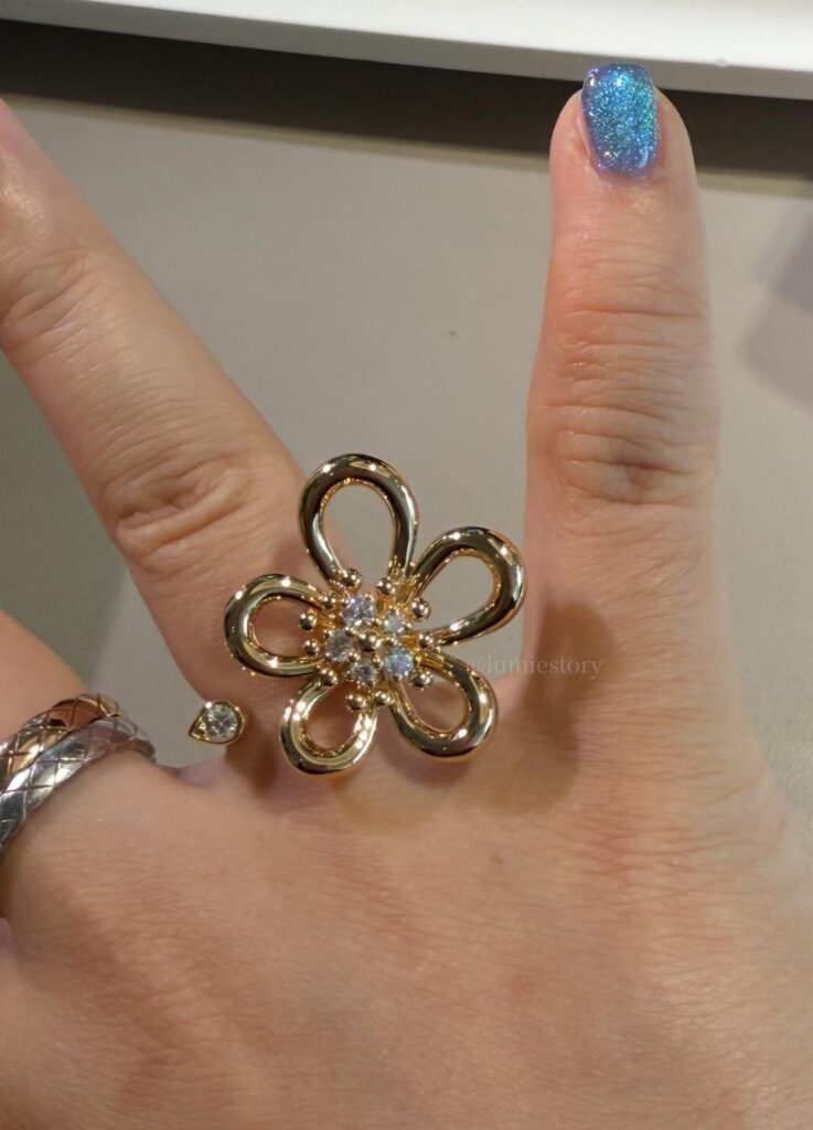
Flowerlace is built, not adorned.
Each piece is shaped through lost-wax casting, a time-intensive technique that allows Van Cleef & Arpels’ ateliers to control curvature at a level mechanical processes cannot achieve. The emphasis here is not surface detail, but spatial coherence:
- Petals with controlled asymmetry
- Convex volumes that hold light rather than scatter it
- Hand-polished surfaces that preserve depth, not glare
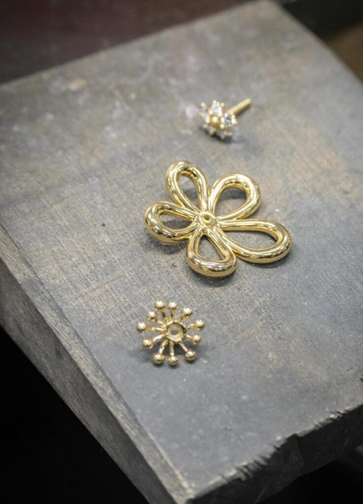
Industry reviewers have noted that this collection feels closer to object design than traditional floral jewelry. The flower does not bloom outward—it stabilizes inward.
In other words, the beauty of Flowerlace lies less in its motif than in its engineering of curves.
2. Why Yellow Gold Came First
Although Van Cleef & Arpels is historically balanced between white and yellow gold, the decision to launch Flowerlace exclusively in yellow gold is telling.
From a structural perspective, yellow gold supports volume without flattening it. The metal retains visual weight, allowing the layered petals to read clearly even at smaller scales. In contrast, white gold—particularly when rhodium-plated—can sometimes dilute dimensional contrast in sculptural designs.
Editorial consensus across European jewelry press highlights two reasons for this choice:
- Optical density
Yellow gold enhances shadow and contour, reinforcing the flower’s three-dimensionality. - Material continuity
The high-polish finish amplifies warmth, aligning Flowerlace with Van Cleef’s artisanal legacy rather than contemporary minimalism.
This is not decorative nostalgia—it is structural logic.
3. Compatibility Analysis
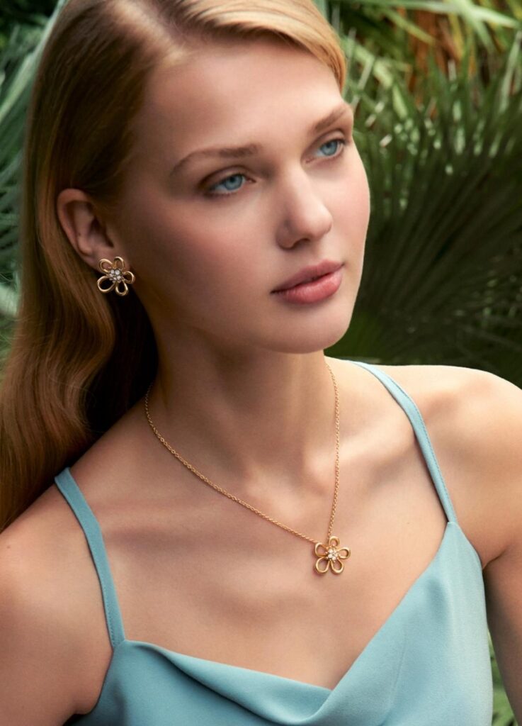
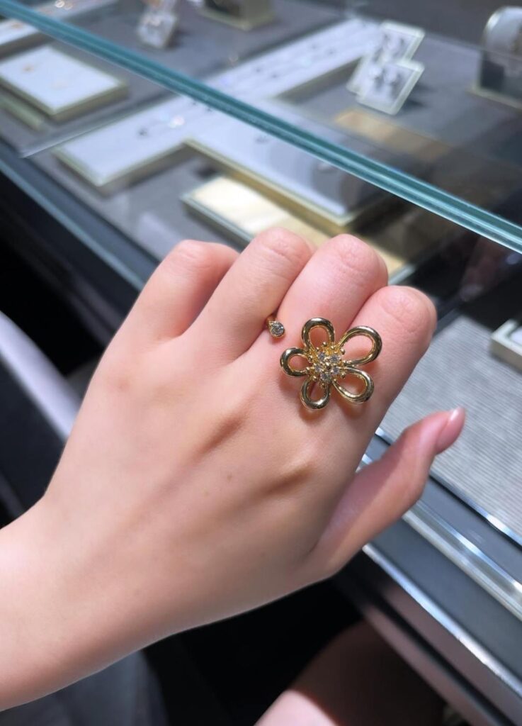
How Flowerlace Interacts With the Hand
One recurring point in collector forums is that Flowerlace photographs “softer” than it wears.
In reality, its impression is quietly architectural. As a result, compatibility depends less on personal style and more on physical structure:
- Finger length and spacing
- Knuckle prominence
- Wrist curvature
- Visual tolerance for negative space
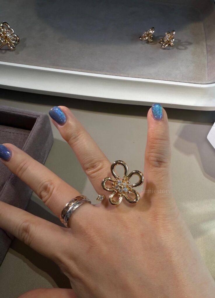
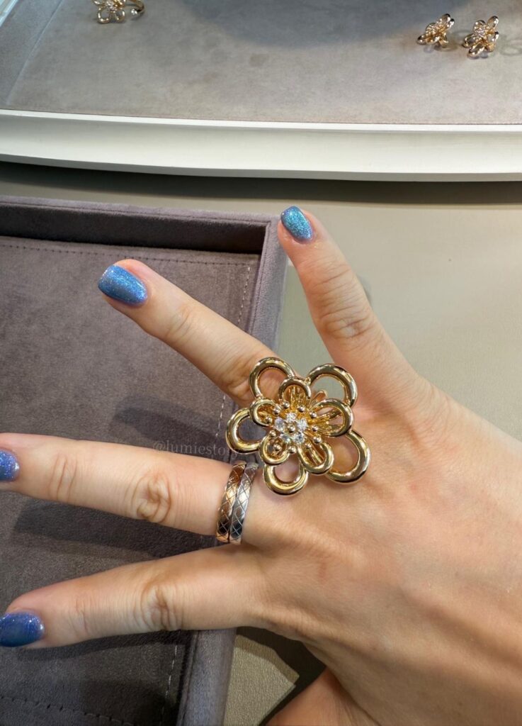
The Between-the-Finger Ring, in particular, has drawn attention for how effectively it creates visual elongation. The open structure introduces air between forms, allowing fuller or shorter fingers to appear more balanced.
That said, this design is not universally preferable. For formal settings or conservative wearers, the single Flower Ring offers greater visual stability and restraint.
One limitation remains widely acknowledged:
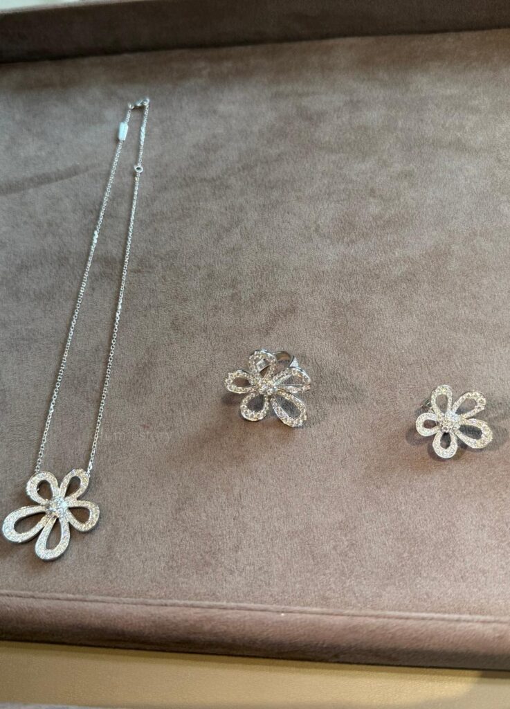
The yellow-gold-only execution strongly favors warm undertones. Cooler skin tones often report a desire for a future white-gold version—a move that could significantly broaden the collection’s appeal.
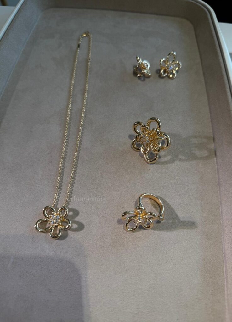
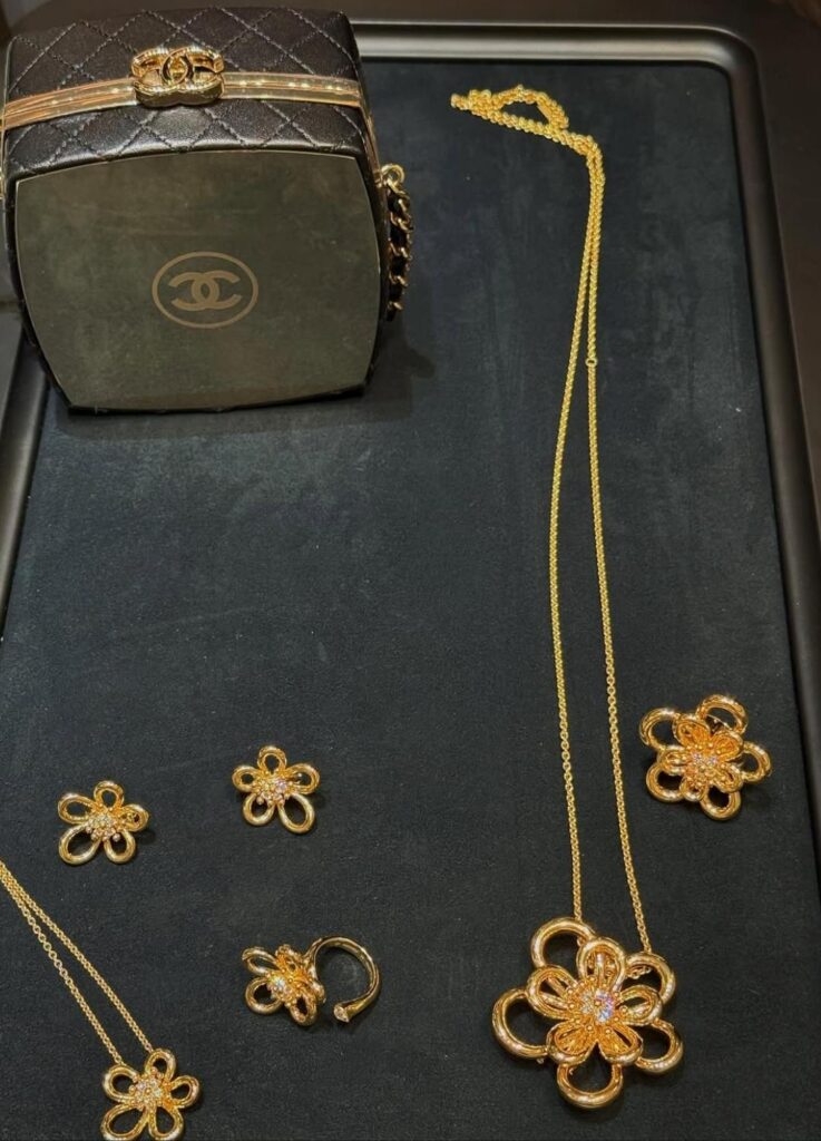
4. Model Overview & Wear Impressions
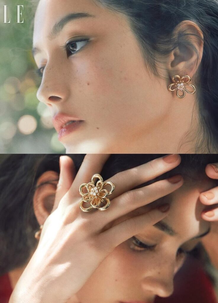
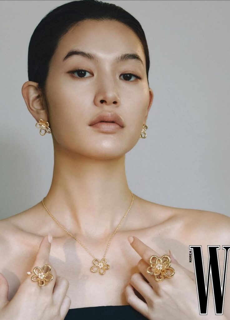
- Flower Ring
The most classical expression. Centered, calm, and visually contained.
- Between-the-Finger Ring
The most sculptural piece. Spatial rhythm, strong presence, and a clear design statement.
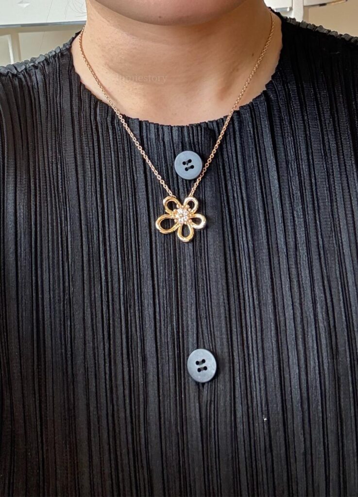
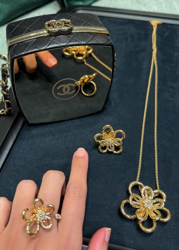
- Pendant Necklace
Understated and versatile. Leaves a controlled trace of light along the neckline. - Clip Pendant (2-way)
Highly adaptable. Favored by stylists for its ability to move between jewelry and garment accent. - Earrings
The least dramatic, but structurally precise. Dimensional without excess.
5. From High Jewelry to Everyday Sculpture
Earlier Flowerlace creations belonged firmly to high jewelry—visually rich, but contextually narrow.
This yellow gold collection is engineered differently:
- Reduced weight
- Controlled reflectivity
- Lower visual noise
The result is jewelry that does not announce itself. It settles.
Several editors have described the line as “elegant without iconography”—a notable departure from Alhambra’s instantly recognizable presence.
6. Market Reception: Quiet Strength, Limited Expansion
Critically, Flowerlace is well received. Commercially, it is selective.
Strengths
- Exceptional sculptural integrity
- Expanded wearability compared to high jewelry
- Distinct artisanal identity within the VCA lineup
Constraints
- Strong dependence on skin tone
- Lack of immediate symbolic shorthand
- Greater appeal among existing collectors than first-time buyers
Forum discussions frequently describe it as “refined, but not urgent.”
This positions Flowerlace less as a mass icon and more as a long-form collection—one that matures with its wearer.
Closing Reflection
When Warmth Becomes the Message
Yellow gold is not simply luminous—it is thermal.
When Flowerlace rests on the hand, its warmth precedes its form. The open structures invite space; the closed ones offer calm. Either way, the emotion arrives gradually, then remains.
For the right wearer, this collection may resonate more deeply than far bolder high jewelry ever could. Not because it dazzles—but because it holds.
A single golden flower, engineered rather than romanticized, moving quietly through seasons.
Its presence is not measured in brilliance, but in temperature.
And sometimes, that is what lasts longest.
[ Related Editorials ]