The Dior Book Tote has never tried to be discreet.
From the beginning, it was less about function and more about surface—
a canvas where the house could decide what deserves to be seen.
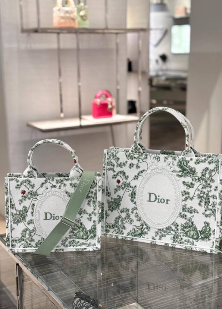
For Spring/Summer 2026, that surface becomes a garden.
Not a sentimental one, but a constructed one.
Vines establish structure.
Lily of the valley leaves traces of meaning.
And Dior by Dior closes the composition like a final line of text.
This season’s Book Tote speaks in two visual languages:
Garden and Graphic.
Together, they reveal how Jonathan Anderson thinks about embroidery—not as decoration, but as editorial design.
Two Surfaces, One Intention
Garden and Graphic as Parallel Languages
What defines the 26SS Book Tote is not a single motif, but a deliberate split.
- Garden / Botanical: embroidery that translates nature into ornamented structure
- Graphic / Typographic: surfaces treated like book covers, ruled by text, borders, and spacing
This is not about expanding options.
It is about redefining what the Book Tote is allowed to say.
Not “Is it pretty?”
But “How does it direct attention?”
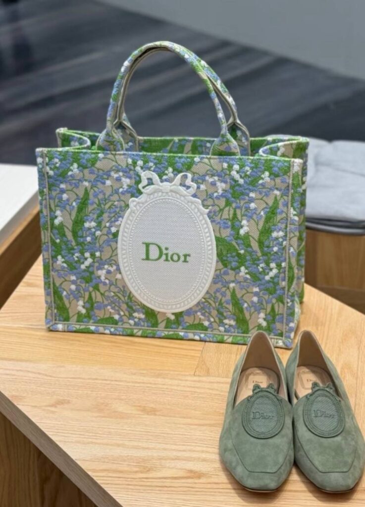
A. Garden: When Nature Becomes Structure
The botanical line is not driven by flowers themselves.
Its real subject is control.
Frames, borders, medallions, scale—
these are the elements that prevent nature from drifting into sentimentality.
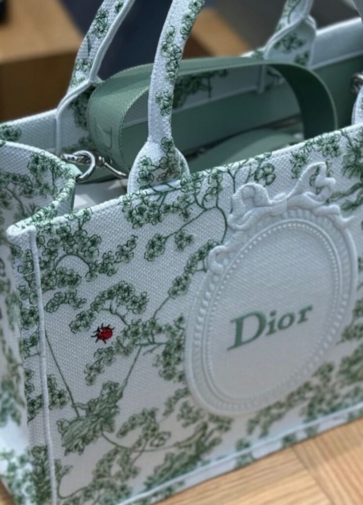
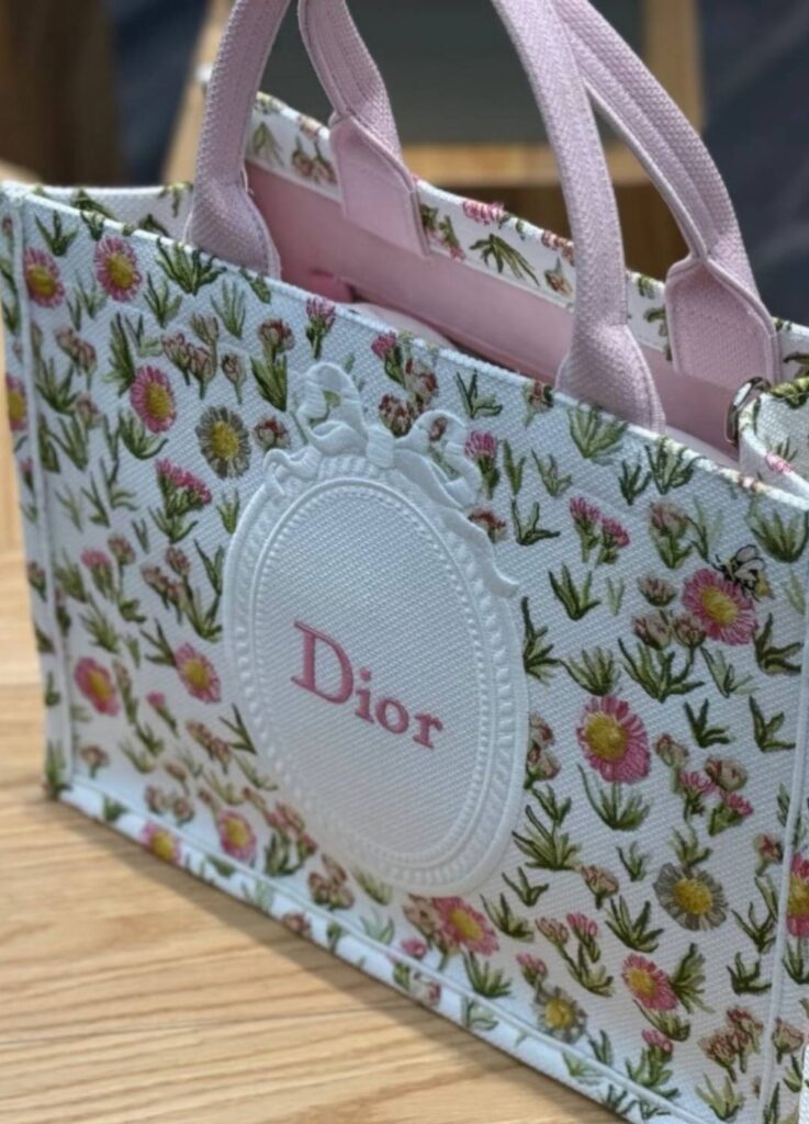
1. Central Medallion and Bow Frame
A cameo logic, not a romantic gesture
At the center sits an oval medallion, topped with a bow-shaped frame.
This is closer to the grammar of antique cameos or medal plaques than to anything floral.
- The oval establishes authority and hierarchy
- The bow functions as a closure, not embellishment
- The logo is anchored, not floating in decoration
Plants may surround the surface, but the center is firmly tied.
This is why the garden never feels excessive.
Nature is present, but never in charge.
2. Vines and Botanical Scale
More specimen than landscape
Look closely at the vines and leaves.
They do not scatter. They repeat.
Spacing is consistent.
Density is measured.
The effect is closer to a botanical plate than a meadow.
Instead of emotional abundance, the embroidery offers order.
A garden designed for display, not wandering.
This restraint is what keeps the piece classical rather than romantic.
B. Graphic: Turning the Tote into a Book Cover
Running parallel is the graphic line—
a completely different way of reading the same object.
Here, typography comes before texture.
Borders frame the surface like margins.
Negative space breathes.
If the garden line persuades through the time of craft,
the graphic line persuades through the clarity of composition.
Garden is about making time visible.
Graphic is about making meaning immediate.
Why Both Exist in the Same Season
Their coexistence is intentional.
Some look to the Book Tote for density and ornament.
Others want a decisive visual statement.
Dior does not force a choice.
Instead, it lets the tote speak in two dialects.
The garden addresses the observer.
The graphic addresses the editor.
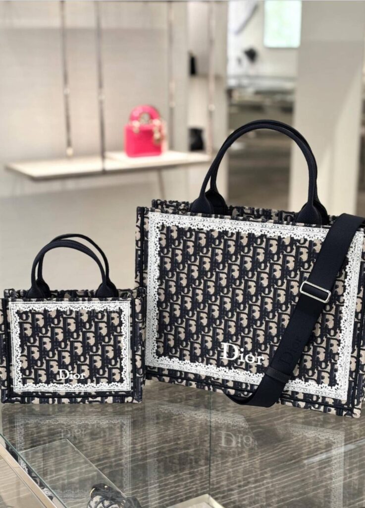
The Vine as the Season’s True Motif
Across variations, one element dominates: the vine.
It is not expressive, and it is never central.
It connects, frames, and restrains.
The vine outlines the surface without crossing into the medallion.
It supports hierarchy rather than competing with it.
This is why it feels like the true seasonal motif.
Not a flower, but a structure that allows everything else to exist in balance.
Lily of the Valley and Florals
Meaning, Not Main Character
Placed above the vines are lilies of the valley and small floral accents.
They do not define the surface—they sign it.
For Dior, lily of the valley is not decorative.
It is personal.
Christian Dior kept it as a talisman, a private symbol of luck.
In embroidery, it remains understated.
Small. Quiet.
Recognizable only to those who know.
These florals are not there to impress.
They anchor memory to structure.
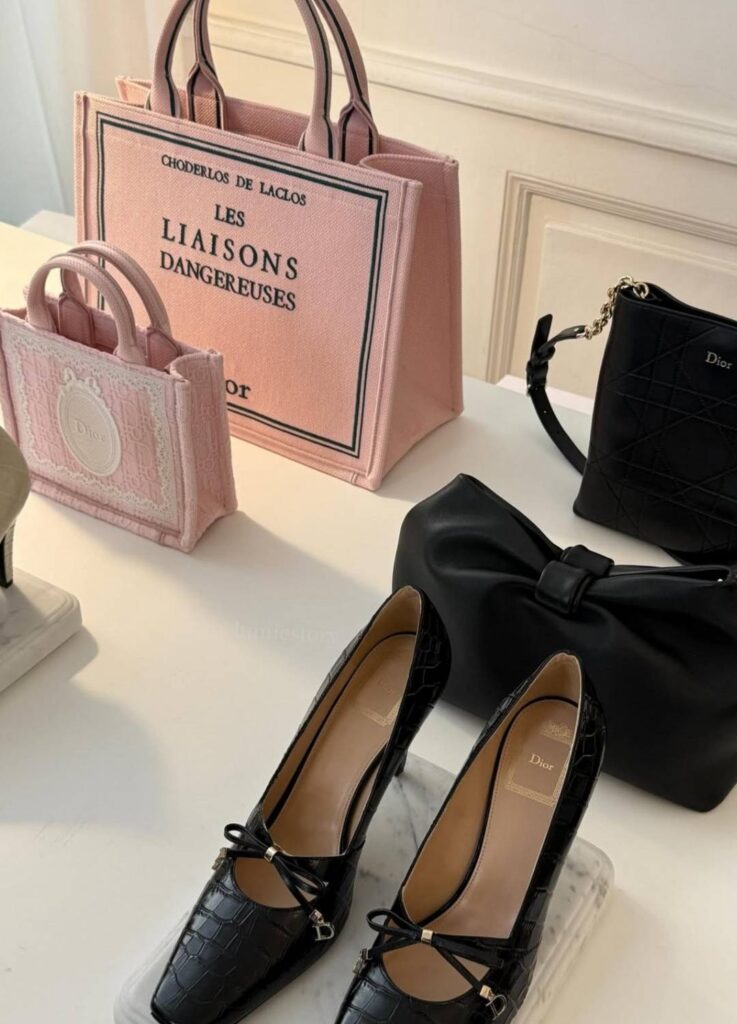
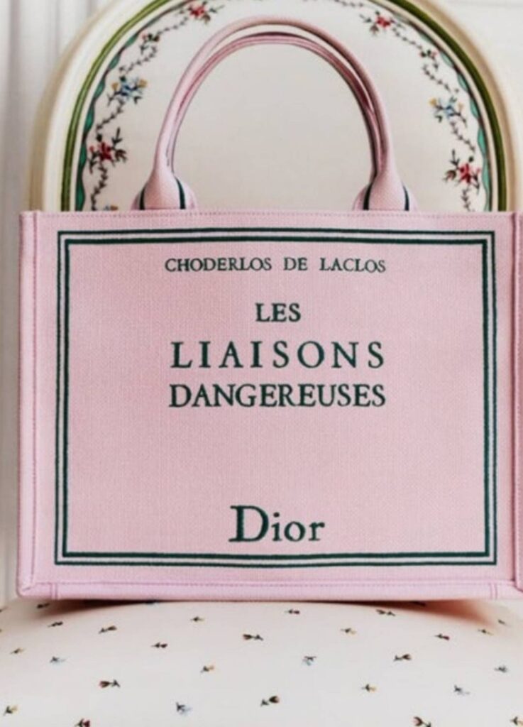
Les Liaisons Dangereuses
When Text Carries the Weight of Meaning
Printed across the surface,
Les Liaisons Dangereuses is not just a literary reference.
It is a thesis.
The novel is about elegance as strategy—
about relationships that appear refined while operating as systems of control.
Fashion works similarly.
Clothes and bags create relationships:
between wearer and viewer,
brand and consumer,
identity and aspiration.
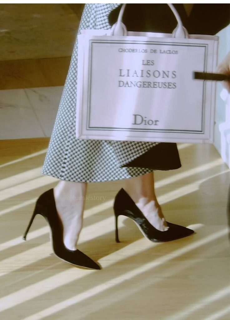
This Book Tote assumes those relationships are never neutral.
Beauty persuades.
Persuasion holds power.
And power is rarely innocent.
This is why the pink version does not feel sweet.
It feels precise.
When Anya Taylor-Joy carried this tote,
it read less as romance and more as authorship—
a conscious choice to command the narrative.
Here, text does not decorate time.
It declares meaning already fixed.
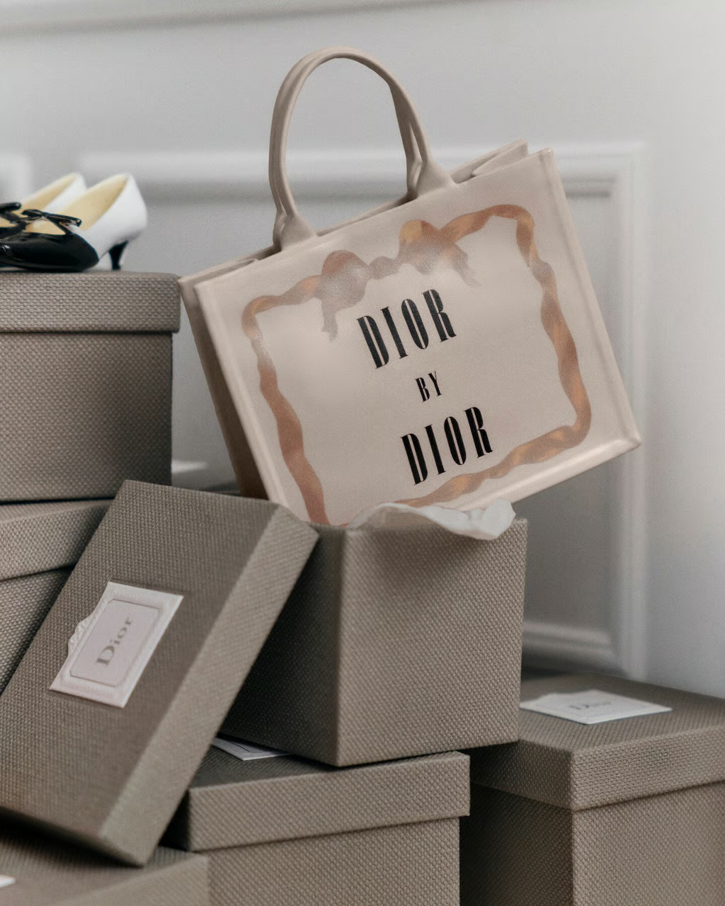
Dior by Dior: Closing the Surface
And finally, the most decisive statement.
Dior by Dior.
Not nature.
Not craft.
A signature.
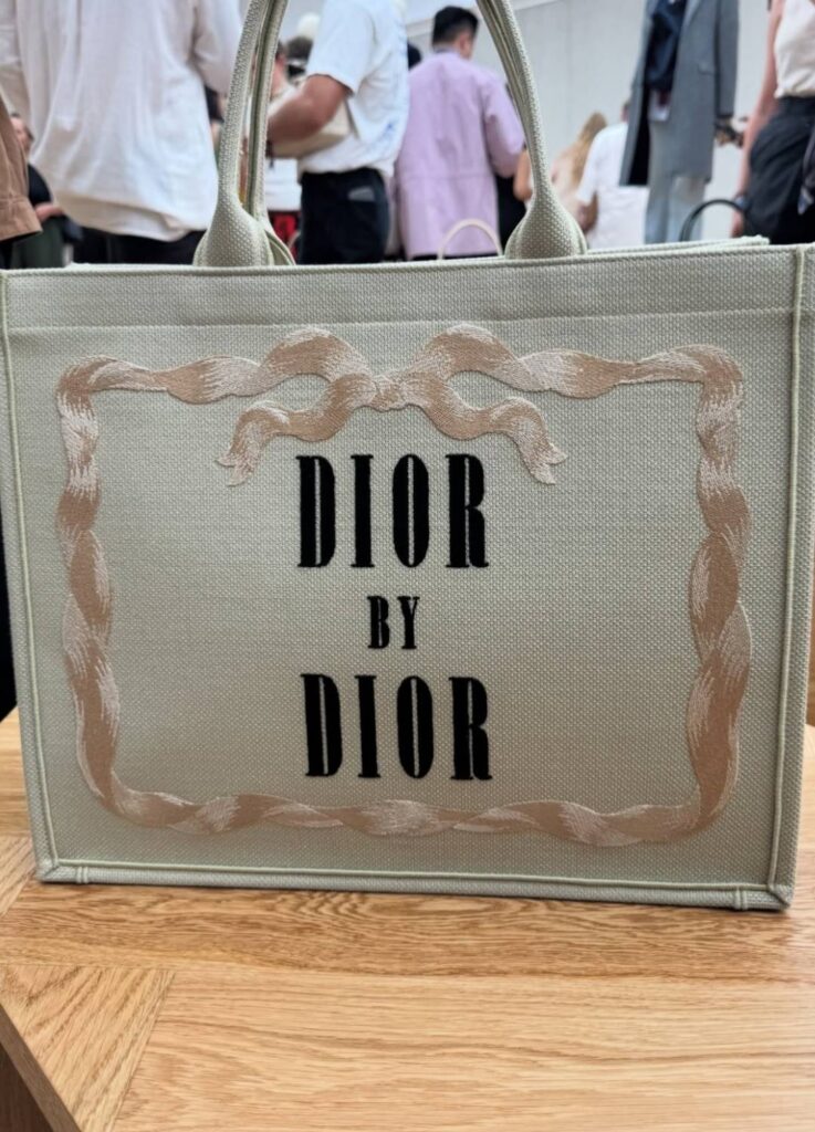
Originally the title of Dior’s own memoir,
the phrase functions like an author credit.
Everything before it—the vines, florals, embroidery—
becomes context.
The garden does not speak last.
The name does.
A Quiet Conclusion
The 26SS Dior Book Tote does not romanticize nature.
It builds structure with vines,
leaves memory through lily of the valley,
and closes the surface with a name.
Its strength is not beauty, but editing.
Less a bag, more a cover—
a carefully composed surface where Dior rewrites itself, once again, in full view.
[ Related Editorials ]