Inside Bottega Veneta 26SS
Louise Trotter showed her debut Bottega Veneta collection at Milan Fashion Week in late September 2025. The show worked at a measured tempo — Trotter studying the house’s vocabulary before adding to it.
The collection didn’t break with what came before. It read more as a careful adjustment of Bottega’s existing material language: intrecciato leather as the constant, texture and structure as the elements being adjusted.
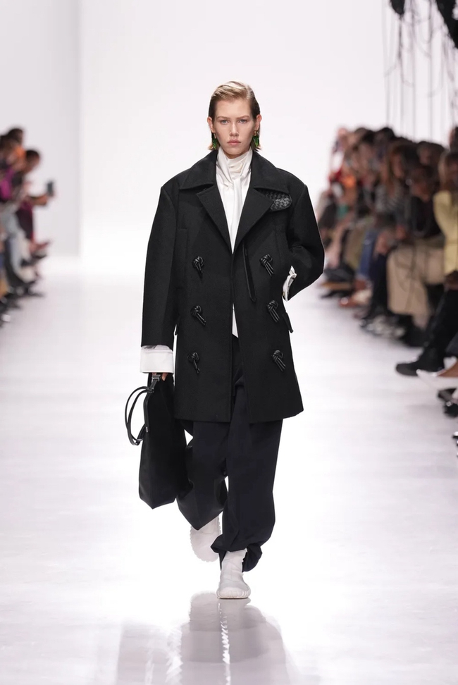
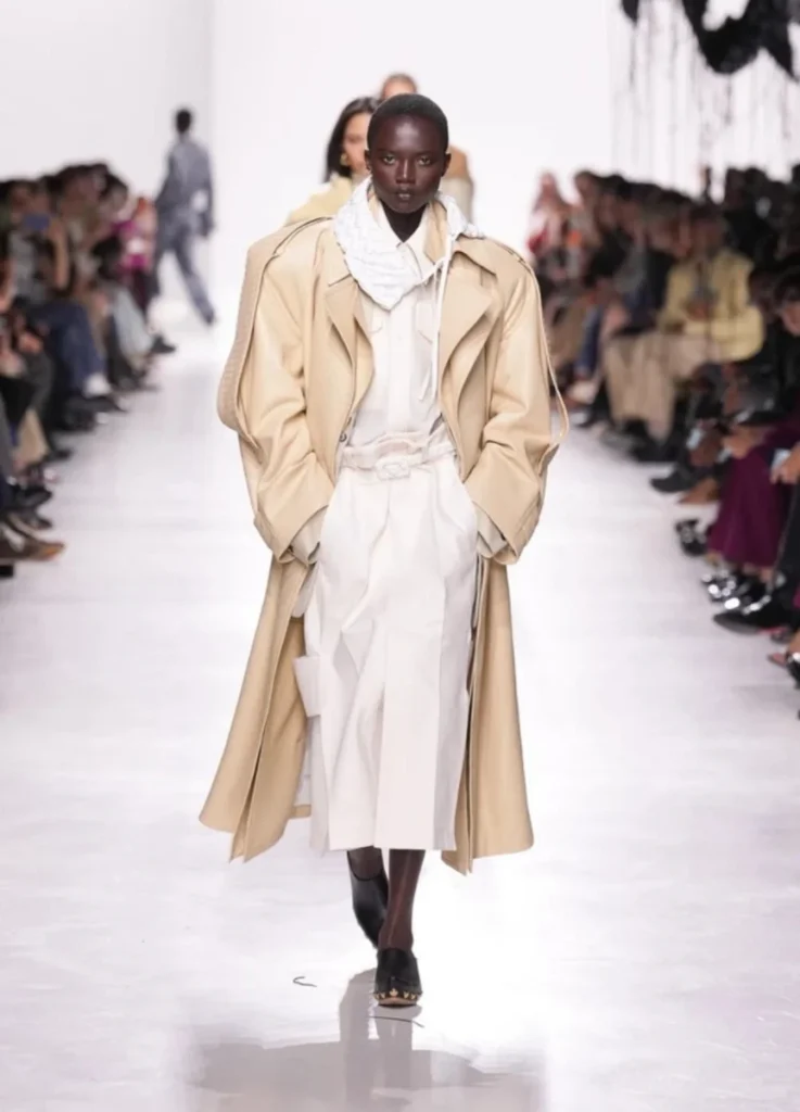
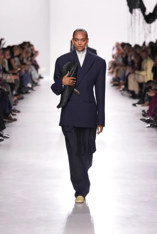
The show opened in stark monochrome — black and white stripped of sentiment — before slowly introducing moss greens, buttered neutrals, and finally select bursts of color. The progression built tension at a measured pace, with Trotter taking her time before letting color in.
Trotter’s Reading of the House
Trotter, announced as Bottega Veneta’s creative director in early 2025, arrives from Carven and Lacoste — labels where practicality and design sensibility have coexisted in her work.
Her first Bottega outing doesn’t try to overwrite the house’s legacy. The collection studies it closely instead.
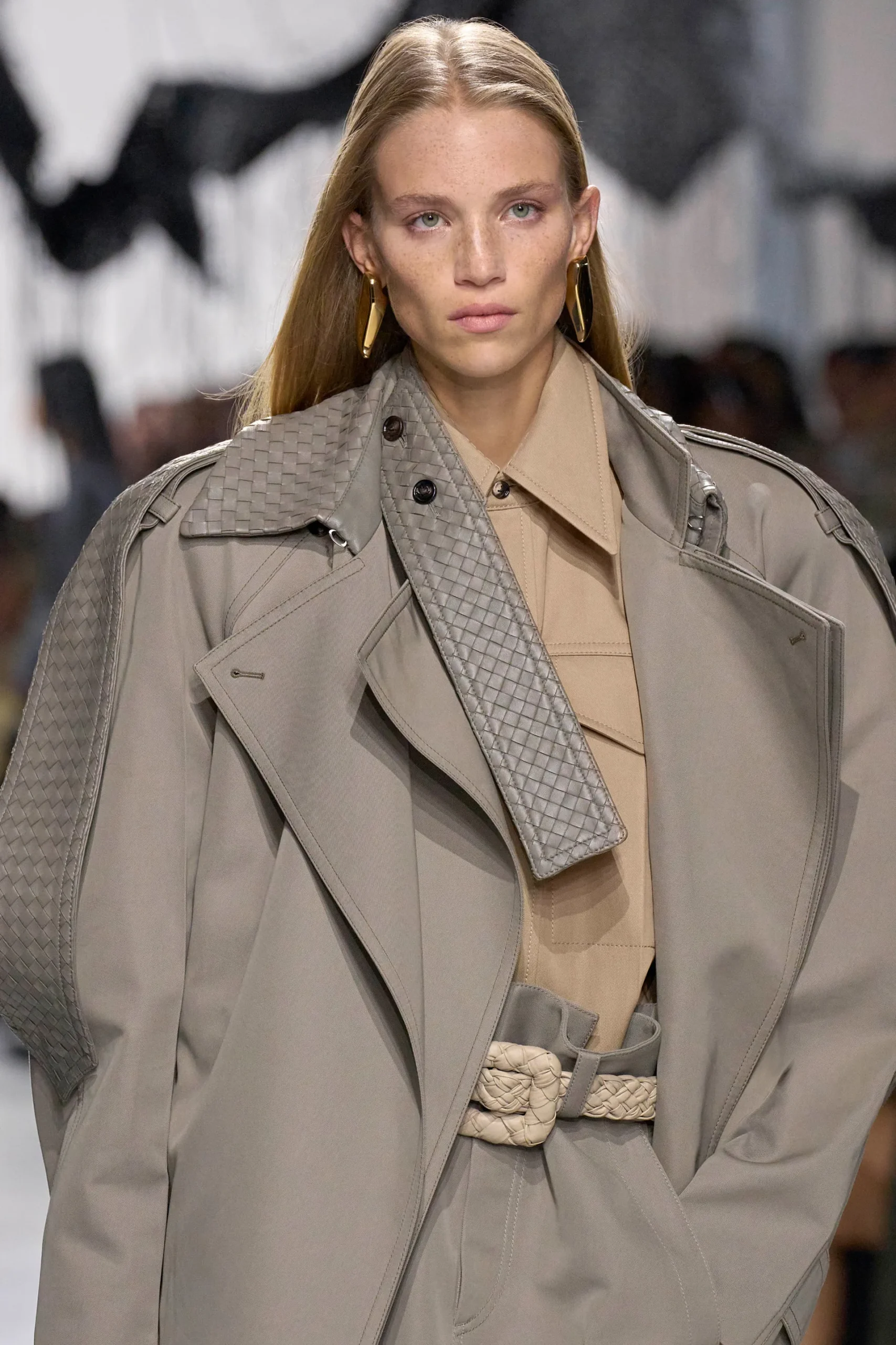
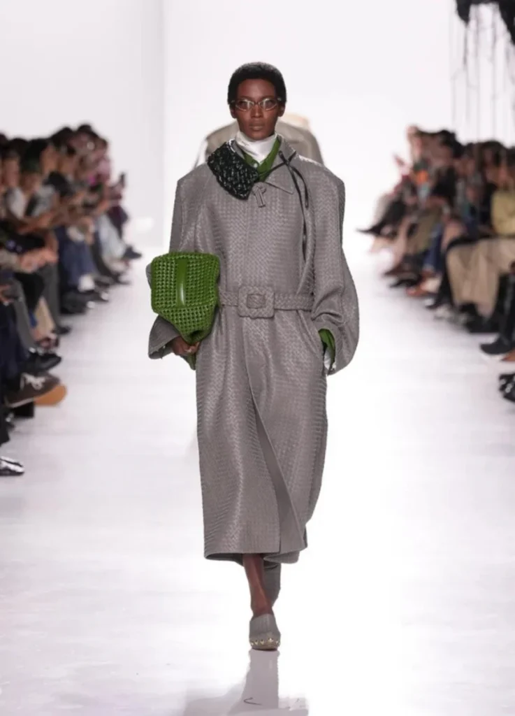
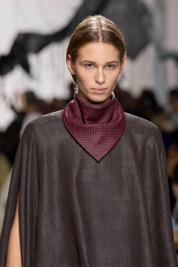
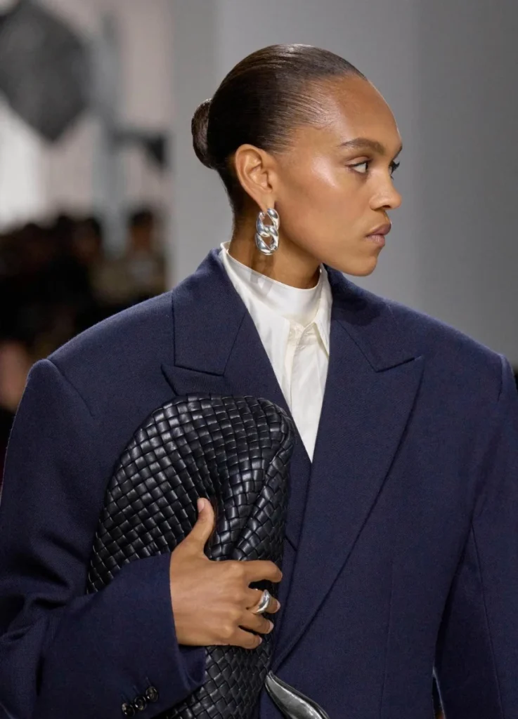
Intrecciato runs through the collection as structural language — bent, layered, sometimes obscured, but always present.
WWD called it a “solid beginning” with intrecciato craftsmanship at the center. Elle wrote favourably about the early monochrome sequence and the way color and texture moved through the show. Marie Claire pointed to the invitation-object detail as a sign of how thoroughly the heritage was held in the room.
Key Ideas │ Visual Grammar
1. Texture in Tension
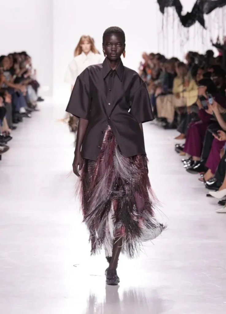
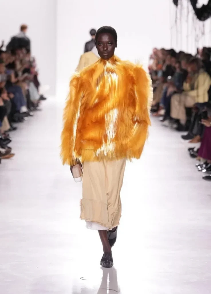
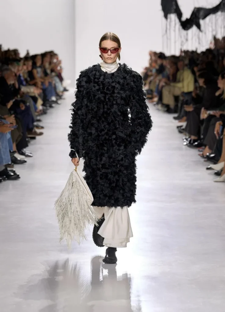
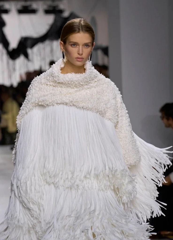
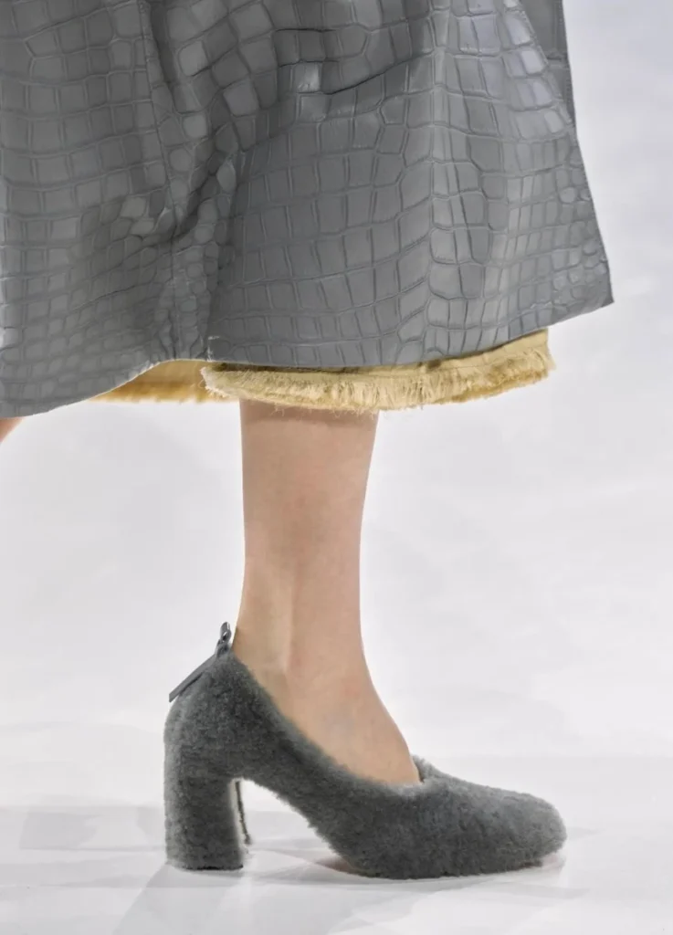
Heavy leather met lighter, less stable elements — fringe, frayed hems, panelled construction that moved with the body. The contrast set up friction: heavy materials moving in one direction, lighter elements pulling in another.
The contrast carried the meaning — the materials interacted through the friction itself.
2. Monochrome as Foundation
The early black-and-white looks set the framework. The looks were minimal and composed, settling the visual ground before any color arrived.
When the colors came — sea-moss green, softened butter tones, and select saturated accents — they arrived as deliberate additions to a controlled palette.
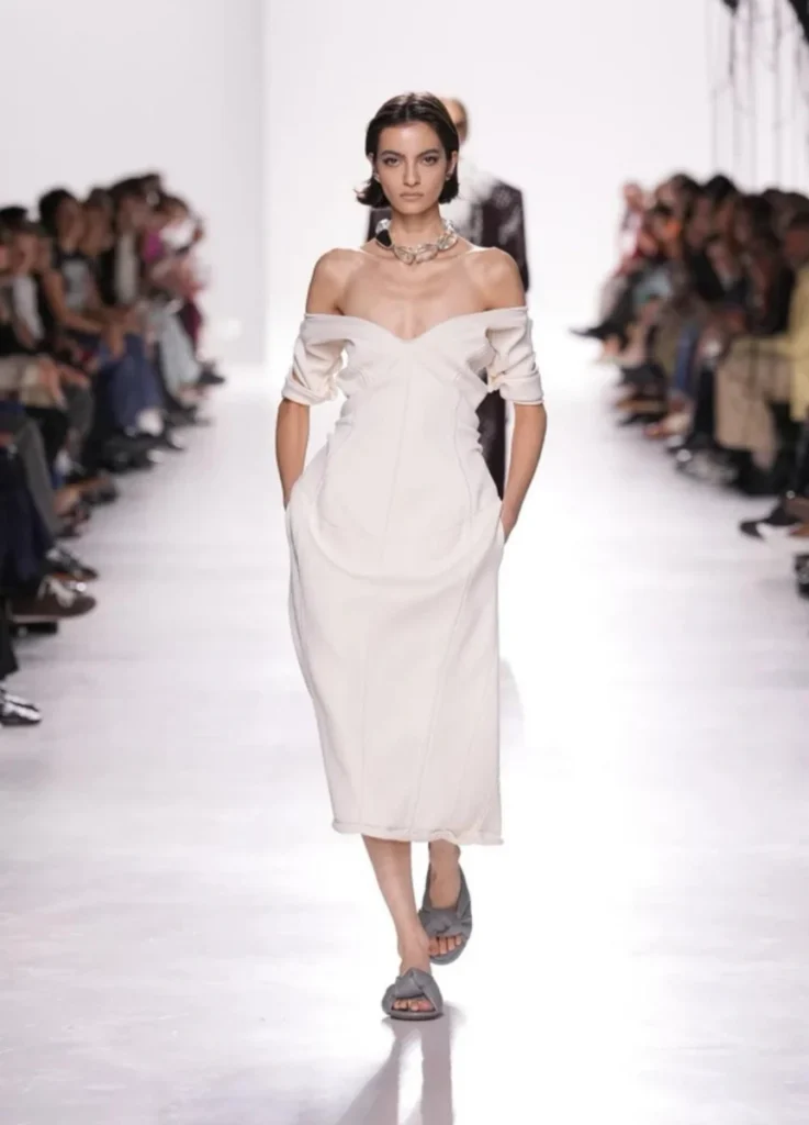
3. Structure without Excess
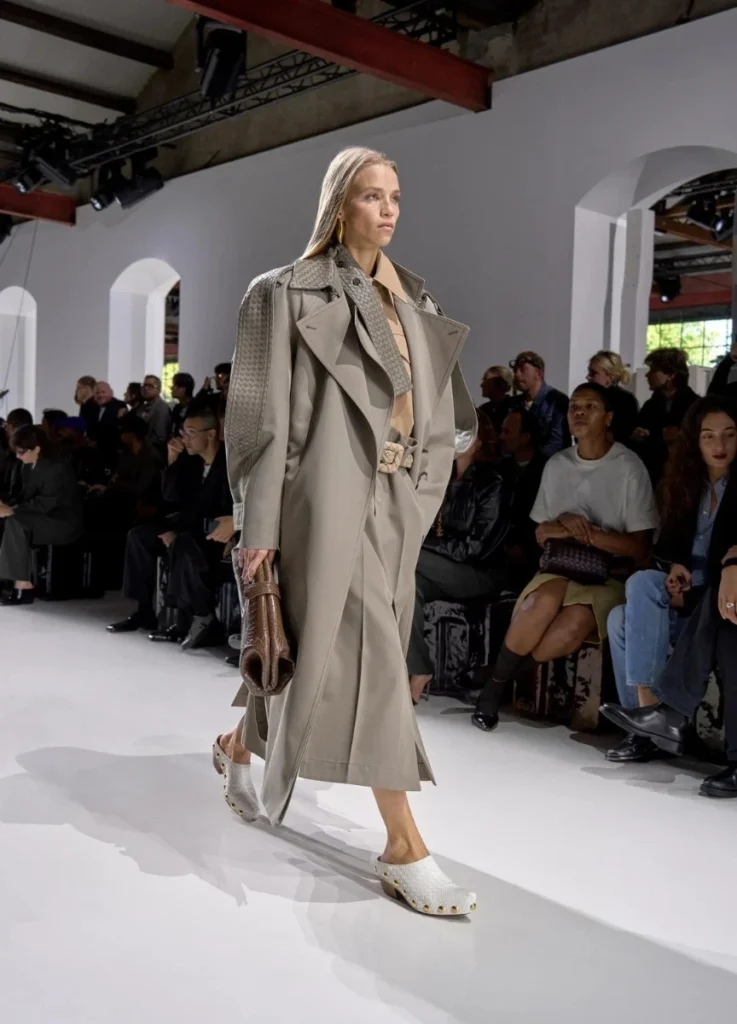
Silhouettes stayed disciplined. There was no overt drama, no exaggerated architecture. Proportion did the work instead.
Straight shoulders, elongated lines, and subtly adjusted volumes stayed close to Bottega’s most recognizable register — discipline carrying elegance.
The balance between feminine register and the harder structural lines was particularly clean. Lines stayed sharp on the surface, but the construction kept softer detail inside.
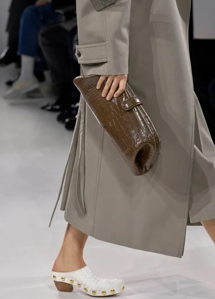
4. Accessories as Continuation
Bags and clutches worked as extensions of the garments, never punctuation marks added afterward. Knot details and intrecciato closures echoed the clothing’s logic, blurring where attire ended and object began.
Models walked with clutches held close under the arm. The gesture pulled the bag inside the silhouette, making it part of the visual discipline of the look.
In Conversation with The Row
The Row comes up in any close reading of this collection. The shared territory makes the comparison hard to avoid.
The monochrome palette, the reliance on material presence, the restraint around ornament — these are familiar minimalist territory.
But the distinction reads clearly.
The Row works through dryness and tension. Bottega leans into weight and tactility. Italian sensibility shows up through fringe that moves, coats that cast shadows, and a late-show red dress that drifts across the runway.
Both houses work in minimalism, but with different accents. The Row works minimalism with edge and dryness. Bottega works it with weight and Italian tactility.
Key Looks │ How They Read
- Monochrome Opening Look
The opening look distilled the season’s intent: clean structure, tonal discipline, classic proportion. The kind of look that doesn’t ask for attention but holds it on its own.
- Moss-Green Tailoring
Earth-toned color, softened rigidity. The moss-green sat warm without tipping into saturation, the way Bottega’s better neutrals tend to. Useful for understated wardrobes that need a single warmer accent rather than a saturated one.
- Fringed Outerwear
Movement built into the surface itself rather than the cut of the garment. The fringe carried emotional weight — and the urban-tactile mood the collection circled around.
- Knot-Detail Clutch Ensemble
Accessories integrated into the look. For wearers who think about cohesion across the silhouette before reaching for individual statement pieces.
- Single-Color Statement
A late-show red dress as concentrated focal point. Color used precisely, with the rest of the silhouette stepping back to let the red carry the look.
The conversation around the collection since the show has clustered around texture: the fringe, the frayed skirts, the oversized outerwear, and the contrast between heavy and light surfaces. From the fashion forum and community discussion I’ve seen, those are the elements that registered most clearly.
Closing │ Tradition, Re-read
Trotter’s first season at Bottega Veneta isn’t an attempt to impress through spectacle. It works by paying close attention to what the house already does well.
Intrecciato breathes here as structure, without leaning on nostalgia.
Trotter’s debut balances sensitivity with discipline, allowing for movement without losing weight.
This wasn’t a reinvention. The first season works as a reading of the house’s existing language — quieter, denser, more textural than what came before, but still recognizably Bottega.
What stays is the way the collection moved across textures and colors — tradition kept in the room and re-read with new emphasis.
All images referenced in this post are drawn from Vogue Runway.
[ Related Editorials ]