At Milan Fashion Week, Bottega Veneta opened a new chapter.
Spring/Summer 2026 marked the debut of its new creative director, Louise Trotter—and with it, a measured recalibration rather than a dramatic reset.
There were no declarations, no abrupt breaks.
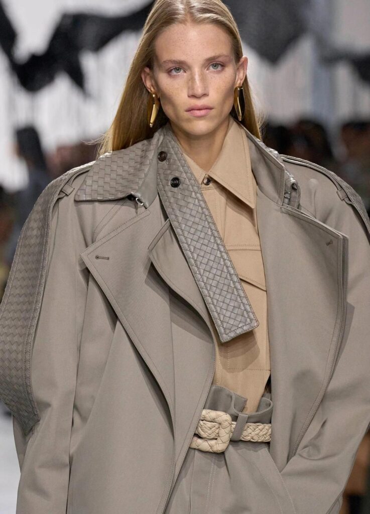
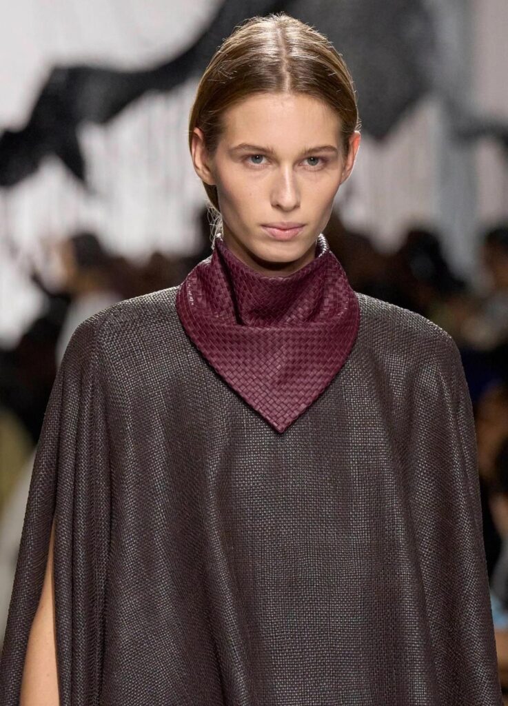
Instead, the collection unfolded as a quiet negotiation between heritage and renewal: intrecciato leather as the constant, structure and texture as the variables.
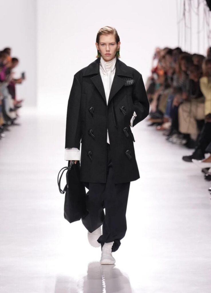
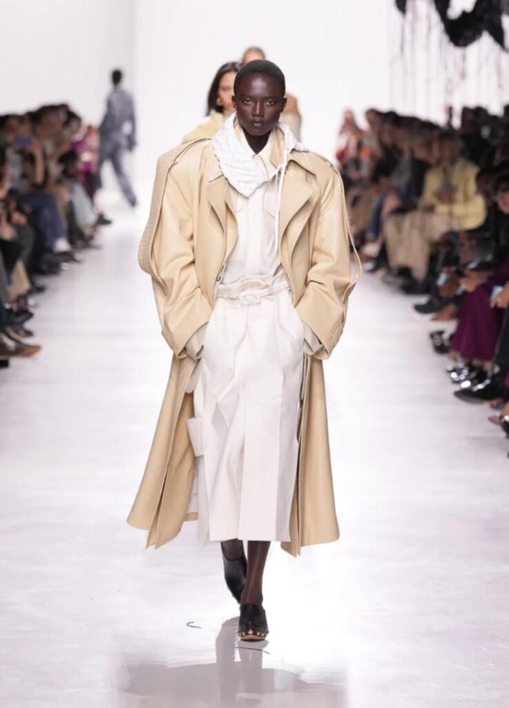
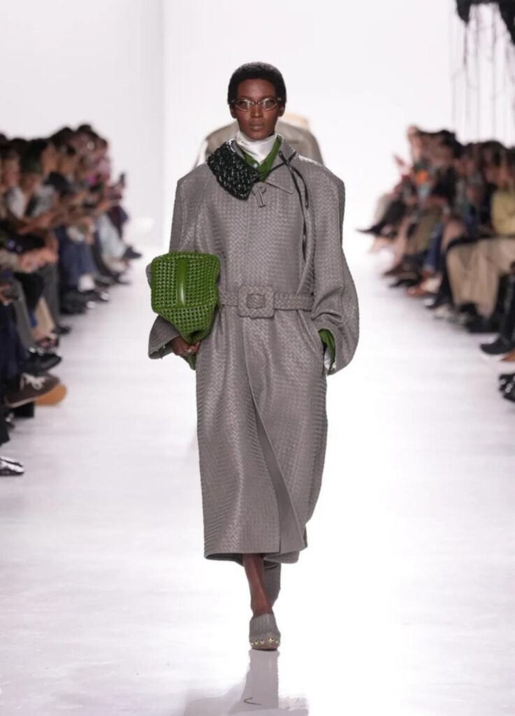
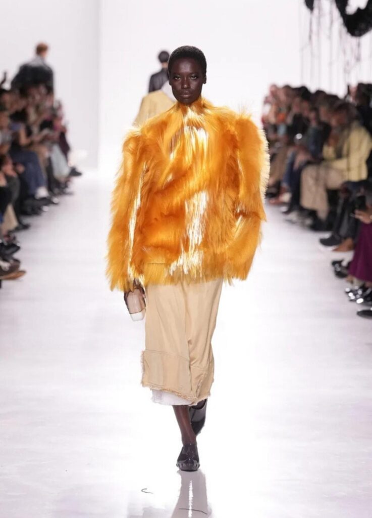
The show began in stark monochrome—black and white stripped of sentiment—before gradually introducing moss greens, buttered neutrals, and finally, concentrated bursts of color. It was a progression that built tension slowly, deliberately, as if insisting that Bottega’s future would not be rushed.
A New Voice, Tuned to the Archive
Trotter, officially announced as Bottega Veneta’s creative director in early 2025, arrives with a reputation shaped by brands such as Carven and Lacoste—labels where practicality and sensitivity coexist.
Her first outing at Bottega does not attempt to overwrite the house’s legacy. Instead, it studies it closely.
Intrecciato is not treated as a motif to be displayed, but as a structural language—bent, layered, occasionally obscured, yet always present.
Several critics described the collection as a “solid beginning.”
WWD noted the emphasis on leather craftsmanship as a sign of continuity, while Elle highlighted the coherence of the color narrative, particularly the controlled transition from restraint to expression.
Key Ideas & Visual Grammar
1. Texture in Tension
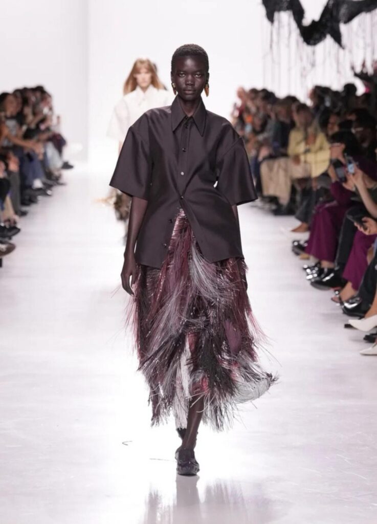
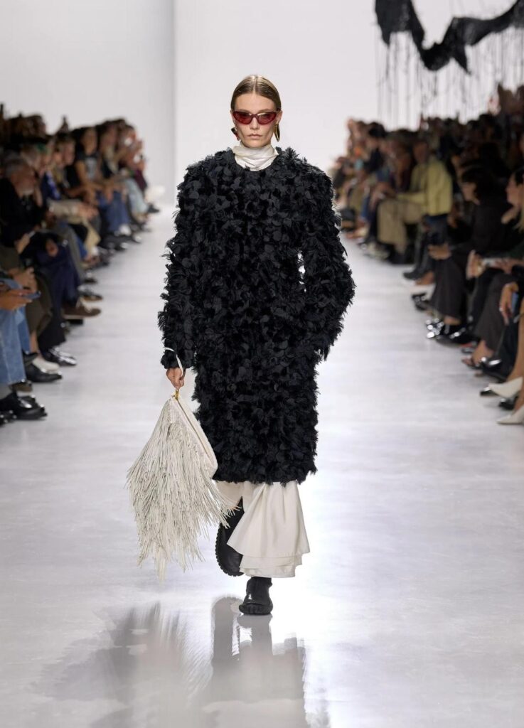
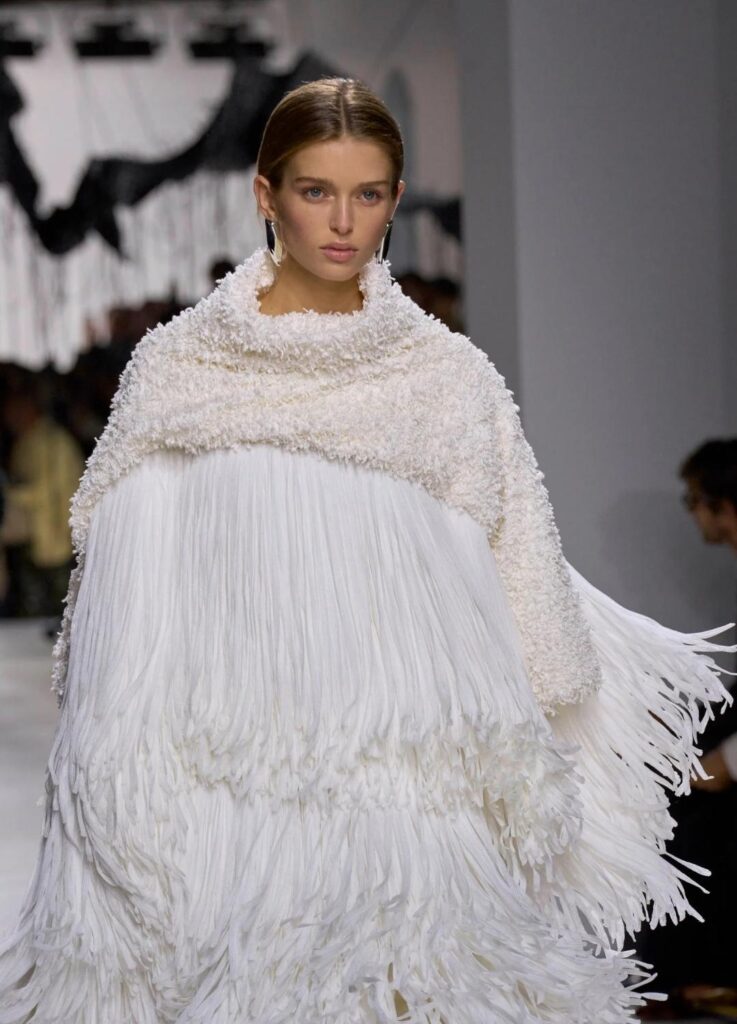
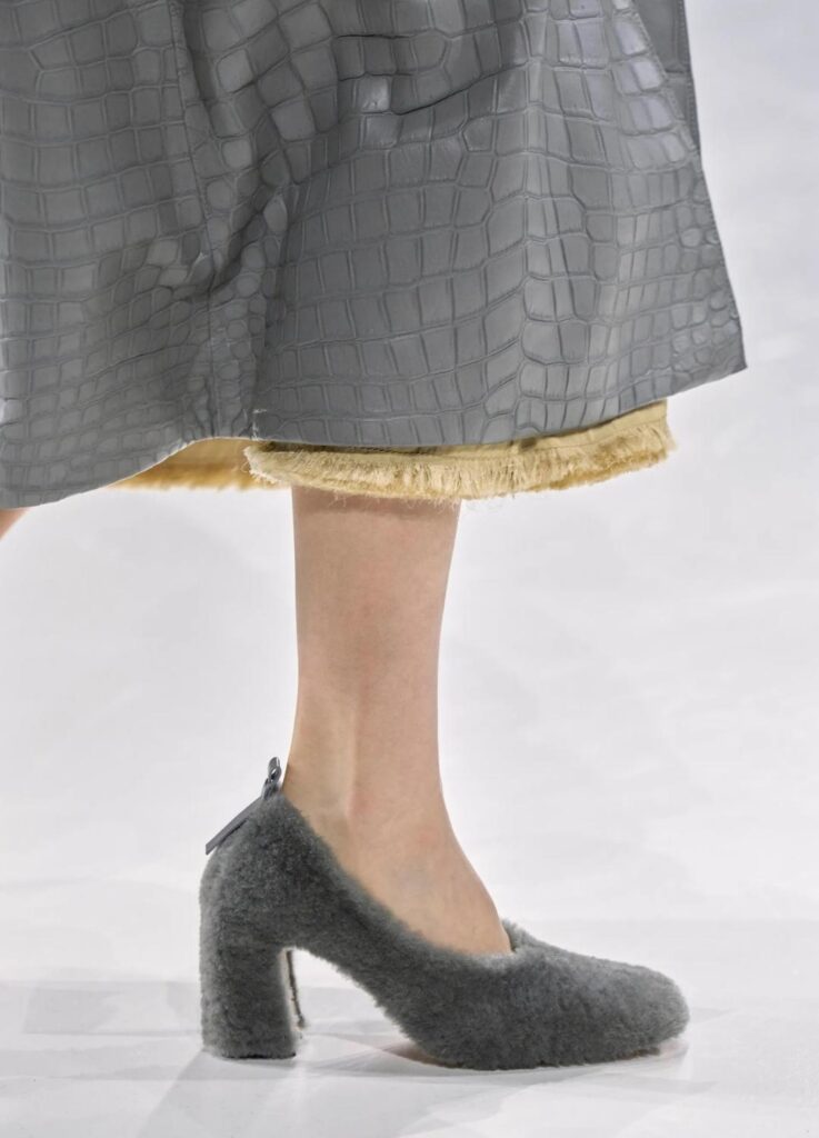
Heavy leather surfaces were set against lighter, unstable elements—fringe, frayed hems, and panelled constructions that moved with the body.
The contrast created friction: weight versus air, permanence versus motion. It was less about decoration and more about how materials converse.
2. Monochrome as Foundation
The early black-and-white looks functioned as a thesis statement. Minimal, composed, and unemotional, they clarified the framework before any color entered the room.
As hues emerged—sea-moss green, softened butter tones, and select saturated accents—they felt earned rather than indulgent.
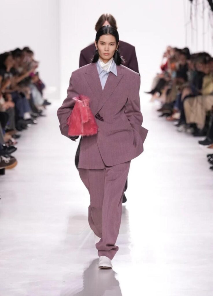
3. Structure without Excess
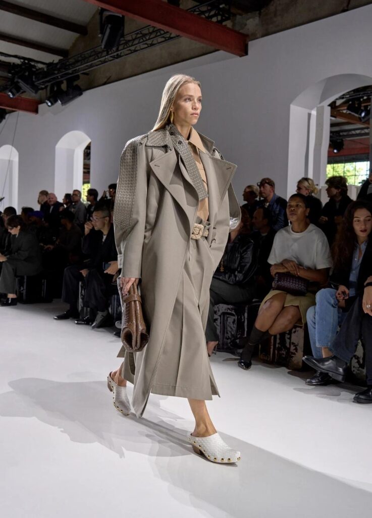
Silhouettes remained disciplined. There was no overt dramatization, no exaggerated architecture. Instead, proportion did the work.
Straight shoulders, elongated lines, and subtly adjusted volumes restored what Bottega has long done best: elegance through control.
The balance between femininity and neutrality was particularly precise—sharp lines softened from within, never announced outright.
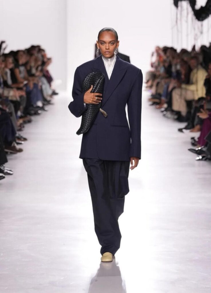
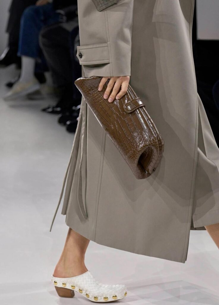
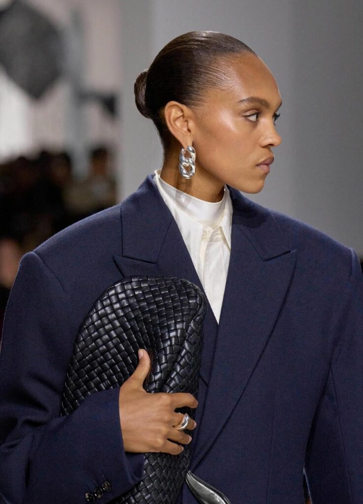
4. Accessories as Continuation
Bags and clutches were not punctuation marks but extensions of the garments themselves.
Knot details and intrecciato closures echoed the clothing’s logic, blurring the boundary between attire and object.
The recurring gesture—clutches held close under the arm—reinforced the idea that accessories were not adornments, but part of the silhouette’s discipline.
In Conversation with The Row
Inevitably, the collection invites comparison with The Row.
The shared monochrome palette, the reliance on material presence, the refusal of ornament—all echo a familiar minimalist language.
Yet the distinction is clear.
Where The Row operates through dryness and tension, Bottega leans into weight and tactility.
Italian sensibility asserts itself through fringe that moves, coats that cast shadows, and a late-stage red dress that drifts rather than stands still.
Both brands speak minimalism, but with different accents.
The Row favors silence sharpened to an edge; Bottega chooses density within restraint.
Five Key Looks & How They Read
- Monochrome Opening Look
Clean structure, tonal discipline.
For those drawn to quiet authority and classic proportion. - Moss-Green Tailoring
Nature-inflected color, softened rigidity.
Neutral yet warm, especially suited to understated wardrobes.
- Fringed Outerwear
Movement introduced through texture, rather than silhouette.
Urban, tactile, emotionally grounded.
- Knot-Detail Clutch Ensemble
Accessories integrated, not appended.
For those who value cohesion over statement pieces.
- Single-Color Statement
Controlled saturation as focal point.
For precise, confident use of color.
Critical Reception
Beyond WWD and Elle, Marie Claire emphasized the collection’s respect for house codes, noting how even peripheral elements—such as invitation objects—reinforced the narrative of craftsmanship.
Across forums and early commentary, attention consistently returned to texture: fringe, frayed skirts, oversized coats, and the interplay of heavy and light materials.
Closing Notes
Louise Trotter’s first season at Bottega Veneta does not seek to impress through spectacle.
Instead, it listens—to the archive, to material, to the weight of history.
Intrecciato breathes again here, not as nostalgia, but as structure.
Her vision layers sensitivity atop discipline, allowing movement without abandoning gravity.
This was not a reinvention.
It was a recalibration—one that suggests Bottega Veneta’s future will be written not in louder gestures, but in quieter, denser ones.
What lingers is not a single look, but the memory of how textures met, how colors arrived slowly, and how tradition was neither discarded nor frozen—only rewritten.
All images referenced in this post are drawn from Vogue Runway.
[ Related Editorials ]