A collector’s reading of yellow gold across eight maisons, from honeyed Cartier amber to solar Bulgari yellow
photograph by Lumie
Yellow gold is often assumed to be constant. Eighteen karats. The same alloy ratio. The same precious metal. On paper, nothing should change.
The reality on skin is something else entirely.
On some wrists, yellow gold settles quietly, warming the skin without calling attention to itself. On others, the color appears first — bright, assertive, almost detached from the body beneath it. The difference has little to do with preference. It has everything to do with how skin absorbs or reflects warmth, and with how each maison engineers its gold to respond to light.
This is not a ranking of which yellow gold is better. It’s an examination of why identical materials behave differently, and how those differences matter once jewelry leaves the display case and enters daily life.
@cartier / Instagram
When Yellow Gold Started to Make Sense
For years, white gold was my default. Its cool clarity sharpened lines, kept jewelry structural, and let form speak louder than color. In one’s twenties and thirties, white metal often reads cleaner — it sits on cool-toned skin without competing, and the discipline of it suited the kind of jewelry I wanted to wear.
Something shifted at the edge of forty.
White gold remained precise. But yellow gold began to feel less decorative and more restorative — responding to body warmth rather than competing with it. The shift wasn’t dramatic. It was the way certain pieces started to read differently in evening light, the way layered stacks began asking for warmth rather than contrast.
That shift didn’t mean all yellow gold suddenly worked. Quite the opposite.
With wear, it became clear that yellow gold isn’t one color. It’s a spectrum — shaped by alloy balance, finishing technique, and each house’s color philosophy. Some blends integrate. Others project. Understanding that distinction is what changed how I collect.
The Technical Foundation — Why 18K Yellow Gold Differs by Maison
Eighteen-karat gold is 75% pure gold by mass. The remaining 25% is alloy — and that alloy is where every maison makes its color.
The two primary metals used to alloy yellow gold are copper and silver. Higher copper content shifts the color toward red and amber. Higher silver content cools it, pulling the gold toward a paler, lemon-leaning yellow. Trace amounts of zinc, palladium, or other metals refine the formula further. The exact ratio is proprietary at most maisons, and the formula tends to remain consistent across decades — which is why a 1960s Cartier Love bracelet still reads as Cartier gold, and why a vintage Bulgari piece still carries that solar warmth.
Surface finishing layers another variable on top. A high polish reflects light directly, intensifying perceived brightness. A brushed or satin finish diffuses light, softening the gold and pulling it closer to the skin. The same alloy can read entirely differently depending on how the surface is worked.
The result is that yellow gold is functionally eight or nine different colors across the major houses — and the ones that work for a given complexion aren’t necessarily the ones that read best on a screen.
How Skin Interacts with Gold
Some complexions naturally absorb warmth, allowing gold to soften and recede. Others reflect warmth, pushing color forward until it becomes the dominant element of the look. Neither is better. But not every maison designs gold with both realities in mind.
For cool-toned skin (skin with pink, blue, or grey undertones), highly saturated yellow golds tend to amplify the cool undertones in unflattering ways — the gold reads as visually separate from the skin, almost floating above it. For warm-toned skin (skin with golden, peachy, or olive undertones), the same gold reads as continuous with the body, integrated rather than applied.
This is where brand-specific color philosophy begins to matter more than karat count. The maisons below approach yellow gold with materially different priorities, and those differences become visible the moment a piece is worn rather than photographed.
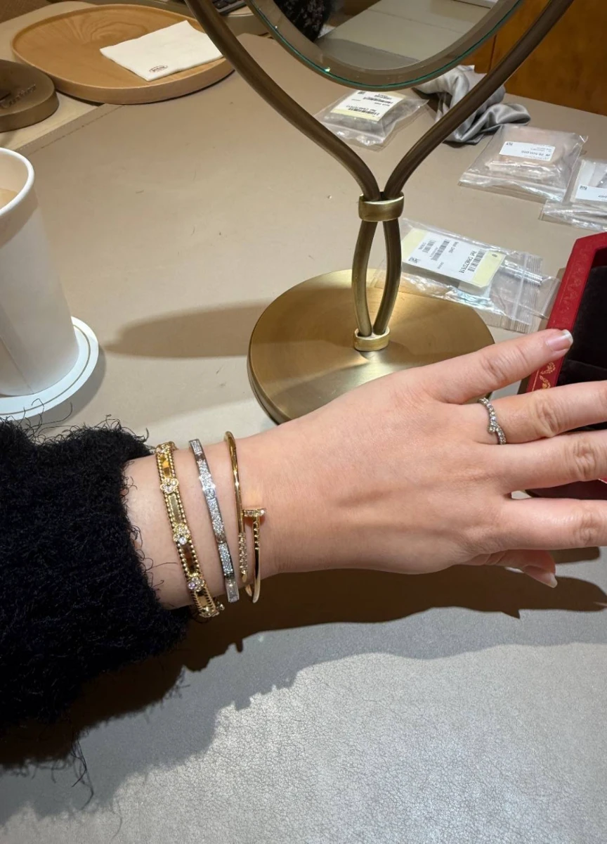
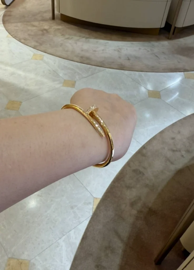
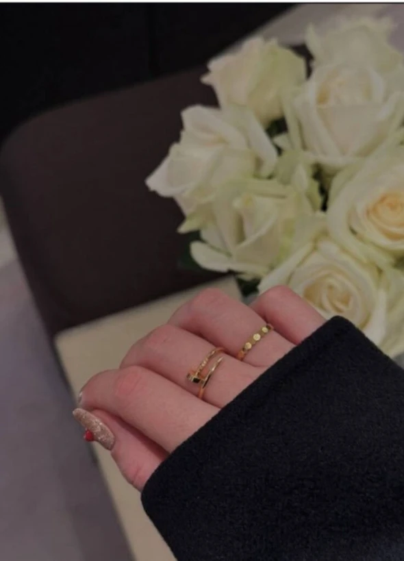
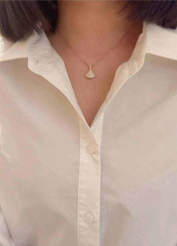
Cartier — Honeyed Amber, Balanced and Grounded
Cartier’s yellow gold is the most stable across a wide range of skin tones.
The color sits closer to warmed amber than to lemon or mustard — rich without being loud, luminous without glare. Rather than flashing under light, it diffuses evenly, behaving more like a surface texture than a color statement. The alloy reads as balanced rather than directional. Some maisons make a yellow gold that argues. Cartier makes one that holds the line.
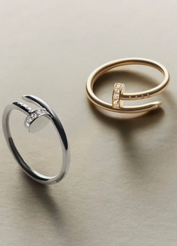
This is why Cartier’s structural designs — Love, Juste un Clou, Baignoire, Panthère — never feel overwhelmed by their own material. The gold supports the line. It doesn’t interrupt it.
photograph by Lumie
On cool-toned skin specifically, Cartier yellow gold doesn’t cast a yellow shadow on the wrist. Instead, the wrist reads more organized — the gold gives structure rather than warmth that sits separately from the body. For someone working a primarily cool palette who wants to introduce yellow gold without disrupting the rest of the wardrobe, Cartier is the most forgiving entry point.
For pavé pieces — the diamond-set Love or Juste un Clou — the diamond surface area further softens the gold, making the cool-toned wear even more seamless. Pavé Cartier reads particularly well on cool-toned skin precisely because the diamonds break up the gold’s warmth without diluting the maison’s signature alloy.
Cartier treats yellow gold not as color, but as material weight.
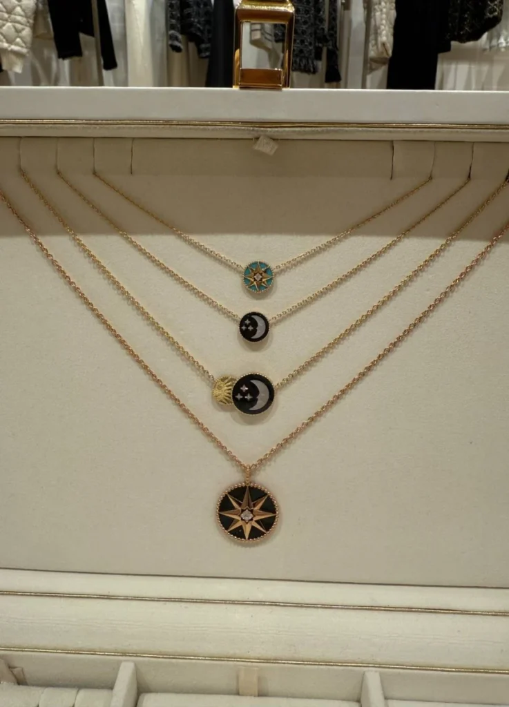
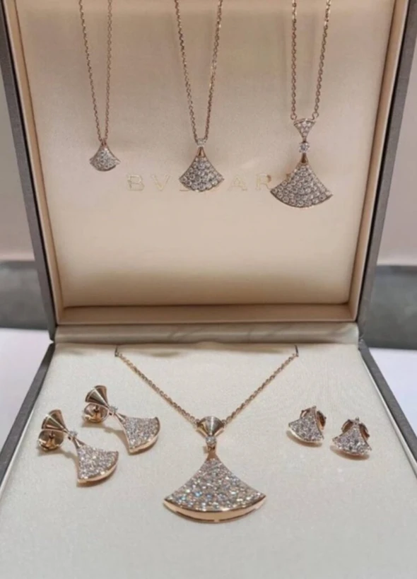
Van Cleef & Arpels — Light Lemon Gold, Emotional and Immediate
Van Cleef & Arpels uses a noticeably brighter yellow gold, often with a lemon-leaning clarity.
In daylight especially, this gold feels buoyant and fresh. It creates an immediate visual response — jewelry that reacts rather than settles. The brightness comes through whether the piece is new or worn, which is part of why VCA pieces photograph as luminous on social media even years into their wear.
source: VCA Official
The quality makes Van Cleef extraordinarily effective in designs where gold surface area is reduced or broken up — mother-of-pearl, pavé, openwork motifs. The Frivole pendant in pavé works beautifully on a wide range of skin tones because the diamond-set surface absorbs and redirects the gold’s brightness. The Magic Alhambra in mother-of-pearl works similarly: the white inlay tempers the lemon yellow, and the result is the kind of soft luminosity that’s harder to find at other maisons.
Where caution is needed is placement. Close to the face, that brightness can dominate rather than integrate, depending on complexion and lighting. On cool-toned skin, a solid yellow-gold Magic Alhambra long necklace can read as bright against the décolletage in a way that competes with the skin rather than completing it. The same maison’s mother-of-pearl Alhambra in the same length reads completely differently — the inlay absorbs the gold’s intensity, and the piece settles instead of asserting.
Van Cleef’s yellow gold delivers immediate emotional lift. It also requires more careful placement than Cartier’s to remain timeless rather than seasonal. For my own collection, it’s selectively chosen — pavé and mother-of-pearl pieces enter freely, but solid-yellow-gold pieces near the face stay rare.
Tiffany & Co. — Clean, Sunlit Yellow with American Precision
Tiffany’s yellow gold occupies a distinct space — cleaner and more reflective than Cartier’s, yet less citrus-bright than Van Cleef’s.
There’s a clarity to it that reads almost architectural. Edges register sharply, surfaces are crisp, and light reflection is more direct. The color philosophy here is closer to gold as a defined object than to gold as a soft layer.
This works beautifully in Tiffany’s link bracelets, hardwear-inspired forms, and sculptural pieces — designs where the gold is meant to function as discrete form rather than dissolved warmth. The Tiffany Lock and the HardWear Link work in this register particularly well. The gold doesn’t disappear into the skin. It remains present, controlled, modern.
The Tiffany approach is unmistakably American in its confidence. The piece doesn’t apologize for being a piece. That clarity is its strength, and it’s also why some collectors find Tiffany yellow gold less comfortable for layering with European maisons — the different formal language can read as a tonal break rather than a continuous stack.
@kerlihoang.authentic / Instagram
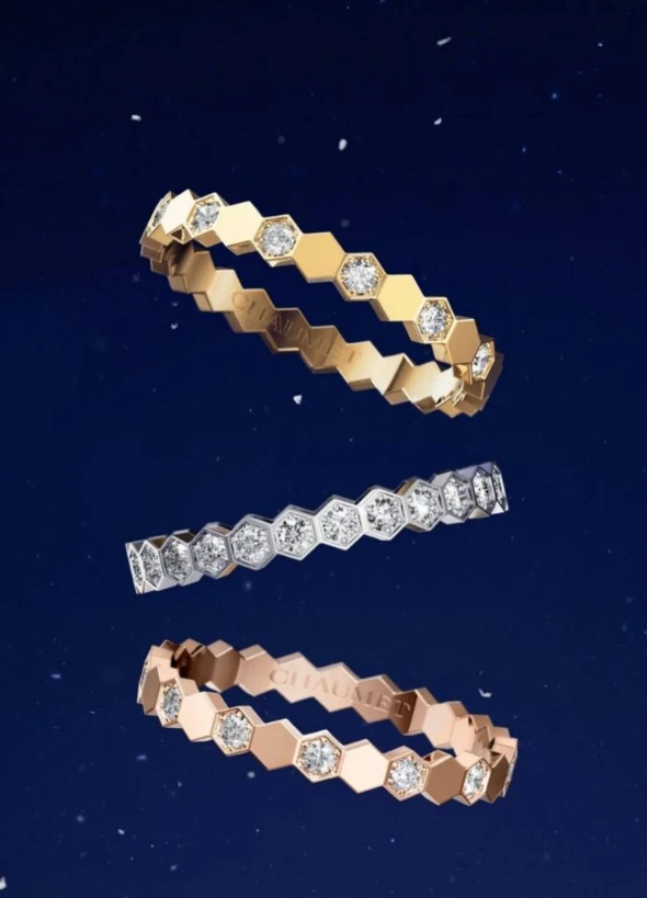
Chaumet — Soft Butter Neutral, Ideal for Layering
Chaumet’s yellow gold sits between Cartier and Van Cleef, but closer to neutrality.
There’s little citrus, little red — just a gentle, buttered warmth that stays close to the skin. The surface finish is even, making it particularly effective when layered alongside other maisons. This is the most quietly engineered yellow gold among the major Place Vendôme houses.
@_aya____21_ / Instagram
Chaumet excels as a supporting voice. It rarely competes. It never overwhelms. It allows form to take precedence over color. For a mixed-maison stack — a Cartier Love next to a Chaumet Bee Mon Joli Bouquet, for instance — the Chaumet gold acts as a chromatic connector. It doesn’t fight Cartier’s amber, and it doesn’t pull toward Van Cleef’s lemon. It simply holds the middle.
For collectors building across maisons rather than committing to a single house, Chaumet often becomes the quiet stabilizer. The brand’s gold is also priced competitively against the other major Place Vendôme maisons, which makes it strategically useful for the layering category specifically.
source: Chaumet Official
Boucheron — Dense Yellow, Color-Forward by Design
Boucheron’s yellow gold carries higher color density. It reads deeper, closer to mustard than to honey.
In graphic designs like Quatre, this intensity works — the gold becomes part of the pattern, reinforcing contrast and visual rhythm. The Quatre’s structural geometry depends on a yellow gold that holds its color rather than receding, and Boucheron’s alloy delivers exactly that.
@jw_inaho / Insatagram
But this is gold that leads with color. It doesn’t recede.
On cool-toned skin, the higher saturation can amplify cooler undertones in the wrist or hand, which makes Boucheron’s yellow gold less forgiving in casual layering than Cartier’s or Chaumet’s. It rewards intentional styling and confident silhouettes — a single Quatre Black Edition ring against a black ensemble works beautifully because the contrast is the point. The same ring layered casually with thinner pieces from softer maisons can read as chromatic mismatch.
Boucheron’s yellow gold is best understood as design-forward gold. The color is part of the piece’s argument, not a neutral support to it.
@jw_inaho / Insatagram
Piaget — Thin, Classical Yellow with Low Saturation
Piaget’s yellow gold is restrained to the point of delicacy.
Both yellow and red undertones are minimal, resulting in a thin, almost historical gold tone. In watches and slim jewelry, this feels refined and timeless — the gold supports the form without claiming attention. The Piaget Polo and the Possession ring both rely on this restraint.
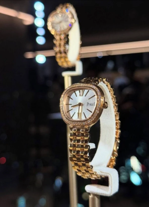
@www__jp / Instagram
As volume increases, however, presence diminishes. A solid Piaget yellow-gold cuff carries less visual weight than a Cartier or Bulgari piece of identical mass. The color simply isn’t engineered to dominate. For collectors who prioritize quiet gold — gold that ages alongside the wearer rather than asserting itself — Piaget is the cleanest delivery of that idea.
The trade-off is that Piaget’s yellow gold can read as conservative in casual styling. It’s gold engineered for elegance rather than impact, and it’s at its best in moderation — a single thin band, a watch on a leather strap, a delicate ring layered beside cooler metals.
@kikoari / Instagram
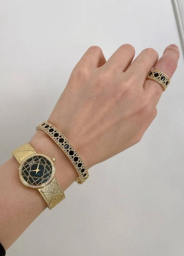
Chanel & Dior — Fashion-Oriented Yellow Golds
Chanel and Dior both treat yellow gold as part of a broader visual language rather than as a material statement.
The warmth tends to read flatter, more graphic. Chanel’s Première bracelets and Coco Crush rings, in particular, often work better with the maison’s beige-gold formula than with its yellow gold — beige gold is closer to a silver-gold neutral that reads cleaner on the brand’s signature quilted leathers and tweeds. The yellow gold versions exist but feel designed to complete a look rather than to age alongside the wearer.
Dior’s yellow gold sits between lemon and butter, leaning fashion-decorative. The Rose des Vents and the Rose Céleste rendered in solid yellow gold both photograph beautifully, but the gold is designed to support a styling moment more than to deepen with wear. These pieces hold their visual register cleanly for years, but they don’t develop the kind of patina that draws collectors back to Cartier or Chaumet over decades.
For the fashion houses, yellow gold is part of a wardrobe rather than a long-term investment in a metal language. That’s a legitimate position, and it produces beautiful pieces — but the framework for evaluating these is different from the framework for evaluating jewelry-house gold. Different criteria, different expected lifespan in a collection.
Bulgari — Mediterranean Gold, Bold and Solar
Bulgari’s yellow gold is unmistakable — strong, sunlit, unapologetic.
This is gold that asserts itself immediately. It pairs naturally with the maison’s bold volumes and Roman intensity. The B.zero1, the Serpenti, and the Diva’s Dream all rely on a yellow gold that holds attention. The alloy delivers a saturation that reads as Mediterranean — sunlight on stone, gold under southern light rather than northern.
@wongcoby / Instagram
It isn’t meant to blend. It’s meant to dominate.
For some collectors, that’s precisely the appeal. A single Serpenti Tubogas in solid yellow gold carries the maison’s full identity — the proposition is integrated, and the gold is essential to it. For others, the saturation demands too much. On cool-toned skin specifically, Bulgari yellow gold can amplify the cooler undertones in the wrist or décolletage, which makes the piece read as separate from the body rather than continuous with it.
Within a personal collection, Bulgari’s yellow gold is best chosen for moments where the gold’s directness is the entire point — a statement piece worn intentionally rather than a daily layer. For the layering category, it’s not the gold that integrates. It’s the gold that anchors a single deliberate look.
@jyccluxury01 / Instagram
Choosing Yellow Gold as a Long-Term Language
Yellow gold isn’t a single decision. It’s a system.
Some maisons engineer gold that settles with time. Others design gold that acts immediately. The difference between gold as material weight and gold as color statement is the difference between a piece that ages with the wearer and one that holds a moment.
For my own collection, pure yellow gold belongs primarily to Cartier — the alloy reads as balanced enough to integrate across varied lighting and complement cool-toned skin without disruption. Van Cleef enters selectively, where pavé or mother-of-pearl breaks up the lemon brightness. Chaumet fills the connecting spaces between maisons. The rest are approached with clarity about their role — Boucheron and Bulgari for intentional statements, Tiffany for sculptural moments, Piaget for refinement, Chanel and Dior as wardrobe pieces rather than jewelry-box anchors.
Across maisons and across years, the principle stays the same. Yellow gold isn’t about trend or brightness. It’s about how quietly — or forcefully — it chooses to remain. The gold that stays in rotation is rarely the gold that argued for itself first.
@jouan.diorhotelvan / Instagram
[ Related Editorials ]
[Bulgari] Serpenti Bracelet : The Architecture of Movement on the Wrist
[Journal] Why Brand Gold Bangles Matter Now
[Tiffany Knot Collection] Tension, Structure, and the Age of Choosing Form