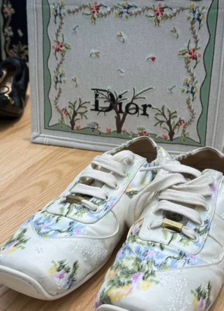
Inside Dior Book Tote by Jonathan Anderson
@sooyaaa___ / Instagram
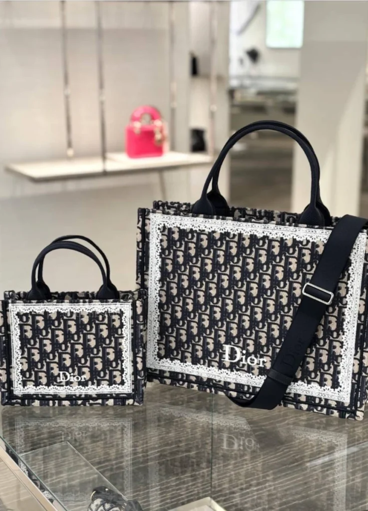
The Dior Book Tote has always been a surface as much as a bag. Its identity has lived in the embroidery — the time spent on the canvas, the scale of the motifs, the way the surface organises attention. For Spring/Summer 2026, that surface splits clearly into two parallel languages: Garden and Graphic.
The split is the clearest sign yet of how Anderson approaches embroidery at Dior — as composition, with structural rules of its own.
@the_vivre / Instagram
Two Languages on One Surface
Garden and Graphic operate as two parallel approaches on the Book Tote’s surface, each with distinct visual logic.
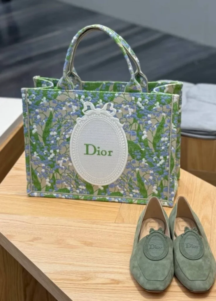
The Garden line translates botanical motifs into structured ornament — vines, medallions, scaled floral arrangements that read closer to a botanical plate than a meadow.
The Graphic line moves the other way. Text, borders, and negative space turn the canvas into something closer to a book cover, where composition leads embellishment.
The Garden line builds its persuasion through density and the time of embroidery. The Graphic line works through compositional clarity instead — typography, framing, and the spacing between elements.
The Garden │ Nature as Structure
The Garden line treats nature as a structural problem. The embroidery is concerned with control as much as with the flowers themselves.
Frames, borders, medallions, and consistent scale are the elements that prevent the embroidery from drifting into sentimentality. Nature is present, but never in charge.
@the_vivre / Instagram
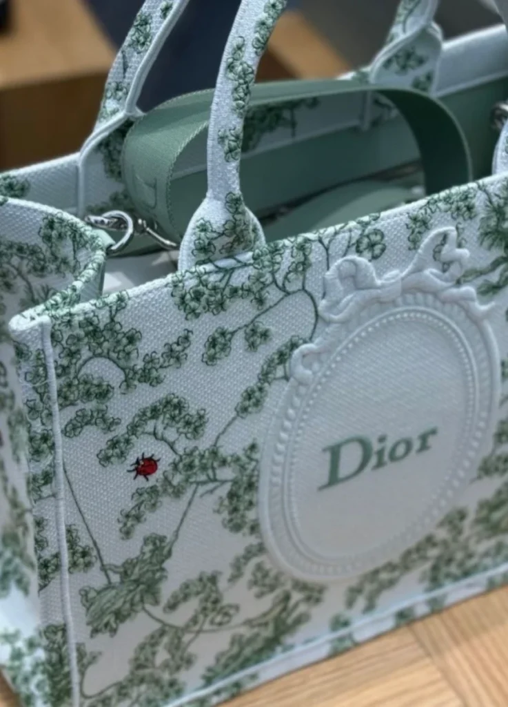
The central medallion
At the heart of the design sits an oval medallion topped with a bow-shaped frame. The grammar here is closer to antique cameo brooches and medal plaques than to anything floral. The oval establishes hierarchy. The bow functions as a closure. The logo sits anchored on the surface.
Plants surround the centre, but the centre stays firmly tied. The line keeps a classical register.
@the_vivre / Instagram
The vines and botanical scale
A close look at the vines and leaves reveals what the embroidery is actually doing. The motifs repeat at consistent intervals, with measured density. The visual effect lands closer to a botanical plate than to a wild garden.
The embroidery offers order; the looseness of a wild garden is deliberately absent.
The Book Tote becomes a surface where natural elements sit under deliberate compositional rules — and that restraint is the source of the piece’s persuasion.
source: Dior Official Website
The Graphic │ The Tote as Book Cover
Running parallel to the Garden line is the Graphic line. The graphic surface treats the canvas as printed matter — typography arrives before texture, borders frame the surface like margins, negative space breathes the way it does on a well-designed book cover.
Where the Garden line uses density, the Graphic line uses clarity. Both are designed to direct attention; they simply do it through different vocabularies.
@dior / Instagram
The Vine │ The Connecting Structure
Across both lines, one element does most of the structural work: the vine.
The vine is rarely central and never the focus. Its job is to connect, frame, and restrain — to outline the surface without crossing into the medallion, supporting hierarchy without competing with it.
This is why the vine functions as the season’s real motif. The role it plays is structural; it organises everything else on the surface.
@the_vivre / Instagram
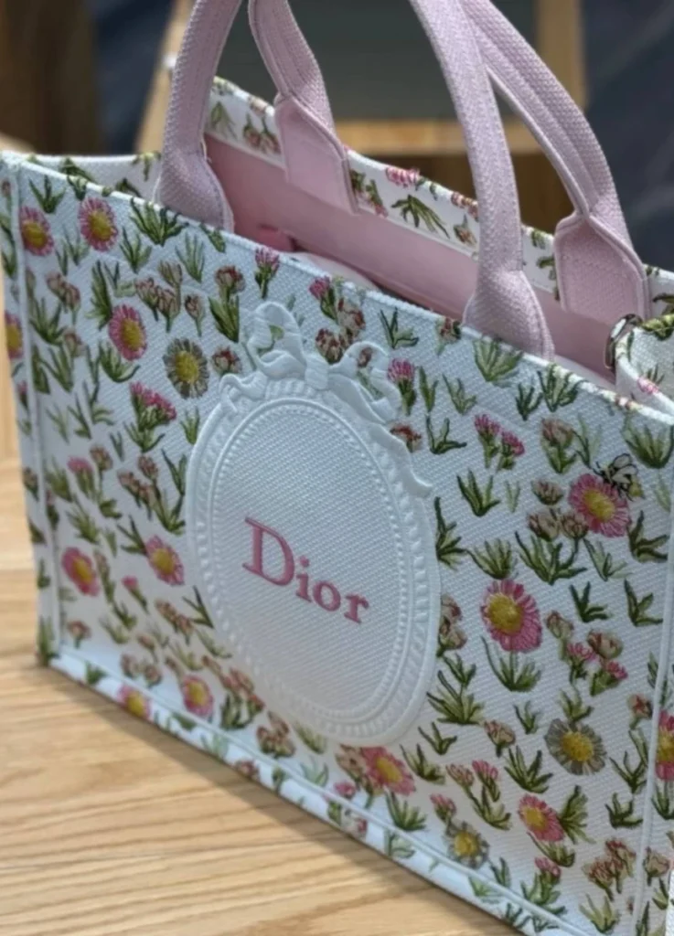
The Quiet Signs │ Lily of the Valley
Above the vines and within the garden, lilies of the valley appear in small clusters. They do something different from the larger embroidery.
The vines do the structural work. The lilies operate at a smaller scale, marking the surface as Dior’s.
@the_vivre / Instagram
Christian Dior kept lily of the valley as a personal talisman, a private symbol of luck. The flower has been a quiet code in the house’s vocabulary for decades. On the 26SS Book Tote, it stays small, off-centre, and easy to miss at first glance.
The placement is deliberate. The lilies do not announce themselves. They are recognisable to wearers who know what to look for, and they leave the larger composition undisturbed for those who don’t.
The Book Tote’s lilies function as memory marks, embedded carefully in the larger composition.
@the_vivre / Instagram
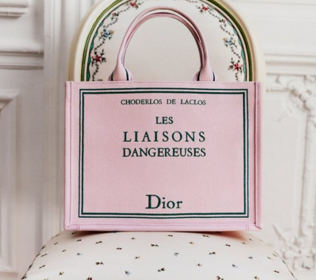
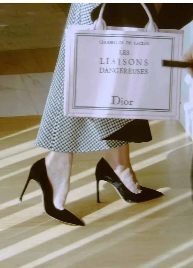
Les Liaisons Dangereuses │ Text as Thesis
The other surface element worth examining is the text — Les Liaisons Dangereuses, printed across the Graphic line.
The phrase carries weight beyond the literary reference. The 18th-century novel is about elegance as strategy, about relationships that look refined while operating as systems of control. Placing that title on a Book Tote can be read as a position, not just a citation.
Fashion involves relationships of the same kind — between wearer and viewer, between brand and customer. Beauty persuades, persuasion holds power, and that dynamic is not always neutral.
This reading is what gives the pink Book Tote its specific register: sentimental in colour, cooler in meaning. When Anya Taylor-Joy was photographed carrying the tote, the styling appeared closer to composure than to softness.
On the Graphic line, the text doesn’t read as decoration. It reads as declaration.
@anyataylorjoy / Instagram
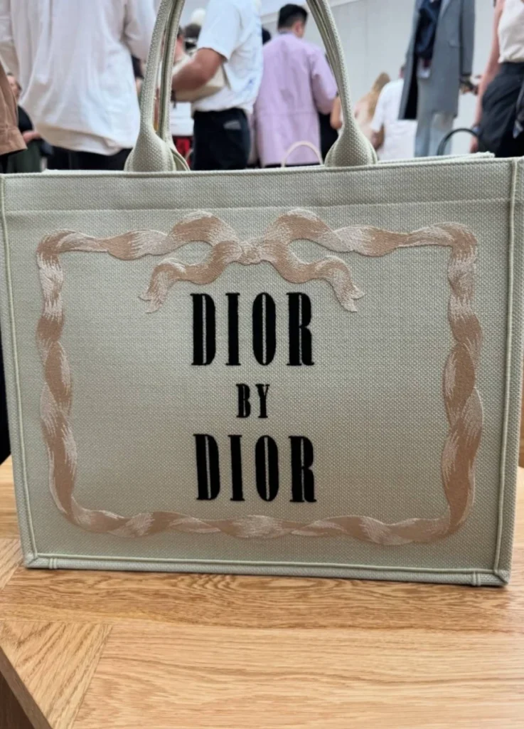
Dior by Dior │ The Final Line
The most decisive surface treatment is the simplest: the words “Dior by Dior” across the canvas.
The phrase functions as a signature. It was the title of Christian Dior’s own memoir, and its placement on the Book Tote can function as an author credit — a quiet but final assertion that everything else on the surface (the vines, the florals, the embroidery, the borders) belongs within the house’s voice.
The garden does not speak last. The name does.
@i_d / Instagram
At the Boutique │ Practical Notes Before Buying
The Book Tote can vary in finishing quality between individual pieces, especially in a season as embroidery-heavy as 26SS. Several things to examine in person.
1. The vine pattern. The vine should connect cleanly across the surface. Watch for vines that cut off awkwardly mid-panel, density that varies between the front and side panels, or pattern that breaks up as it approaches the base.
2. The central medallion and bow frame. The bow at the top of the medallion holds the surface in place — it should sit symmetrical, with both sides matching in length and curve. Logo centred within the frame; embroidery raised, not flattened by overhandling. Worth viewing under shifting light at the boutique.
@the_vivre / Instagram
3. The smaller embroidery. The lily of the valley and small floral accents reveal finishing quality more than the larger patterns. Look for protruding threads, uneven brightness in floral details, and clustering or thinning in stitching density.
4. Handles and canvas tension. The first place a Book Tote tends to wear is the handle attachment. Check that both handles sit at the same angle, that the canvas isn’t pulling tighter on one side, and that the bag stays balanced when lifted from above.
5. Colour, weighed against actual use. White and ivory tones photograph beautifully but ask for more upkeep. The toned-down botanical colourways tend to suit clients who plan to wear the bag often. For clients buying their first Book Tote, the safer colour usually wears better over time than the more striking options.
source: Dior Official Website
Closing │ A Cover, Carefully Composed
The 26SS Dior Book Tote does not romanticise nature. It builds structure with vines, embeds memory through lily of the valley, and closes the surface with a name.
What makes the bag persuasive is its editing.
The result reads closer to a cover than to a bag — a carefully composed surface where Anderson’s Dior writes itself, again, in full view.
[ Related Editorials ]