Inside New Lady Dior
When Jonathan Anderson engages with an established house icon, he rarely disrupts its structure. He adjusts the framing around it.
His reinterpretation of the Lady Dior doesn’t alter the architecture of the bag. The cannage quilting, the top handles, the dangling charms remain. What changes is the narrative field in which the bag is placed.
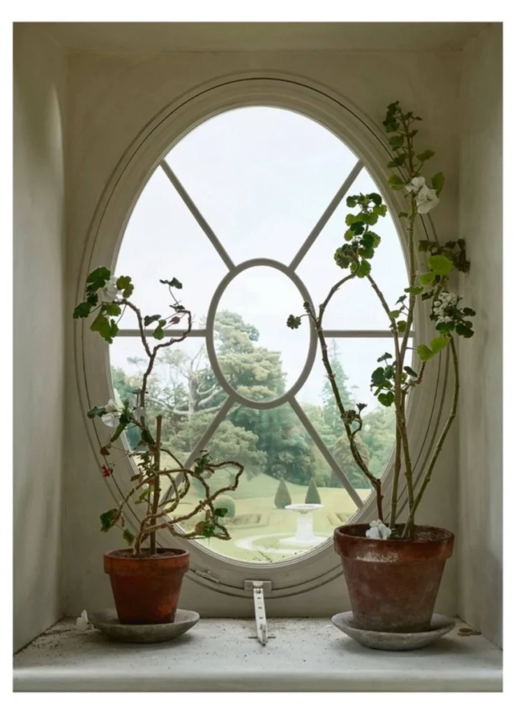
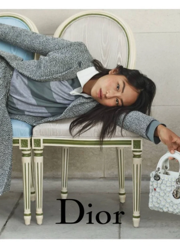
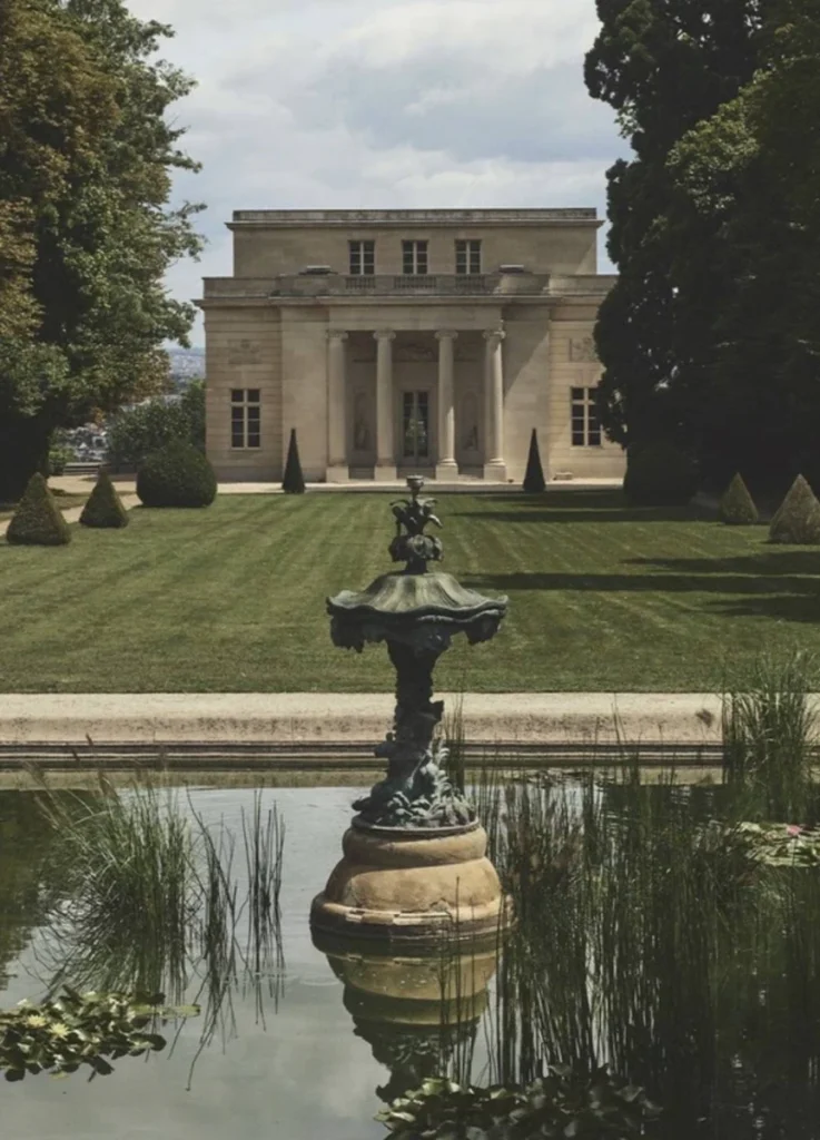
The campaign was shot at the Pavillon de Musique de Madame du Barry — the 1771 pleasure pavilion commissioned by Louis XV’s last official mistress, set within the gardens of Versailles. This isn’t a generic 18th-century interior. It’s a building designed specifically for intimate aristocratic ritual, situated at the edge of one of the most studied formal gardens in French history.
The campaign situates Lady Dior among gardens, sculpture, windows, and stillness. The bag isn’t presented as novelty. It’s presented as continuity.
The Garden as Structure, Not Decoration
The garden has long been central to Dior mythology.
Christian Dior’s earliest aesthetic memories trace back to Granville — the Normandy estate where he spent his childhood, with its formal gardens overlooking the Channel. Les Rhumbs, the family villa, organized its world through cultivated planting, geometric pathways, and seasonal flower arrangements. Dior himself credited that garden as the foundation of his design instinct.
Under Anderson, that motif is neither discarded nor romanticized. It’s reframed.
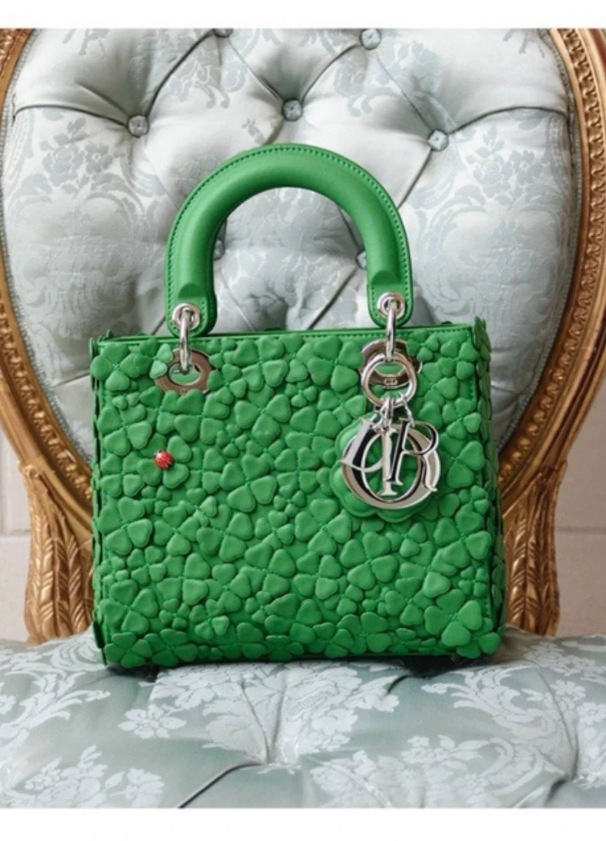
Floral embroidery, clover-textured surfaces, dimensional appliqué, and heightened color palettes shift the reading of cannage from architectural grid to cultivated ground. The surface begins to suggest landscape rather than lattice.
This doesn’t make the bag softer. It makes it layered.
The floral interventions read less as embellishment and more as commentary on how Dior continues to rely on garden symbolism to anchor its identity. The question isn’t whether the garden remains relevant. It’s how that garden gets reinterpreted for a different visual literacy.
@dior / Instagram
Casting and Cultural Positioning
The casting suggests a broader recalibration.
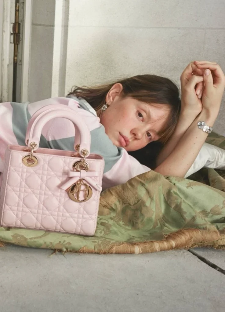
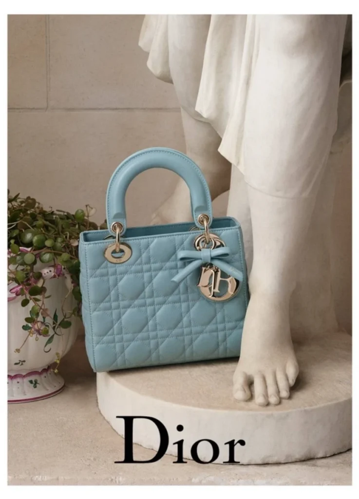
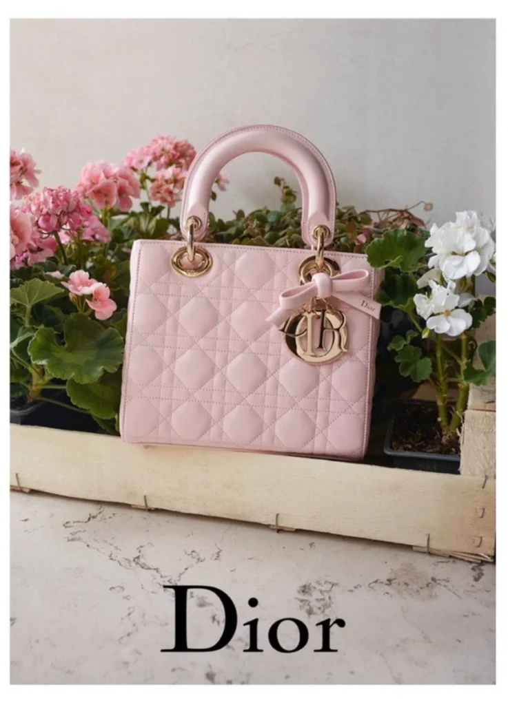
Mia Goth appears almost porcelain against antique interiors with her pink quilted Lady Dior — reinforcing fragility within structure. The reading lands at the intersection of antique surface and youthful presence.
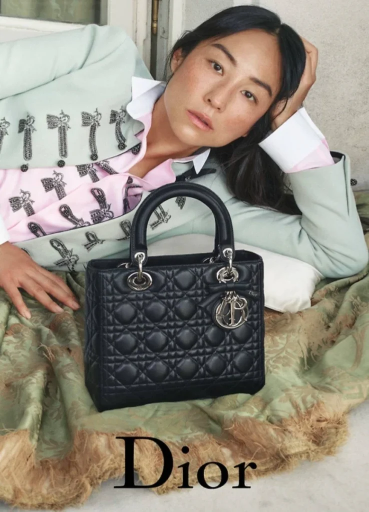
Greta Lee introduces tonal restraint and cross-cultural modernity. Her gray jacket and floral-embroidered Lady Dior position her as a contemporary translation point — Western luxury read through Korean American sensibility.
@dior / Instagram
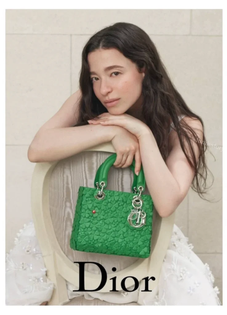
Mikey Madison brings kinetic contrast, particularly in the green clover iteration, which reads less nostalgic and more present. Her cinematic persona injects movement into what would otherwise sit as still life.
Rather than presenting a single archetype of femininity, the campaign distributes Lady Dior across different temperaments. Anderson isn’t framing Lady Dior as one woman’s bag. He’s framing it as the connector between women whose backgrounds, registers, and presences are deliberately different.
Three women, three worlds, one icon.
@dior / Instagram
The Ribbon | Gesture Within Structure
The most visible addition is the ribbon detail tied near the handle.
Historically, Lady Dior’s identity relied on structural precision. The ribbon introduces gesture — an element of softness that interrupts architectural clarity.
Its detachability is significant. The bag can revert to its original severity. This optionality suggests the shift isn’t imposed. It’s proposed.
@dior / Instagram
For younger collectors, the ribbon may read as romantic or playful. For established clients, it may remain unused.
The design therefore doesn’t redefine the icon outright. It tests elasticity.
Reinvention would mean replacing what Lady Dior is. Elasticity testing asks how much the icon can stretch while remaining itself. Anderson chose the second strategy. The detachable ribbon is the proof — a feature that exists, but never insists.
@dior / Instagram
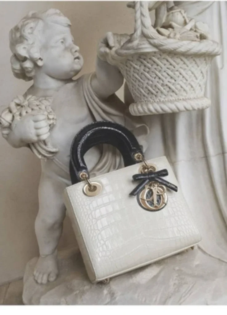
Surface as Biography
The green clover variation invites another reading.
The clover sits at the intersection of two histories. Christian Dior himself kept a four-leaf clover in his suit pocket as a personal lucky charm — the maison’s superstition codes are well documented. Anderson’s Irish background introduces a parallel resonance. The clover here doesn’t operate as a single symbol but as a doubled one — Dior’s personal archive overlapping with Anderson’s biography.
The motif here isn’t symbolic in a literal sense. It operates texturally.
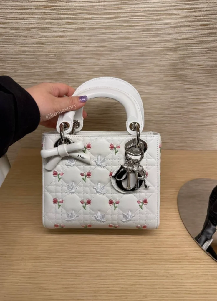
The white daisy edition similarly foregrounds surface density rather than print. These interventions ask the viewer to reconsider Lady Dior not as a flat leather object, but as constructed textile.
This move aligns with Anderson’s broader practice — elevating materiality without abandoning form.
The exotic versions extend the same logic. Crocodile Lady Dior under previous house directors carried grande dame gravity. Anderson’s reading is different. The exotic skins under his direction read fresh and youthful rather than ceremonial. The texture remains rare. The mood doesn’t.
Still Life and Temporal Framing
The campaign’s compositional language recalls 18th-century still life painting:
- flowers arranged with deliberate restraint
- clocks and sculpture as silent temporal markers
- windows framing manicured exterior gardens
Lady Dior sits among these elements rather than dominating them. The bag becomes one object among objects.
The women are rarely hyper-posed. They sit, recline, or lean. The mood resists spectacle.
What emerges is quiet staging.
Age and the Question of Fit
The reinterpretation doesn’t tie to a single demographic, yet perception varies meaningfully across age brackets.
Late twenties to mid-thirties
The colorful versions — Mia Goth’s pink, the daisy embroidery, the green clover — register most directly here. The ribbon detail reads as fresh rather than disruptive. For collectors at this stage, the new Lady Dior arrives at the right intersection of recognizable icon and seasonal personality.
This is the demographic that would buy the new Lady Dior without hesitation.

@sooyaa__ / Instagram
Mid-thirties to forties
Greta Lee’s gray, white, and green variations register here as composed and architectural. The ribbon becomes optional rather than essential. The classic palette under Anderson’s direction reads as a continuation of Lady Dior’s authority, refreshed rather than redefined.
Fifty and beyond
The garden context, classical quilting, and floral combinations carry naturally for this audience. The icon’s structure remains unchanged. The new layers — ribbon, embroidery, exotic colorways — integrate as choice rather than requirement.
The Ribbon as Generational Filter
The most honest reading concerns the ribbon specifically.
For collectors under thirty-five, the ribbon reads as the bag’s most contemporary feature. For collectors over forty who already own Lady Dior in its classical configuration, the ribbon may register as decorative excess — pleasant on younger wearers, less essential on themselves.
The detachability resolves the friction. Anderson and the Dior atelier appear to have anticipated exactly this generational gap. The ribbon arrives as an option, not an obligation. The bag’s structural identity holds regardless.
That decision is itself strategic. Anderson isn’t displacing the Lady Dior’s existing collector base. He’s expanding the bag’s age window without alienating the women who already own it.
@dior / Instagram
What This Campaign Signals for Future Dior Womenswear
The Lady Dior campaign isn’t only about a bag.
It reveals the directional codes Anderson is preparing for the broader womenswear collections ahead.
Dimensional florals. Three-dimensional embroidery, appliqué, and surface textile work — already visible on the bag — will likely extend into ready-to-wear dresses, jackets, and outerwear. The garden won’t stay on bags. It will move onto fabric.
Soft pastels punctuated by saturated greens and yellows. The campaign’s color logic — pale pink, ivory, gray as base / green clover and yellow as accent — suggests the same chromatic structure across upcoming collections. Pastels for surface. Saturated colors as compositional punctuation.
Architectural silhouette plus ornamental layer. The strategy remains consistent. Structured base form (jackets, coats) overlaid with decorative gesture (embroidery, ribbons, lace). Architecture and garden, simultaneously rather than in alternation.
The Lady Dior campaign reads as a directional preview. The bag is the test piece. The collections ahead will likely scale the same logic across categories.
@dior / Instagram
Conclusion | Context Over Reinvention
Jonathan Anderson doesn’t radically alter Lady Dior. He alters its environment.
By situating the bag within garden imagery, historical interiors, and plural casting, the campaign shifts the emphasis from object to context.
The icon remains structurally stable. What evolves is the frame through which it’s viewed.
Whether this repositioning marks a long-term recalibration for Dior, or a seasonal exploration of texture and gesture, will become clearer over the next few seasons.
For now, Lady Dior appears less as proclamation and more as placement — an object carried not only through space, but through interpretation.
@sooyaa__ / Instagram
Featured Image via @dior / Instagram
[ Related Editorials ]